Anime Character Color Setting Sheet
Full prompt
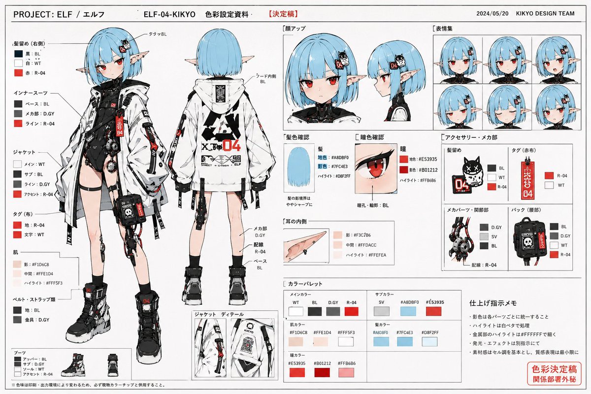
Use the reference image as a base for character design to draw 'professional-spec character color setting materials used in commercial anime production sites.' Maintain the character's face, hairstyle, hair color, eyes, contour, body type, silhouette, costume design, color scheme, and overall impression accurately. Never break the character's identity. Do not redraw as a different character. This is not a finished illustration, not a poster, and not concept art. The purpose is setting materials for color sharing aimed at animators, colorists, finishing staff, and photography staff. The screen is a white background-based Japanese anime setting material layout. Arrange multiple color setting cuts as a organized material page. Include the following: Full-body color front, full-body color back, face close-up, facial expression variations, hair color confirmation, eye color confirmation, costume color scheme confirmation, accessory color specifications, shoe color scheme, small item color settings, partial enlarged views, color palette column, color-coded arrows, handwritten-style color specification notes, and finishing instruction notes. The character should be depicted with clean anime cel-shading. No thick painting. Excessive gradients are prohibited. Cinematic lighting is prohibited. Social game-style rendering is prohibited. Excessive effects are prohibited. Shadow colors are organized and designed to be simple and easy to read, like color specification materials at an anime production site. Saturation is slightly organized, with natural colors like those in a printed setting collection. Naturally add color numbers, simple annotations, arrows, part names, and color-coding instructions within the screen. As a material page, prioritize visibility and structural understanding. The layout has an atmosphere like Japanese anime setting collections from the 90s to the 2000s. High information density but organized and easy to read. Allow natural margins as a page. The entire page has an atmosphere like an actually printed and scanned setting collection. Naturally add minor paper texture, a slight sense of printing, copy paper feel, and scanning feel. Prioritize looking like 'actual production site materials' rather than a completed artwork.
Original prompt
参照画像をキャラクターデザインのベースとして使用し、「商業アニメ制作現場で使用される、プロ仕様のキャラクター色彩設定資料」を描く。

キャラクターの顔、髪型、髪色、瞳、輪郭、体型、シルエット、衣装デザイン、配色、全体の印象を正確に維持すること。

キャラクターのアイデンティティを絶対に崩さない。
別キャラクターとして描き直さない。

完成イラストではない。
ポスターではない。
コンセプトアートではない。

目的は、アニメーター、彩色担当、仕上げ担当、撮影担当へ向けた、色彩共有用の設定資料。

画面は、白背景ベースの日本アニメ設定資料レイアウト。

複数の色彩設定カットを、資料ページとして整理して配置する。

以下を含める:

・全身カラー正面
・全身カラー背面
・顔アップ
・表情差分
・髪色確認
・瞳色確認
・衣装配色確認
・アクセサリー色指定
・靴配色
・小物カラー設定
・部分拡大図
・カラーパレット欄
・色分け矢印
・手書き風色指定メモ
・仕上げ指示メモ

キャラクターは、セルアニメ調のクリーンなアニメ塗りで描写する。

厚塗りしない。
過剰なグラデーションは禁止。
映画的ライティングは禁止。
ソーシャルゲーム風レンダリングは禁止。
過剰なエフェクトは禁止。

影色は整理され、アニメ制作現場の色指定資料のように、シンプルで読みやすく設計する。

彩度はやや整理されており、印刷された設定資料集のような自然な色味。

画面内には、色番号、簡易注釈、矢印、パーツ名、色分け指示などを自然に追加する。

資料ページとして、視認性と構造理解を最優先する。

レイアウトは、日本の90年代〜2000年代アニメ設定資料集のような空気感。

情報密度は高いが、整理されていて読みやすい。

紙面として自然な余白を持たせる。

誌面全体は、実際に印刷・スキャンされた設定資料集のような空気感。

軽微な紙の質感、わずかな印刷感、コピー紙感、スキャン感を自然に加える。

完成されたアート作品ではなく、「実際の制作現場資料」に見えることを最優先する。
Use this prompt in the VdoBloom image editor.
Opens the image editor with this prompt — add your own photo to generate.