Architectural Perspective Sketch Poster
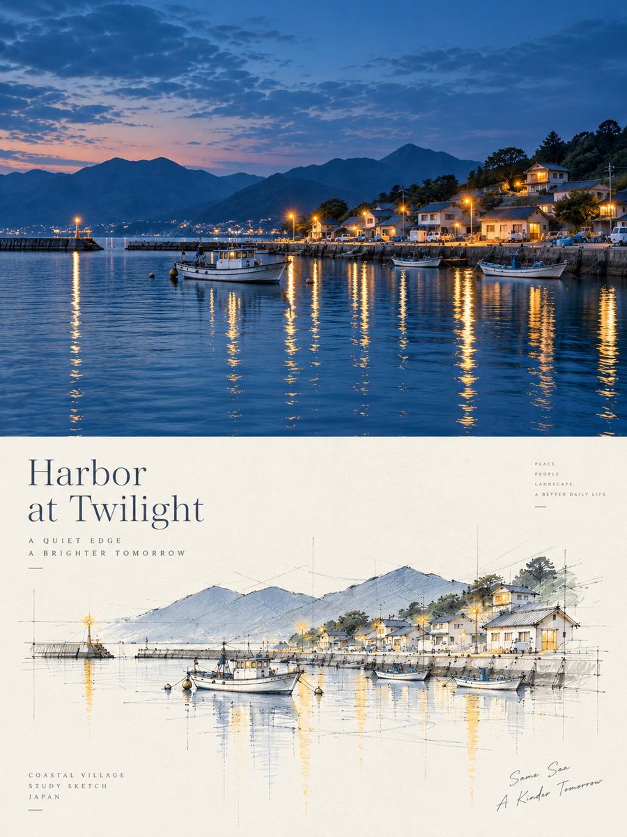
Full prompt
Please create each photo I upload into an independent, high-end design poster, no multi-image stitching, each photo output separately. The overall composition adopts a 3:4 vertical layout, with the upper and lower areas strictly 1:1 in height, each occupying 50% of the screen. The upper part retains the original photo, maintaining the subject identity, structure, posture, real texture, natural light and shadow, and the original color atmosphere, with only slight high-end color grading to give it the texture of art magazines and exhibition images. To adapt to the frame, the environment background can be naturally expanded, but the subject must not be stretched, distorted, or changed. The lower part extracts only the most recognizable subject, outline, structure, posture, and narrative relationship from the photo, and reconstructs it into an architectural concept perspective sketch / architectural design presentation hand-drawing. Do not keep the full scene, do not copy the photo object by object; actively delete most of the background, surroundings, and irrelevant details, leaving only the core forms, spatial relationships, and visual memory points that best represent the original theme. The lower part re-evaluates the artistic judgment. Even if the original composition is poor, the background is messy, or the subject is small, it should be rescued into a valid work through deletion, reorganization, cropping, scale changes, and white space, truly giving the model the power to re-direct the scene. The drawing style uses freehand perspective line drawings + a small amount of selective color blocks. The lines are relaxed, restrained, slightly repetitive, and punctuated, allowing for a small number of auxiliary lines, extension lines, construction lines, and geometric reference lines of architectural drawings to form a clear sense of design deliberation. Color is only lightly applied in a few key parts to emphasize the subject, structural levels, local shadows, or spatial focuses, and other areas are mostly left unpainted. The screen must be centered on a large amount of conscious white space. The subject should be smaller and more refined, with large areas of other spaces left empty. White space is not just an empty background, but a part of the composition, forming a sense of breath, space, and rhythm together with the subject, line drawings, reference lines, shadows, and a small number of color blocks. The subject can be off-center, edge-aligned, partially cropped, or scaled down; it is better to draw less than to fill it up. A small amount of geometric shadow color blocks can be added to strengthen volume, depth, and spatial layers, but avoid heavy rendering, complex environments, and a realistic rendering feel. The background remains minimalist, retaining only a very small amount of necessary site suggestions. The color scheme extracts 2-4 of the most recognizable and vibrant colors from the photo above and rearranges them into a cleaner, more restrained, and appealing sketch color palette. The overall can be appropriately brightened, purified, and desaturated, mainly using off-white, light gray, warm gray, soft green, light wood color, light blue-gray, etc., with a small amount of more vivid but not dazzling accent colors reserved locally. Avoid dirty gray, dullness, excessive vintage feel, and cheap high-saturation. Text intervention is minimal and editorial, with no language restrictions. A few words, short phrases, or notes can be generated based on the subject, location, action, or emotion, quietly placed in the white space, forming a restrained graphic-text relationship with the image. The overall presentation is a high-end visual effect composed of architectural concept hand-drawings, free line drawings, geometric reference lines, a small number of color blocks, geometric shadows, massive white space, and editorial layout. Avoid complete scene retention, object-by-object duplication, complex backgrounds, full-frame coloring, realistic renderings, thick strokes, cartoonish feel, 3D feel, and template-like expressions.
Original prompt
请将我上传的每一张照片分别制作成一张独立的高级设计海报,不多图拼接,每张照片单独输出。整体采用 3:4 竖版构图,上下两个区域高度严格 1:1,各占画面 50%。上半部分保留原始照片,保持主体身份、结构、姿态、真实质感、自然光影和原有色彩氛围,仅进行轻微高级调色,使其具有艺术杂志与展览图像质感。为适配画幅,可自然扩展环境背景,但不得拉伸、扭曲或改变主体。下半部分只提取照片中最具识别性的主体、轮廓、结构、姿态与叙事关系,重构为建筑概念透视草图 / 建筑方案表现手绘。不要完整保留场景,不要逐物复制照片;主动删去大部分背景、配景和无关细节,只留下最能代表原始主题的核心形体、空间关系与视觉记忆点。下半部分重新做美术判断。哪怕原图构图差、背景乱、主体小,也要通过删减、重组、裁切、尺度变化和留白,把它救成一张成立的作品,真正赋予模型重新导演画面的权力。画风采用自由徒手透视线稿 + 少量选择性色块。线条松弛、克制、略带重复与停顿感,可保留少量辅助线、延长线、构造线与建筑手绘的几何参考线,形成明确的设计推敲感。色彩只在少数关键部位轻微铺陈,用于强调主体、结构层次、局部阴影或空间重点,其余区域尽量不画。画面必须以大量有意识的留白为核心。主体应更小、更精炼,其余空间大面积留空。留白不是空背景,而是构图的一部分,要与主体、线稿、参考线、阴影和少量色块共同形成呼吸感、空间感与节奏感。主体可偏心、贴边、局部裁切或缩小尺度;宁可少画,也不要填满。可加入少量几何阴影色块强化体量、进深与空间层次,但避免厚重渲染、复杂环境和写实效果图感。背景保持极简,只保留极少量必要的场地暗示。配色从上方照片中提取 2–4 种最具识别度和生命力的颜色,重新整理为更干净、克制、耐看的草图色系。整体可适度提亮、提纯、去灰,以米白、浅灰、暖灰、柔和绿色、淡木色、浅蓝灰等为主,局部保留少量更鲜明但不刺眼的点睛色。避免脏灰、暗沉、过度复古和廉价高饱和感。文字只作极少量编辑性介入,不限制语种。可根据主体、地点、动作或情绪生成少量字词、短句或注记,安静地落在留白区域,与画面形成克制的图文关系。整体呈现建筑概念手绘、自由线稿、几何参考线、少量色块、几何阴影、超大量留白与编辑式排版共同构成的高级视觉效果。避免完整场景保留、逐物复制、复杂背景、满幅上色、写实效果图、粗重描边、卡通感、3D感和模板化表现。
Use this prompt in the VdoBloom image editor.
Opens the image editor with this prompt — add your own photo to generate.