Architectural Typographic Portrait Fusion
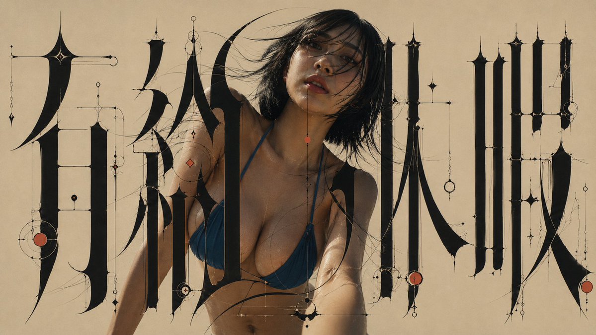
Full prompt
Create a new, fully integrated single artwork in a 16:9 widescreen format, using the two attached images as a visual design blueprint.

IMAGE A: Experimental Japanese typography art.
IMAGE B: Live-action portrait.

==================================================
ABSOLUTE GOAL

Do not make a simple collage where Image B is just cut out and pasted onto Image A as a background.
Do not simply overlay the letters from Image A onto the person in Image B.
Do not think of them as separate combinations like "Background + Person," "Photo + Text," or "Person + Decoration."

Use Image A and Image B as design blueprints to construct the final piece.
Rebuild everything—the person, letters, black surfaces, thin lines, negative space, light, color, contours, foreground/background relationships, and decorations—as a single, inseparable visual structure designed simultaneously from the start.

The final image should not be "a person inside typography," but rather a state where the person's very existence establishes the typographic composition.

==================================================
CORE COMPOSITION PRINCIPLE

Do not compose the typography first and insert the person afterward.
Compose the typography and the person simultaneously as one inseparable visual structure.

Do not treat the person as an independent subject.
Treat the face, hair, neck, shoulders, arms, clothing, body contours, and the negative space created by the body as typographic components equal in status to the giant letters, black strokes, fine lines, circular ornaments, and vermilion accents.

Aim for a state where, if the person were removed, the typography composition itself would feel incomplete.

==================================================
IMAGE A / TYPOGRAPHY PRESERVATION

Maintain to the maximum extent the elements present in Image A:
Basic character structure, number of characters, major placement, giant black strokes, extreme thick-thin contrast, ultra-elongated forms, giant curved strokes, needle-like tips, long S-curves, ultrafine horizontal/vertical lines, circles, rings, beads, pendulum-like ornaments, vermilion accents, greige background, and the overall left-center-right composition.

Do not change the characters to different ones. Do not change the character count. Do not revert to normal Japanese fonts, standard Mincho, Gothic, or brush calligraphy.

However, to fully integrate the person and typography, you may re-adjust local stroke positions, layering, line paths, character spacing, and some negative spaces as long as the overall composition holds. Prioritize completing the design philosophy of Image A through integration with the person over rigid character preservation.

==================================================
TYPOGRAPHIC CHARACTER

Typography is an experimental, sculptural form merging Japanese, high-contrast Mincho, Blackletter, Art Nouveau, illuminated manuscripts, precision machinery, architectural drawings, and high jewelry.
- Main vertical strokes are extremely thick.
- Horizontal and auxiliary lines are hair-thin (extreme thick-thin contrast).
- Massive black surfaces, very long thin lines, giant crescent curves, sharp pointed ends.
- Strokes like blades or feathers, geometric line structures.
- Typography must feel like architecture. Treat characters as structural elements building the screen rather than "text for reading."

==================================================
PERSON IDENTITY PRESERVATION

For the person in Image B, strongly maintain: facial features, proportions, eyes, nose, mouth, contour, hairstyle, hair color, unique characteristics, clothing, and body silhouette.

Do not change to a different person. Do not significantly change age perception. Do not change the hairstyle or clothing design.

However, the original photo's background, lighting, color temperature, contrast, shadows, and specific environment do not need to be maintained. Re-render the person as if photographed specifically for this artwork while preserving their recognizable identity. Do not paste the source photograph.

==================================================
PHOTOREALISTIC PERSON

The person must maintain complete photorealistic expression. Do not stylize into anime, manga, line art, painting, vector, or posterized skin. No black outlines.
- Real human skin texture, natural pores, subtle skin variation, individual hair strands, realistic facial detail, real fabric texture, natural photographic depth, editorial fashion photography, subtle photographic grain.
The person should not look like CG or illustration.

==================================================
PERSON AS TYPOGRAPHIC COMPONENT

Do not treat the person as an independent model inside typography.
The person's face functions as both a face and a bright organic shape between giant black letters.
- Design space around the face as typographic negative space.
- Use hair flow as a visual extension of fine decorative lines.
- Echo shoulder curves with giant curved strokes.
- Relate arm angles to horizontal or diagonal line directions.
- Connect black clothing parts with the visual mass of black strokes.
- If the outfit has red, coordinate it with the vermilion accents in Image A.
- Use the silhouette as a composition part equal to the giant letters.

==================================================
NEGATIVE SPACE

Do not treat space around the person as just "person space."
The gaps between face and letters, neck and fine lines, shoulders and black strokes, arms and letters must be designed intentionally like counters, kerning, and leading. The negative space created by the person determines the balance of the entire typography.

==================================================
MULTI-LAYER INTERWEAVING

Simple two-layer structures (person in front, letters in back) are prohibited. Create at least multiple levels of depth.
Example: Giant stroke A -> Behind person. Person's hair -> In front of stroke A. Fine line B -> In front of some hair. Different hair clump -> In front of line B. Giant stroke C -> In front of shoulders. Arm -> In front of stroke C. Vermilion line D -> Crosses part of the outfit. Another line -> Disappears behind the person.
Typography must physically weave around the person.

==================================================
HAIR INTEGRATION

Treat hair as the most important integration point. Keep individual hair strands natural. No uniform cutout boundaries. Intersect fine hair strands with typographic fine lines. Some hair is front, some is back. Art Nouveau curves should echo hair curves, but do not deform the hair into letters.

==================================================
EDGE INTEGRATION

Do not create a uniform Photoshop-like cutout boundary. No white/black outlines or universal shadows. Contact between person and letters should vary: some places fully obscured, some slightly overlapping, some lines passing through, some negative space. Do not unify contour treatments.

==================================================
SHARED LIGHTING

Ensure the person and typography share the same visual space. The greige background should subtly reflect on skin and clothing. Near black strokes, create very weak light occlusion (not strong 3D shadows, but subtle light changes). No flashy rim lights or overly cinematic lighting.

==================================================
COLOR SYSTEM

Strictly limit the palette:
- BACKGROUND: Warm matte greige (~#C9BBA8).
- BLACK: Near-perfect black (~#060403).
- IVORY: Pale ivory (~#F2E4CE).
- RED: Muted vermilion (~#B14D3B, use sparingly, <3%).
Maintain natural skin tones but integrate their temperature/saturation with the final work.

==================================================
ORNAMENT SYSTEM

Extend fine decorative lines from endpoints, joints, and curves of giant letters. Elements: small black/ivory/vermilion circles, rings, beads, diamonds, drops, stars, pendulums, fine horizontal/vertical lines. Do not scatter randomly; every ornament must have a structural relationship with the typography and person.

==================================================
COMPOSITION

16:9 aspect ratio. Maintain Image A's left-center-right structure. Giant structures on sides, person near center (slightly left). The person shouldn't dominate like a poster hero; the entire integrated structure is the lead. Focus on face, hair, shoulders, and upper body. The person's silhouette should complete the shape of the central text block.

==================================================
VISUAL HIERARCHY

1. Giant jet-black shapes. 2. Person's face. 3. Wide greige negative space. 4. Hair-thin lines. 5. Small vermilion accents. Create strong contrast in density. Do not fill the screen with decoration; keep space around the face quiet.

==================================================
SURFACE & TEXTURE

High-end print quality. Matte background with subtle paper texture. No aging, dirt, or heavy noise. Keep fine photographic textures in the person and apply a subtle common print grain to both to unify them.

==================================================
DEPTH

Not a full 3D work. Flat high-end editorial graphic feel with very shallow layering only at intersection points (Flat graphic typography + photorealistic human + subtle spatial layering).

==================================================
STYLE

High-end mixed-media fashion editorial, avant-garde Japanese graphic design, architectural/sculptural lettering, Art Nouveau/Blackletter influence, precision vector linework, luxury book cover, minimal, quiet, strange, precise, refined, elegant, sophisticated.

==================================================
ABSOLUTE AVOID

No direct cut-and-paste, no simple overlays, no side-by-side placement. No 100% front/back separation. No uniform outlines, no anime/illustration/vector styles. No standard fonts, no brush calligraphy, no neon, no cyberpunk, no gold/metallics, no 3D letters, no strong drop shadows, no lens flares, no gradients, no colorful backgrounds. No extra Japanese/English text/logos/watermarks.

==================================================
FINAL VISUAL TEST

When looking at the image, one should not feel the person is in front of or behind the letters. Every part of the person must be integrated into the typographic composition principles. If the person is removed, the typography should look broken. If the typography is removed, the person's placement should look unnatural. The human figure is not placed inside the typography; the human figure is part of the typography. Rebuild the entire art.
Original prompt
添付された2枚の画像をvisual design blueprintとして使用し、
横長16:9の完全に統合された1枚のアートワークを新しく制作する。

IMAGE A:
実験的な日本語タイポグラフィ・アート。

IMAGE B:
実写人物写真。

==================================================
ABSOLUTE GOAL

画像Aを背景として使用し、
その上に画像Bの人物を切り抜いて貼り付けるような
単純なコラージュには絶対にしない。

画像Bの人物写真の上へ、
画像Aの文字を単純にオーバーレイするだけにも絶対にしない。

「背景+人物」
「写真+文字」
「人物+装飾」

という別々の素材の組み合わせとして考えない。

画像Aと画像Bを、
完成作品を構築するための設計情報として使用し、

人物、
文字、
黒い面、
細線、
余白、
光、
色、
輪郭、
前後関係、
装飾、

すべてを最初から同時に設計された
一つの不可分なビジュアル構造として再構築する。

最終画像は、

「タイポグラフィの中に人物がいる」

のではない。

人物の存在そのものが、
タイポグラフィ構成を成立させている状態にする。

==================================================
CORE COMPOSITION PRINCIPLE

Do not compose the typography first and insert the person afterward.

Compose the typography and the person simultaneously
as one inseparable visual structure.

人物を独立した被写体として扱わない。

人物の、

顔、
髪、
首、
肩、
腕、
衣装、
身体の輪郭、
身体によって生まれる余白、

これらすべてを、
巨大文字、
黒いストローク、
極細線、
円形装飾、
朱赤アクセント、

と同格の
タイポグラフィ構成要素として扱う。

人物を取り除いた場合、
画面のタイポグラフィ構成自体が未完成に感じられる状態を目指す。

==================================================
IMAGE A / TYPOGRAPHY PRESERVATION

画像Aに存在する、

文字の基本骨格、
文字数、
主要な文字配置、
巨大な黒いストローク、
極端な太細コントラスト、
超長体の造形、
巨大な湾曲ストローク、
針のような先端、
細長いS字曲線、
極細の水平線、
極細の垂直線、
円、
リング、
ビーズ、
振り子状装飾、
朱赤のアクセント、
グレージュ背景、
左・中央・右の大きな構成、

を最大限維持する。

文字を別の文字へ変更しない。

文字数を変更しない。

普通の日本語フォントへ戻さない。

普通の明朝体へ戻さない。

ゴシック体へ戻さない。

毛筆書道へ変換しない。

ただし、
人物とタイポグラフィを完全に一体化させるため、

局所的なストローク位置、
前後関係、
細線の経路、
文字間の距離、
一部のネガティブスペース、

については、
作品全体の構成を成立させる範囲で再調整してよい。

文字を保存することより、
人物との統合によって
画像Aのデザイン思想を完成させることを優先する。

==================================================
TYPOGRAPHIC CHARACTER

タイポグラフィは、

日本語、
高コントラスト明朝体、
ブラックレター、
アールヌーヴォー、
装飾写本、
精密機械、
建築図面、
高級ジュエリー、

を融合したような
実験的で彫刻的な造形。

主要な縦ストロークは極端に太い。

横線や補助線は、
髪の毛のように極端に細い。

extreme thick-thin contrast.

巨大な黒い面。

非常に長い細線。

巨大な三日月型曲線。

鋭く尖った終端。

刀身や羽根のようなストローク。

幾何学的な細線構造。

Typography must feel like architecture.

文字を「読むためのテキスト」ではなく、
画面を構築する巨大な建築構造として扱う。

==================================================
PERSON IDENTITY PRESERVATION

画像Bの人物については、

顔立ち、
顔の比率、
目、
鼻、
口、
輪郭、
髪型、
髪色、
人物固有の特徴、
衣装、
身体のシルエット、

を強く維持する。

別人へ変更しない。

人物の年齢印象を大きく変えない。

髪型を別物にしない。

衣装を勝手に別デザインへ変更しない。

ただし、
元写真の、

背景、
照明、
色温度、
コントラスト、
影、
局所的な色、
元画像特有の撮影環境、

は維持する必要はない。

人物のアイデンティティは維持しながら、
最終作品の世界の中で
最初から新しく撮影された人物のように再レンダリングする。

Do not paste the source photograph.

Re-render the person inside the final artwork
while preserving their recognizable identity.

==================================================
PHOTOREALISTIC PERSON

人物は完全な実写表現を維持する。

アニメ化しない。

漫画化しない。

線画化しない。

絵画化しない。

ベクター化しない。

人物へ黒い輪郭線を付けない。

肌をポスタライズしない。

real human skin texture,
natural pores,
subtle skin variation,
individual hair strands,
realistic facial detail,
real fabric texture,
natural photographic depth,
editorial fashion photography,
subtle photographic grain.

人物だけがCGやイラストに見えないこと。

==================================================
PERSON AS TYPOGRAPHIC COMPONENT

人物を、
タイポグラフィの内部に置かれた独立したモデルとして扱わない。

人物の顔は、
構図上の人間の顔であると同時に、
巨大な黒い文字の間に存在する
明るい有機的な形状として機能させる。

顔の周囲に生まれる余白を、
タイポグラフィのネガティブスペースとして設計する。

髪の流れを、
極細装飾線の視覚的な延長として利用する。

肩の曲線を、
巨大文字の湾曲ストロークと呼応させる。

腕の角度を、
水平線や斜線の方向性と関係させる。

衣装の黒い部分を、
巨大な黒ストロークの視覚的な質量と連続させる。

衣装やアクセサリーに朱赤がある場合は、
画像Aの朱赤アクセントと視覚的に呼応させる。

人物のシルエットそのものを、
巨大文字と同等の
コンポジションパーツとして使用する。

The person's silhouette must function
as part of the typographic architecture.

==================================================
NEGATIVE SPACE

人物の周囲の空間を、
ただの人物用スペースとして扱わない。

顔と巨大文字の間。

首と細線の間。

肩と黒ストロークの間。

腕と文字の間。

それぞれに生まれる空白の形を、
文字内部のカウンター、
文字間、
行間、

と同じように意図的に設計する。

人物によって生まれるネガティブスペースが、
タイポグラフィ全体のバランスを決定する。

==================================================
MULTI-LAYER INTERWEAVING

単純な二層構造は禁止。

「人物が全部前」
「文字が全部後ろ」

にしない。

最低でも複数段階の前後関係を作る。

例:

巨大な黒ストロークA
→ 人物の背後。

人物の髪
→ ストロークAより前。

極細装飾線B
→ 一部の髪より前。

別の髪束
→ 装飾線Bより前。

巨大黒ストロークC
→ 肩や衣装の前。

人物の腕
→ ストロークCより前。

朱赤の細線D
→ 衣装の一部分を横切る。

別の細線
→ 人物の背後へ消える。

このように、

文字
→ 人物
→ 文字
→ 人物
→ 装飾

という複雑な前後関係を作る。

Typography must physically weave around the person.

==================================================
HAIR INTEGRATION

髪を最重要の融合ポイントとして扱う。

人物の髪の毛一本一本を自然に残す。

均一な切り抜き境界にしない。

極細の髪の毛と、
タイポグラフィの極細線を、
視覚的に交差させる。

一部の髪は文字より前。

一部の髪は文字より後ろ。

細い装飾線の一部は髪の間を通る。

髪のカーブと、
アールヌーヴォー的な文字曲線を呼応させる。

ただし、
髪そのものを文字へ変形しない。

==================================================
EDGE INTEGRATION

人物の周囲に、
Photoshopで切り抜いたような均一な境界を作らない。

白い縁取り禁止。

黒い縁取り禁止。

人物の外周全体へ影を付けない。

髪、
衣装、
アクセサリー、
腕、

それぞれ異なる方法で
文字と接触させる。

ある場所では完全に遮蔽。

ある場所では微妙に重なる。

ある場所では細線が前後を通る。

ある場所では余白を残す。

輪郭処理を均一にしない。

==================================================
SHARED LIGHTING

人物だけ別の世界から来たような照明にしない。

人物とタイポグラフィを
同じ視覚空間に存在させる。

グレージュ背景の暖かい色が、
人物の肌や衣装へ
ごくわずかに反射しているようにする。

巨大な黒ストロークの近くでは、
人物の肌や衣装へ
非常に弱い遮光感を作る。

これは強い3D影ではない。

物体同士が近接していることを感じさせる
ごく微妙な光の変化。

朱赤のパーツ付近では、
必要な場合のみ、
極めて弱い暖色反射を許可。

人物だけに派手なリムライトを付けない。

映画的な照明にしすぎない。

==================================================
COLOR SYSTEM

画面全体のカラーパレットを厳しく限定する。

BACKGROUND:

温かいマットなグレージュ。
approximately #C9BBA8.

BLACK:

ほぼ完全な黒。
approximately #060403.

IVORY:

淡いアイボリー。
approximately #F2E4CE.

RED:

くすんだ朱赤。
approximately #B14D3B.

朱赤は少量だけ使用する。

画面全体の3%前後以下。

人物の肌は自然な肌色を維持する。

ただし、
人物だけ彩度が高くならないよう、
最終作品に合わせて
色温度と彩度を穏やかに統合する。

==================================================
ORNAMENT SYSTEM

巨大文字の、

端点、
接合部、
交差点、
カーブの終端、

から極細装飾線を伸ばす。

装飾要素:

小さな黒い円。

中空リング。

アイボリーの円。

朱赤の円。

小さなビーズ。

菱形。

雫。

星形。

振り子。

非常に細い水平線。

非常に細い垂直線。

装飾は背景へランダムに散らさない。

すべてが、
巨大文字や人物のシルエットと
構造的な関係を持つように配置する。

人物のアクセサリー、
髪、
衣装の線、

とも視覚的に連携させる。

==================================================
COMPOSITION

横長16:9。

画像Aの、

左、
中央、
右、

の大きなタイポグラフィ構成を維持する。

左右には巨大な文字構造。

人物は中央付近、
わずかに左寄り。

人物をポスターの主人公のように
画面中央へ大きく置きすぎない。

巨大文字と人物を合わせた構造全体が主役。

人物は基本的に、

顔、
髪、
肩、
腕、
上半身、

を中心に使用。

全身表示は不要。

人物の頭、
髪、
肩のラインによって、
中央文字ブロックの形そのものが完成するように設計する。

==================================================
VISUAL HIERARCHY

画面の主要要素は、

1.

巨大な漆黒の形。

2.

人物の顔。

3.

広いグレージュの余白。

4.

髪の毛のような極細線。

5.

小さな朱赤アクセント。

この5つの情報密度に
強いコントラストを作る。

画面を装飾で埋め尽くさない。

人物の顔の周辺は、
比較的静かな空間にする。

==================================================
SURFACE & TEXTURE

画面全体は、
高級印刷物のような質感。

背景はマット。

微細な紙質感のみ。

古紙化しない。

汚さない。

強いノイズを加えない。

人物には写真の微細な質感を残す。

人物とタイポグラフィの両方へ、
ごく微弱な共通印刷粒子感を与え、
同じ作品として出力された印象を作る。

==================================================
DEPTH

完全な3D作品にしない。

基本的には、
平面的な高級エディトリアルグラフィック。

ただし、
人物と文字の交差部分だけ、
非常に浅い前後関係を感じさせる。

flat graphic typography
+
photorealistic human
+
subtle spatial layering.

==================================================
STYLE

high-end mixed-media fashion editorial,

photorealistic human integrated into experimental Japanese typography,

avant-garde Japanese graphic design,

architectural lettering,

sculptural typography,

extreme high contrast letterforms,

Art Nouveau curves,

blackletter influence,

mechanical diagram ornament,

precision vector linework,

luxury book cover design,

museum-quality editorial poster,

Japanese avant-garde fashion graphics,

minimal,

quiet,

strange,

precise,

refined,

elegant,

sophisticated.

==================================================
ABSOLUTE AVOID

人物写真をそのまま切り抜いて貼らない。

画像Aをそのまま背景として貼らない。

人物の上へ文字を載せるだけにしない。

人物の後ろへ文字を置くだけにしない。

人物と文字を横に並べない。

人物100%前、
文字100%後ろにしない。

人物を独立したモデルとして扱わない。

人物用の穴を開けてそこへ人物を入れない。

人物の周囲へ均一な縁取りを作らない。

人物だけ別の色温度にしない。

人物だけ別の光にしない。

人物だけ異常にシャープにしない。

人物をアニメ化しない。

漫画化しない。

イラスト化しない。

ベクター化しない。

絵画化しない。

セルシェーディング化しない。

普通の日本語フォント禁止。

普通の明朝体禁止。

普通のゴシック体禁止。

毛筆書道禁止。

ネオン禁止。

サイバーパンク禁止。

金色禁止。

派手なメタリック禁止。

3D文字禁止。

強いドロップシャドウ禁止。

レンズフレア禁止。

派手な光禁止。

過度なグラデーション禁止。

カラフルな背景禁止。

過剰な朱赤禁止。

余計な日本語禁止。

英語テキスト禁止。

数字禁止。

ロゴ禁止。

ウォーターマーク禁止。

==================================================
FINAL VISUAL TEST

完成画像を見たとき、

「タイポグラフィの前に人物がいる」

と感じてはいけない。

「人物の後ろに文字がある」

とも感じてはいけない。

人物の、

顔、
髪、
肩、
腕、
衣装、
余白、

そのすべてが
巨大タイポグラフィの構成原理に組み込まれていること。

人物を消した場合、
タイポグラフィ構成そのものが
崩れて見えるほど一体化させる。

文字を消した場合も、
人物の配置が不自然に見えるほど
相互依存した構図にする。

The human figure is not placed inside the typography.

The human figure is part of the typography.

The typography and the human figure
must form one inseparable composition.

Rebuild the entire art
Use this prompt in the VdoBloom image editor.
Opens the image editor with this prompt — add your own photo to generate.