Beethoven Cello Sonata Poster
Full prompt
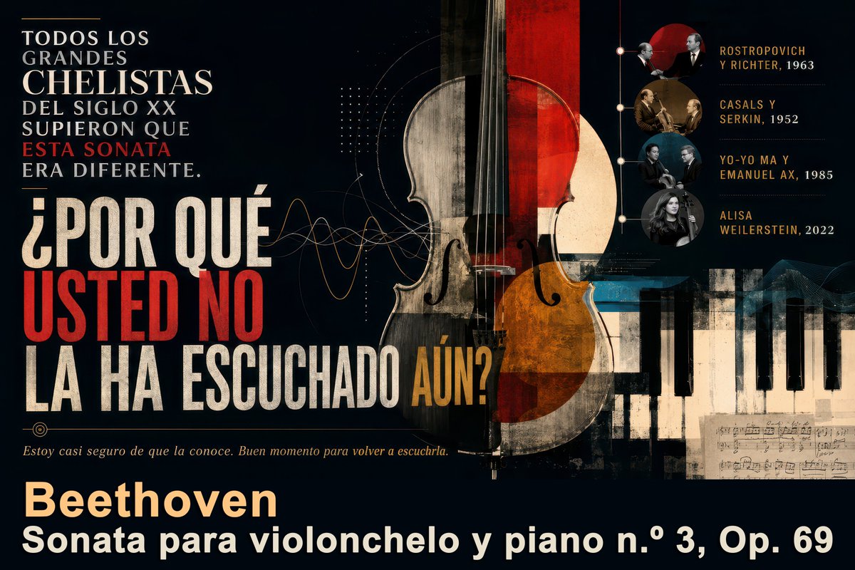
Goal: Create a dramatic Spanish editorial poster about {argument name="music work" default="Beethoven Sonata para violonchelo y piano n.º 3, Op. 69"}, presenting it as an essential classical music discovery.

Canvas: Wide horizontal 16:9 poster, dark near-black background, vintage concert-program texture, slightly distressed print grain, high contrast, elegant museum/exhibition design.

Layout: Left side dominated by large Spanish typography; center-right dominated by a tall cello collage; lower-right contains piano keys and a small handwritten sheet-music fragment; upper-right contains a vertical timeline of notable performers with circular photo medallions. Use layered geometric shapes, thin technical diagram lines, waveform curves, dotted grids, and subtle music-notation details.

Main text content: At upper left, set a stacked serif headline in white with one red emphasis line: “TODOS LOS GRANDES CHELISTAS DEL SIGLO XX SUPIERON QUE ESTA SONATA ERA DIFERENTE.” Make “ESTA SONATA” red. Below it, use huge condensed distressed block lettering for the question: “¿POR QUÉ USTED NO LA HA ESCUCHADO AÚN?” Make “USTED NO” bright red, most other words off-white, and “AÚN?” ochre-gold. Under the question, add a small italic sentence in warm beige: “Estoy casi seguro de que la conoce. Buen momento para volver a escucharla.” At the bottom, add the composer name in large warm cream: “Beethoven”, and beneath it in bold white: “Sonata para violonchelo y piano n.º 3, Op. 69”.

Central subject: A large upright cello, cropped from top to bottom, centered slightly right. Make it a mixed-media collage: realistic wood grain, black strings, visible bridge and f-holes, semi-transparent overlays, red vertical rectangle through the upper body, amber-orange lower bout, beige circular moon-like disk behind it, and worn paper textures. The cello should overlap abstract sound-wave lines that travel from the left typography toward the instrument.

Right timeline: Include exactly 4 circular performer medallions connected by a thin vertical line with small nodes. Labels must read exactly: 1) “ROSTROPOVICH Y RICHTER, 1963”, 2) “CASALS Y SERKIN, 1952”, 3) “YO-YO MA Y EMANUEL AX, 1985”, 4) “ALISA WEILERSTEIN, 2022”. Use small sepia or black-and-white portrait-style musician images inside the circles, with names in ochre uppercase and years in pale cream.

Visual style: Sophisticated classical-music magazine cover meets Bauhaus concert poster; dark navy-black, ivory, scarlet red, ochre gold, muted teal, and sepia; distressed ink, aged paper, fine scratches, subtle halftone, and layered collage. Typography should feel bold, Spanish, editorial, and cinematic, with a mix of elegant serif text and massive condensed sans-serif display type.

Constraints: Keep all visible text in Spanish exactly as specified. Do not add logos, watermarks, modern UI elements, or extra performer entries. Maintain strong readability despite the vintage grunge texture.
Use this prompt in the VdoBloom image editor.
Opens the image editor with this prompt — add your own photo to generate.