Chibi Eraser Product Photography
Full prompt
Use the attached character sheet as a STRICT design reference. Do not change the face, hairstyle, eye shape, or proportions under any circumstances.
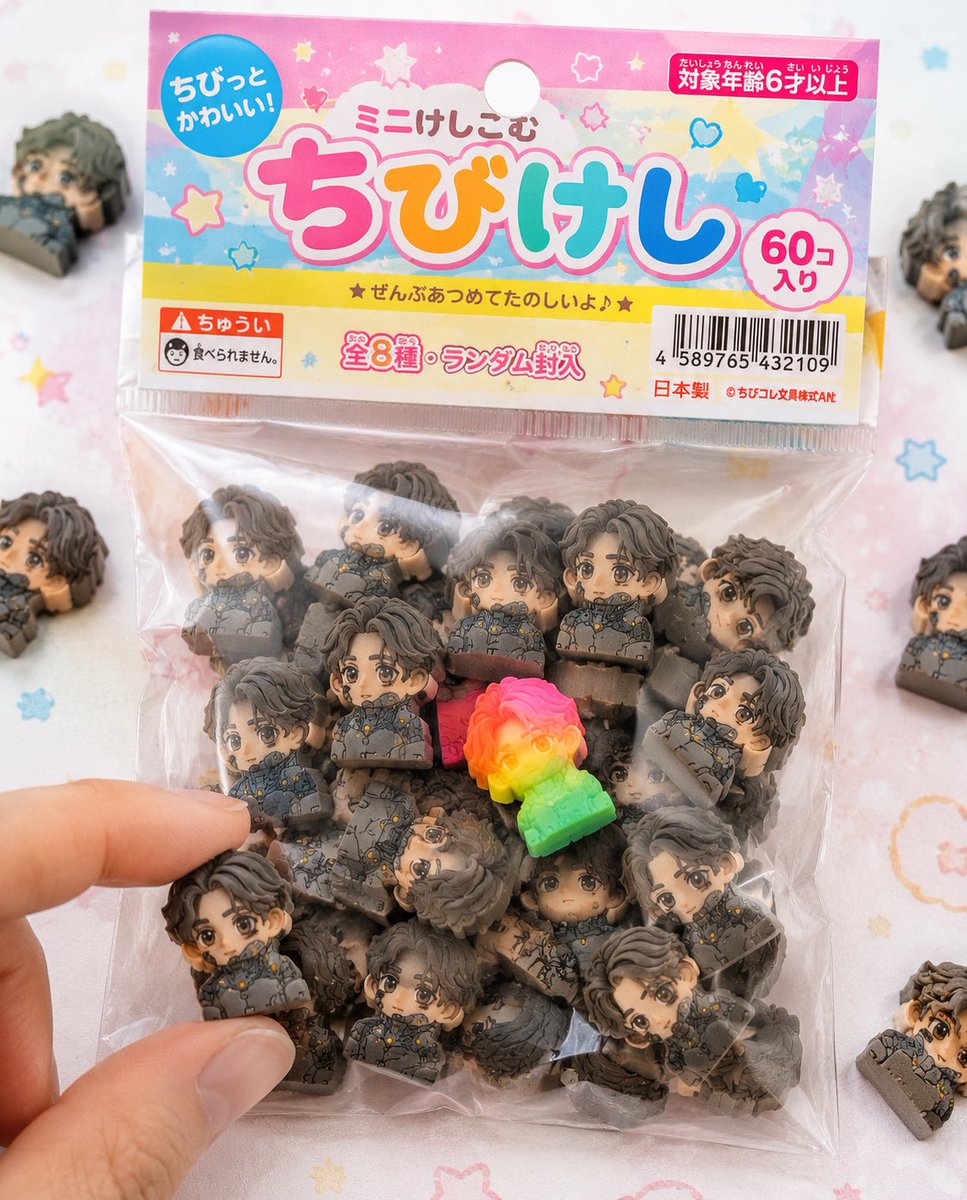
■ Purpose: To fully commercialize the character as a Japanese "{argument name="product name" default="chibi eraser product"}" and create realistic packaged product photos like those sold in stationery stores or gashapon machines.
■ Concept: "Bagged chibi eraser products sold in 100-yen shops and stationery stores."
■ Eraser Main Body: (Maintain exact same specs as before) - Strongly deformed chibi character - Thick block shape - Fully matte rubber material - Fine particles/powder/chips/wear present - Print misalignment/color variations - Random configuration of 50+ items.
■ Packaging (CRITICAL): - Small transparent plastic bag (OPP bag) - Paper header at the top (with hanging hole) - Slightly cheap printing on the header (slight misalignment/ink unevenness) - Wrinkled vinyl, slightly cloudy, sticking to contents due to static - Some air inside causing bulging - Light warping on the sealed section.
■ Graphic Design: - Japanese children's stationery style - Pop and colorful ({argument name="color theme" default="pink, yellow, light blue"} base) - Handwritten-style or rounded fonts - Product logo (original okay) - Text like 'Mini-Keshi' or 'Chibi-Keshi' - Stars, hearts, sparkle decorations.
■ Informational Elements (Enhanced Realism): - JAN code (barcode) - 'Ages 6 and up' - 'Not edible' warning - 'Total X types' or 'Randomly included' - Small company name (fictional) - MADE IN JAPAN or CHINA markings.
■ Composition: - Packaging is main in center of frame - A few spilled erasers around - 1 or 2 out of the bag - A fingertip picking one up for effect - Natural feel with some frame-out.
■ Rare Element: - Mix in one special individual with fluorescent color or gradient - Place in a prominent position to guide the viewer's gaze.
■ Lighting: - Bright natural light (slightly high-key) - Soft shadows - Cleanliness like a product catalog photo.
■ Camera: - Macro-leaning - Shallow depth of field - Sharp center.
■ Background: - White to pastel table - Subtle dots or pop patterns - Simple and clean.
■ Prohibited: - Plastic feel - glossy expression - Overly high-end texture (cheapness is correct) - Overly perfect printing.
■ Output: - A level indistinguishable from real products - Reality like items found in convenience stores or 100-yen shops - Quality that makes people on SNS say 'I want this.'
Original prompt
添付されたキャラクターシートをSTRICTなデザインリファレンスとして使用すること。 キャラクターの顔、髪型、目の形、プロポーションは絶対に変更しない。

■目的: キャラクターを日本の「{argument name="商品名" default="ちび消しゴム商品"}」として完全に商品化し、 実際に文房具売り場やガチャで販売されているようなリアルなパッケージ商品写真を作成する。

■コンセプト: 「100円ショップや文房具店で売られている袋入りちび消しゴム商品」

■消しゴム本体: (※前回と同じ仕様を完全維持) - 強いデフォルメちびキャラ - 厚みのあるブロック形状 - 完全マットなラバー素材 - 微細な粒子・粉・削れ・摩耗あり - 印刷ズレ・色ブレあり - 50個以上のランダム構成

■パッケージ(超重要): - 小さな透明ビニール袋(OPP袋) - 上部に紙ヘッダー(吊り下げ用の穴あり) - ヘッダーはややチープな印刷(軽いズレ・インクのムラ) - ビニールはシワあり、やや曇り、静電気で中身に張り付く - 一部空気が入ってふくらみあり - シール部分に軽いヨレ

■グラフィックデザイン: - 日本の子供向け文房具風デザイン - ポップでカラフル({argument name="色指定" default="ピンク・黄色・水色"}ベース) - 手書き風フォントや丸文字 - 商品名ロゴ(オリジナルでOK) - 「ミニけし」「ちびけし」などの表記 - 星・ハート・キラキラ装飾

■情報要素(リアル感強化): - JANコード(バーコード) - 「対象年齢6才以上」 - 「食べられません」注意書き - 「全◯種」や「ランダム封入」 - 小さな会社名(架空) - MADE IN JAPAN or CHINA表記

■構図: - パッケージがメインで画面中央 - 周囲に少しだけこぼれた消しゴム - 1〜2個は袋から出ている - 指先が1つをつまもうとしている演出 - 一部フレームアウトで自然さ

■レア要素: - 蛍光カラーやグラデーションの特別個体を1つ混ぜる - 視線誘導として目立つ位置に配置

■ライティング: - 明るい自然光(ややハイキー) - 柔らかい影 - 商品写真のような清潔感

■カメラ: - マクロ寄り - 浅い被写界深度 - 中央シャープ

■背景: - 白〜パステルのテーブル - ほんのりドットやポップ柄 - シンプルで清潔

■禁止: - プラスチック感 - glossy表現 - 高級すぎる質感(安っぽさが正解) - 完璧すぎる印刷

■出力: - 実在する商品にしか見えないレベル - コンビニや100均にありそうなリアリティ - SNSで「これ欲しい」と思わせる完成度
Use this prompt in the VdoBloom image editor.
Opens the image editor with this prompt — add your own photo to generate.