Chinese Embroidery Art Poster
Full prompt
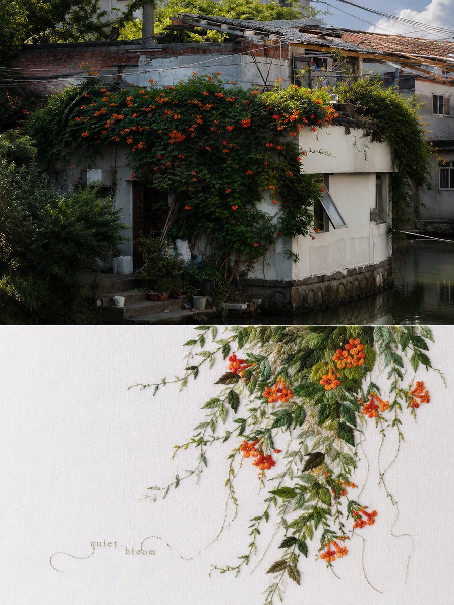
Please turn each photo I upload into an independent high-end design poster, no collage; each photo is output separately. The overall design adopts a 3:4 vertical composition, with the upper and lower areas strictly 1:1, each occupying 50% of the frame. The upper part retains the original photo, maintaining the main structure, real texture, natural light and shadow, and original color atmosphere, with only slight high-end photographic color grading to give it the texture of an art magazine, independent publication, or exhibition photography. To adapt to the frame, the sky, ground, or environmental background can be naturally extended, but the subject must not be stretched, distorted, or changed. The lower part first understands the true core spirit, emotional relationship, and potential metaphor of the original image, then extracts the most recognizable subject, outline, posture, and narrative relationship, and selects only one core imagery that best represents the entire photo for a Chinese embroidery-style reconstruction. Do not embroider the entire photo, nor convert all elements into embroidery one by one; boldly delete secondary information, using a posture, an outline, a relationship, an action, or a symbolic detail to carry the core of the entire photo, so that when people see the lower part, they not only recognize "what it is," but also feel "what the original image is expressing." The embroidery language integrates the silk thread layers, stitch variations, virtual-real relationships, and Oriental white space (liu bai) of traditional Chinese embroidery. Various stitches such as flat stitch, long and short stitch, couching, wrapping, knot stitch, and stem stitch can be used, with the needle direction, density, and layers changed according to the shape of the subject. Parts can be detailed, while others can leave only a few stitches, a line, or an unfinished outline, letting "to embroider or not" together constitute the image. Truly present the silk thread luster, stitch direction, overlapping lines, and slight manual variations, but avoid full-page traditional patterns, a handicraft display feel, or digital-looking embroidery. The composition emphasizes trade-offs, white space, rhythm, and a sense of life. It is not fixedly centered or evenly filled; freely arrange the position, scale, cropping, and density according to the subject's center of gravity, movement, sightline, flow, and emotion. It can be off-center, suspended, partially enlarged, cross boundaries, or only partially visible, letting a small amount of embroidery and large white space form tension; a stray silk thread, an unfinished edge, or a small patch of color can also carry emotions. White space should be like air, distance, pause, and resonance, rather than an empty spot waiting to be filled. The background must be clean, clear, and airy, and not default to beige, gray-beige, old linen, or dingy light colors. Based on the color temperament of the top photo, adaptively choose clean white, cool white, soft ivory, extremely light tints, or a clear silk background with a specific hue; a bolder but pure colored background can also be used if suitable. The background is allowed to show very slight silk, damask, or fabric textures, but must not be yellowed, dusty, dingy, aged, or stained. The manual feel of embroidery comes from the threads and stitches, not from creating an aged background. Color palettes also have no fixed card. Find the most spirited, vibrant color relationship from the original image that best represents its spirit, then convert it into the unique agile silk thread color scales of Chinese embroidery. Instead of averaging the colors, retain the truly meaningful primary colors and allow for subtle shifts in warmth, depth, brightness, and purity, producing thread shimmer through analogous color placement, small complementary highlights, high-purity highlights, and varying stitch directions. Colors can be elegant, fresh, rich, soft, or simple, determined by each original image; rich but not cluttered, bright but not gaudy, soft but not dull, traditional but not stiff. Text serves only as a light editorial touch, distilling a very short English word or phrase from the emotions, actions, relationships, or metaphors not explicitly stated in the photo. Use fine-thread embroidery, slender labels, or minimalist small text, allowing the text to follow the flow of the silk threads, embed into negative space, or hug the subject's edge, even becoming part of the composition like a line; minimal and meaningful, not an explanatory label, and not competing with the embroidery. The overall pursuit is one image, one core; one core, one imagery: first understand the image, then choose what is most worth leaving behind; other elements would rather be discarded than piled up for richness. The final result presents the unique agile colors, silk thread luster, Oriental white space, subtle metaphors, and contemporary editorial design sense of Chinese embroidery—clear, spirited, emotional, and vibrant. Avoid full-image replication, element stacking, dingy beige backgrounds, yellowed old cloth, fixed national-style color palettes, full-page embroidery, a gift-shop feel, or a template look.
Original prompt
请将我上传的每一张照片分别制作成一张独立的高级设计海报,不多图拼接,每张照片单独输出。整体采用 3:4竖版构图,上下两个区域高度严格1:1,各占画面50%。上半部分保留原始照片,保持主体结构、真实质感、自然光影和原有色彩氛围,仅进行轻微高级摄影调色,使其具有艺术杂志、独立出版物和展览摄影质感。为适配画幅,可自然扩展天空、地面或环境背景,但不得拉伸、扭曲或改变主体。下半部分先理解原图真正的核心精神、情绪关系与潜在寓意,再提取其中最具识别性的主体、轮廓、姿态与叙事关系,只选择一个最能代表整张照片的核心意象进行中国刺绣式重构。不要把照片完整绣一遍,也不要把所有景物逐项转换成刺绣;应大胆删减次要信息,用一个姿态、一段轮廓、一种关系、一个动作或一个具有象征性的局部承载整张照片的内核,让人看到下半部分时,不只是认出“是什么”,还能够感受到原图“在表达什么”。刺绣语言融合中国传统织绣的丝线层次、针法变化、虚实关系与东方留白,可使用平针、长短针、盘线、缠线、打籽、压线等不同针迹,根据主体形态改变针向、密度和层次。局部可以精细,局部可以只留下几针、一道线或未完成的轮廓,让“绣与不绣”共同构成画面。真实呈现丝线光泽、针脚方向、叠线与轻微手工误差,但避免满版传统纹样、工艺品展示感和数字假刺绣。构图强调取舍、留白、气韵与生命感。不固定居中,不平均填满,根据主体的重心、动作、视线、走势和情绪自由安排位置、尺度、裁切与疏密。可以偏心、悬置、局部放大、越界或只出现一部分,让少量绣面与大片空白形成张力;一根游离的丝线、一个未完成的边缘或一小片颜色也可以承担情绪。留白应像空气、距离、停顿和余韵,而不是空出来等待填充的位置。背景必须干净、清亮、有空气感,不默认使用米黄、灰米、旧亚麻或脏浅色。 根据上方照片的色彩气质,自适应选择洁净白、冷白、柔和象牙白、极浅彩色或具有明确综合色相的清透丝绢底色,也可以在原图适合时使用更大胆但纯净的有色底。背景允许看到极轻微的丝绢、绫罗或织物纹理,但不得泛黄、蒙灰、发脏、做旧或出现污渍。刺绣的手工感来自丝线与针法,而不是靠脏旧背景制造。配色同样不设固定色卡。从原图中寻找最有神采、最有生命力、最能代表其精神的颜色关系,再转化成中国刺绣特有的灵动丝线色阶。不是平均吸取照片颜色,而是保留真正有意义的主色,并允许同一颜色在冷暖、深浅、明暗与纯度之间细微游移,通过近似色穿插、少量互补色点醒、高纯度小面积亮色和不同针向产生丝线闪烁。颜色可以清丽、鲜活、浓郁、柔美或素雅,由每张原图决定;丰富但不杂乱,明艳而不俗艳,柔和但不灰,传统但不死板。文字只作为轻巧的编辑性点睛,从原图没有直接说出的情绪、动作、关系或隐喻中提炼一个极短英文词或短句。可使用细线刺绣、纤细题签或极简小字,让文字顺着丝线走势、嵌入负空间、贴近主体边缘,甚至像一根线一样成为构图的一部分;少而有意味,不做说明标签,不抢夺刺绣主体。整体追求一图一核、一核一意象:先理解原图,再选择最值得被留下的东西;其他元素宁可舍弃,也不要为了丰富而堆砌。最终呈现中国刺绣特有的灵动色彩、丝线光泽、东方留白、含蓄寓意与当代编辑设计感,清亮、有神、有情绪、有生命力。避免整图复刻、元素堆积、脏米色背景、泛黄旧布、固定国风配色、满版刺绣、文创商品感和模板感。
Use this prompt in the VdoBloom image editor.
Opens the image editor with this prompt — add your own photo to generate.