Conceptual Editorial Poster Design Framework
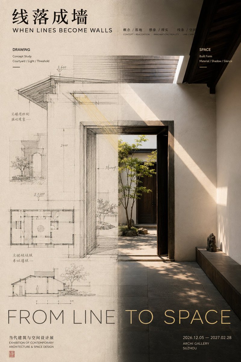
Full prompt
【Subject / Work Title】:{argument name="subject" default="____"}
【Left State】:{argument name="left state" default="____"}
【Right State】:{argument name="right state" default="____"}
【Relationship Type】:Front and Back / Concept and Finished / Source and Spread / Entity and Translation / Other
【Axis Change】:____ → ____ → ____
【Chinese Title】:____
【English Title】:____
【Primary Color】:____
【Secondary Color】:____
【Aspect Ratio】:9:16

Generate an editorial design poster with exhibition visual quality featuring a left-right composition.

Do not simply cut the screen into two columns; let the left and right visual areas express different states of the same theme, with the 'middle boundary' being where the actual change occurs.

Use unequal ratio layouts for the left and right areas (40:60, 45:55, 55:45) based on the subject's weight, avoiding a mechanical 50:50 split. The left side establishes the starting point or original state, while the right side shows the transformed result.

The most important part is the axis translation. Avoid sharp vertical lines; instead, choose a core element that passes through both areas and continuously changes as it crosses the axis (e.g., petals turning into stitches, sketches into real walls).

Typography should participate in the relationship, but all text must belong to the work itself. Control colors within 2–4 main tones. The final reading order should lead the viewer from the two states to the connection/change and finally to the causal relationship.
Original prompt
【主题 / 作品名】:{argument name="主题" default="____"}
【左侧状态】:{argument name="左侧状态" default="____"}
【右侧状态】:{argument name="右侧状态" default="____"}
【关系类型】:正面与背面 / 概念与成品 / 来源与传播 / 实体与转译 / 其他
【中轴变化】:____ → ____ → ____
【中文标题】:____
【英文标题】:____
【主色调】:____
【辅助色】:____
【画面比例】:9:16

生成一张具有成熟 Editorial Design 与展览视觉质感的左右构图海报。

不要简单把画面切成左右两栏,而是让左右两个视觉区域表达同一个主题的不同状态,并让“中间边界”成为变化真正发生的位置。

左右区域采用不等比例布局,根据主体重量使用 40:60、45:55、55:45 等关系,不要机械 50:50。左侧负责建立起点或原始状态,右侧负责展示变化后的结果,例如:
正面作品 → 背后的结构与制作路径;
设计草图 → 建成后的真实空间;
声源主体 → 向外扩散的振动与声场;
真实实体 → 纸面上的拓印、痕迹或图像。

最重要的是中轴转译。不要用明显竖线分隔,而要选择一个核心元素穿过左右区域,并在跨越中轴时连续发生变化.

例如:花瓣逐渐化成针脚和丝线;建筑线稿逐渐变成真实墙面;器物震动逐渐扩散成声纹;石刻浮雕逐渐压平成为黑墨拓印。

这种变化必须连续、自然,让观众一眼理解左右两边存在因果、过程或转译关系,而不是两张无关图片拼在一起。

Typography 也参与左右关系,但所有文字必须属于作品本身。使用真正的作品标题、副标题、短句 and 展览信息,不出现“左右构图”“设计案例”“视觉研究”等模板占位文字。

图像较重的一侧减少信息,较空的一侧可以承担更多标题与文字,通过字体大小、密度和位置完成视觉配重。

色彩控制在 2–4 个主要色系。左右可以有明显明暗、冷暖或材质差异,但至少保留一种颜色、纹理或视觉元素跨越中轴,保证整张作品统一。

最终阅读顺序:第一眼看到左右两种明显不同的视觉状态;第二眼发现中轴处正在发生连接 and 变化;第三眼理解“左边为什么会变成右边”;最后再阅读标题与作品信息。

整体要求:两个视觉域各有作用,中间有明确转译过程,左右不平均但视觉平衡,既有内容逻辑,也有成熟作品感。
Use this prompt in the VdoBloom image editor.
Opens the image editor with this prompt — add your own photo to generate.