Artistic Collage Design Poster
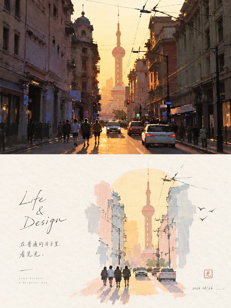
Full prompt
Please make each photo I upload into an independent high-end design poster, no multi-image stitching, each photo output separately. The overall structure uses a 3:4 vertical composition, with the upper and lower areas strictly 1:1, each occupying 50% of the screen. The upper part retains the original photo, maintaining the subject identity, structure, posture, real texture, natural light and shadow and original color atmosphere, with only slight high-end color adjustment. To adapt to the frame, the environment background can be naturally extended, but the subject must not be stretched, distorted or changed. The lower part should not be redrawn according to the photo, but first judge a **core theme, a visual anchor and an emotional relationship really worth keeping** in the original image, and boldly delete the rest of the information. Even if the composition of the original photo is ordinary, messy or like waste, the scale, position, cutting, direction and element relationship of the subject should be redesigned to reconstruct the original material into an independently established artistic screen. Only the outline, trend, posture and visual memory points that best represent the original object are retained, so that people can feel the connection with the above photo at a glance, but the lower part has better composition and artistic expression than the original photo. The painting style adopts **{argument name="style" default="fine line hand-drawing + flat wash + paper texture + light collage"}**. The subject is identified with a small amount of concise outlines, with very few necessary lines left inside; the color is summarized by thin, calm large color blocks, without painting realistic details. A very light themed base color block can be added to support the subject, and the subject is allowed to pierce, cross or cut the edge of the color block, forming a natural editorial collage relationship. The composition emphasizes **{argument name="composition" default="small-scale seal impression + large areas of conscious white space"}**. The subject can be eccentric, edge-hugging, suspended, partially cut or change its position in the original photo, not pursuing full presentation. The blank area is significantly larger than the drawing area, and participates in the composition as a true graphic, forming positive and negative shapes, distance, direction, gathering and scattering and asymmetrical balance with the subject. Better to delete the environment than to fill the layout; let the blank be responsible for air, space, pause and emotion. The color palette extracts 2–4 most vital and recognizable colors from the above photo and modulates them into a **{argument name="color system" default="high brightness, clear, soft pastel system"}**, such as mint green, tender leaf green, mist pink, light purple, cream yellow, soft blue, apricot, etc., changing naturally according to the original image. The background is kept in a very shallow, near-white paper color, and the subject and base color blocks must be clearly visible, not gray, dirty or blurry. Only a very small amount of symbolic small elements derived from the emotion or theme of the original image are allowed around, which can be expressed in one or two strokes, not copying real objects, nor decorating for the sake of filling space. The text is also minimal, not limited to languages, and a few phrases can be freely generated from the subject, action, emotion, memory or metaphor, entering the blank space with a slender, natural, slightly handwritten font, together with the subject forming the layout. The overall focus is not on "drawing the photo out", but **refining the soul of the original image and then redirecting the screen**: few elements, strong themes, small subjects, large blank spaces, light lines, shallow color blocks, and clever reconstruction. Avoid object-by-object redrawing, full background, accumulation of details, subject too large, screen filled, realistic tracing, smooth vector and templated typesetting.
Original prompt
请将我上传的每一张照片分别制作成一张独立的高级设计海报,不多图拼接,每张照片单独输出。整体采用3:4竖版构图,上下两个区域高度严格1:1,各占画面50%。上半部分保留原始照片,保持主体身份、结构、姿态、真实质感、自然光影和原有色彩氛围,仅进行轻微高级调色。为适配画幅,可自然扩展环境背景,但不得拉伸、扭曲或改变主体。下半部分不要照着照片转绘,而是先判断原图**真正值得保留的一个核心主题、一个视觉锚点和一种情绪关系**,其余信息大胆删除。即使原照片构图普通、杂乱或像废片,也要重新设计主体尺度、位置、裁切、方向和元素关系,把原始素材重构成一张独立成立的艺术画面。只保留最能代表原物的轮廓、走势、姿态和视觉记忆点,使人一眼感受到与上方照片的联系,但下半部分拥有比原图更好的构图和美术表达。画风采用**{argument name="风格" default="细线手绘 + 淡彩平涂 + 纸张肌理 + 轻拼贴"}**。主体以少量简洁轮廓完成识别,内部只留极少必要线条;颜色用轻薄、平静的大色块概括,不画写实细节。可加入一块极浅的主题基色色块承托主体,并允许主体穿出、越过或切断色块边缘,形成自然的 editorial collage 关系。构图强调**{argument name="构图" default="小尺度章印 + 大面积有意识留白"}**。主体可偏心、贴边、悬置、局部裁切或改变原照片中的位置,不追求完整呈现。留白面积明显大于绘制面积,并作为真正的图形参与构图,与主体形成正负形、距离、方向、聚散和不对称平衡。宁可删掉环境,也不要填满版面;让空白负责空气、空间、停顿和情绪。配色从上方照片中提取2–4种最有生命力、最有辨识度的颜色重新调制为**{argument name="色系" default="高明度、清透、柔和的粉彩体系"}**,如薄荷绿、嫩叶绿、雾粉、浅紫、奶油黄、柔蓝、杏色等,根据原图自然变化。背景保持极浅、近白的纸色,主体与基色色块必须清晰可见,不灰、不脏、不糊。周围只允许极少量从原图情绪或主题中衍生出的符号化小元素,用一两笔即可表达,不复制真实物件,也不为了填空而装饰。文字同样极少,不限制语种,可从主体、动作、情绪、记忆或隐喻中自由生成少量词句,以纤细、自然、略带手写感的字体进入留白,与主体共同构成版面。整体重点不是“把照片画出来”,而是**提炼原图灵魂后重新导演画面**:少元素、强主题、小主体、大留白、轻线条、浅色块、聪明重构。避免逐物转绘、完整背景、细节堆积、主体过大、画面填满、写实描摹、光滑矢量和模板化排版。
Use this prompt in the VdoBloom image editor.
Opens the image editor with this prompt — add your own photo to generate.