Experimental Chinese Typography Design
Full prompt
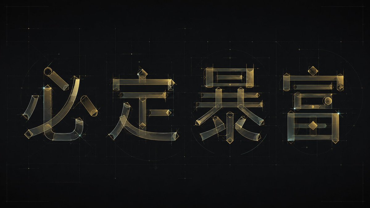
Generate a set of experimental Chinese font designs around specific theme words. Deconstruct each character into a clearly identifiable skeleton, horizontal and vertical structural bars, curved strokes, and a few geometric components, then re-synthesize them into glyphs using the same modular logic. The main body should not rely on ordinary font outlines but should be composed of fine lines and semi-transparent color blocks, like a transparent architectural drawing: long horizontal strokes maintain a stable horizontal order, vertical strokes have slight tilting tension, corners retain sharp angles, and main curves sweep through the internal space with a large radius, forming a mix of calligraphic brushwork and geometric engineering. Maintain sufficient white space and balanced visual weight between characters; local strokes can intersperse, overlap, or be misplaced, but the text must remain readable. Repeated horizontal lines, vertical lines, diamond dots, circles, or arc nodes serve rhythmic functions, making the group of characters feel like a unified font system rather than individual decorative characters. Colors are extracted from the theme's material, emotion, and semantics, maintaining a relationship between a high-brightness clean background, low-saturation semi-transparent main colors, slightly darker fine outlines, and a very small number of clear emphasis points. The overall look is bright, transparent, airy, and precisely designed. The image completion should be like the state between a font design draft and a brand logotype, with clean edges, visible transparent layers, and restrained line widths, avoiding heavy solid characters, dirty gray retro textures, casual handwriting, and common poster layouts.

Target text: {argument name="theme text" default="Wealthy and Overbearing"}

Aspect ratio 16:9
Original prompt
围绕具体主题文字生成一套实验性中文字体设计,把每个字拆成清晰可辨的骨架、横竖结构条、弧线笔势与少量几何部件,再用同一套模块逻辑重新叠合成字形。主体不要依赖普通字体轮廓,而要像透明建筑图纸一样由细线描边和半透明色块共同构成:长横画保持稳定水平秩序,竖画略带倾斜张力,转折处保留锋利切角,主要弧线以大半径扫过字内空间,形成书法笔势和几何工程感的混合。各字之间保持充足留白和均衡视觉重量,局部笔画可以穿插、覆盖、错位,但必须让文字仍然可读;重复的横线、竖线、菱形点、圆形或弧形节点承担节奏功能,使整组文字像同一套字库系统而不是单个装饰字。色彩从主题自身的材质、情绪和语义中提取,保留高明度干净底场、低饱和半透明主体色、稍深一阶的细描边和极少量清晰强调点的关系,整体明亮清透、通风、有精确设计感。画面完成度应像字体设计稿与品牌字标之间的状态,边缘干净,透明层次可见,线宽克制,避免厚重实心字、脏灰复古质感、随意手写感和普通海报排版。

本次文字:{argument name="主题文字" default="财大气粗"}

比例16:9
Use this prompt in the VdoBloom image editor.
Opens the image editor with this prompt — add your own photo to generate.