Premium Stacked Crisp Advertising Poster
Full prompt
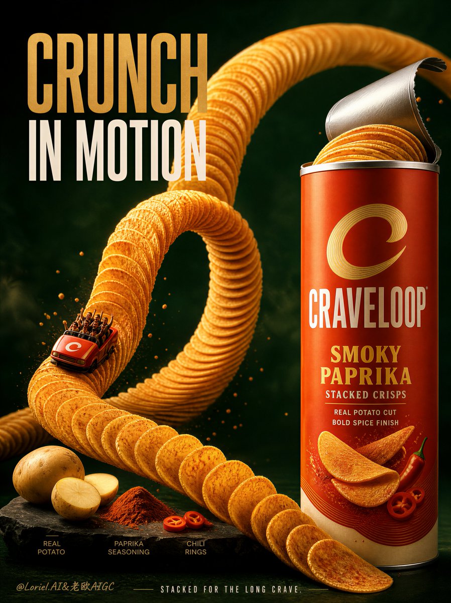
Create a Cannes-level flagship advertising poster for an original stacked crisp brand named CRAVELOOP, featuring the hero product Smoky Paprika Stacked Crisps. Build the image with strong Orbit circulation and refined Transit reduction, creating a bold, globally polished premium snack campaign. Core composition: Use a vertical poster set against a deep moody forest-green background with subtle texture, soft atmospheric depth, and cinematic spotlighting. Keep the layout clean and powerful with three essential zones: 1. a giant looping crisp roller-coaster at center 2. one large upright CRAVELOOP can on the right as the official product anchor 3. one tightly edited ingredient platform at the lower left The overall image must feel dramatic, craveable, and highly controlled. Orbit structure: Design the composition so the eye moves in a clear closed loop: headline -> crisp roller-coaster -> product can -> lower-left ingredient platform -> back upward into the roller-coaster. Use the rising curve of the crisps, the opened can lid, the scattered crisp direction, and the angle of the lower-left ingredient labels to reinforce this circulation. The roller-coaster must feel like the emotional engine of the poster, while the can remains the clearest commercial hero. Hero visual logic: At the center, build an elegant roller-coaster track entirely from perfectly aligned stacked crisps, including one strong rising arc and one full loop. The crisps must feel ultra-realistic, evenly layered, delicately seasoned, golden, crisp-edged, and physically believable. A tiny red coaster cart rides on the track as a subtle storytelling accent, but it should remain secondary and not turn the poster into a toy scene. Product hero: On the right, place one oversized CRAVELOOP can standing upright with the lid partially opened, revealing a neat stack of crisps inside. The packaging should feel premium, real, shelf-ready, and globally publishable, using a disciplined red-orange, cream, and golden palette. The can must be sharply lit, highly legible, and visually stable enough to counterbalance the motion of the roller-coaster. Packaging text: Use original on-pack wording such as: CRAVELOOP SMOKY PAPRIKA STACKED CRISPS Refined supporting lines: “REAL POTATO CUT” “BOLD SPICE FINISH” Keep the front-of-pack hierarchy clean and premium, with no cluttered claims. Typography system: At the upper left, place one concise original campaign headline in expressive oversized type: “CRUNCH IN MOTION” Use a refined combination of warm golden emphasis and clean white supporting text, with strong hierarchy and premium spacing. Keep it shorter and cleaner than a retail ad headline so the poster feels more international and flagship. Transit reduction: Edit the lower-left ingredient area down to only the most essential flavor cues: - raw potatoes - paprika seasoning - a small supporting accent such as chili rings Use only 2-3 tiny art-directed ingredient labels in elegant micro typography. Remove excess props, extra bowls, and unnecessary callouts. The ingredient platform should support the story without competing with the main product and roller-coaster. Lower strip: If a footer is used, keep it extremely restrained. Replace any loud promotional banner with one short premium line in small typography: “Stacked for the long crave.” No sales language, no retail clutter, no aggressive CTA button feel. Lighting and atmosphere: Use premium commercial lighting with warm highlights on the crisps, sculpted reflections on the can, subtle seasoning sparkle, controlled shadows on the lower platform, and enough depth separation to make the loop, can, and ingredient base feel dimensional. The scene should feel cinematic but clean. Color direction: Deep forest green, near-black shadow tones, golden crisp yellow, paprika red-orange, restrained cream typography, and warm brown ingredient accents. Keep the palette rich and disciplined. The red-orange can should act as the key brand beacon. Visual style: Ultra-realistic commercial food photography, flagship FMCG campaign quality, believable crisp texture, elegant seasoning detail, premium packaging realism, clean art direction, strong hierarchy, and no clutter. The final image must feel like a global snack-brand launch visual, not a supermarket flyer. Mood: Bold, immersive, craveable, graphic, premium, internationally branded, high-impact, cleanly theatrical. Negative prompt: cheap supermarket flyer, cluttered ingredient platform, too many props, low-detail crisps, warped roller-coaster, unreadable can design, excessive claim text, cartoon snack styling, muddy background, weak lighting, flat composition, plastic-looking chips, noisy footer banner, low-end promo aesthetic
Use this prompt in the VdoBloom image editor.
Opens the image editor with this prompt — add your own photo to generate.