Gourmet Braised Pork Advertising Poster
Full prompt
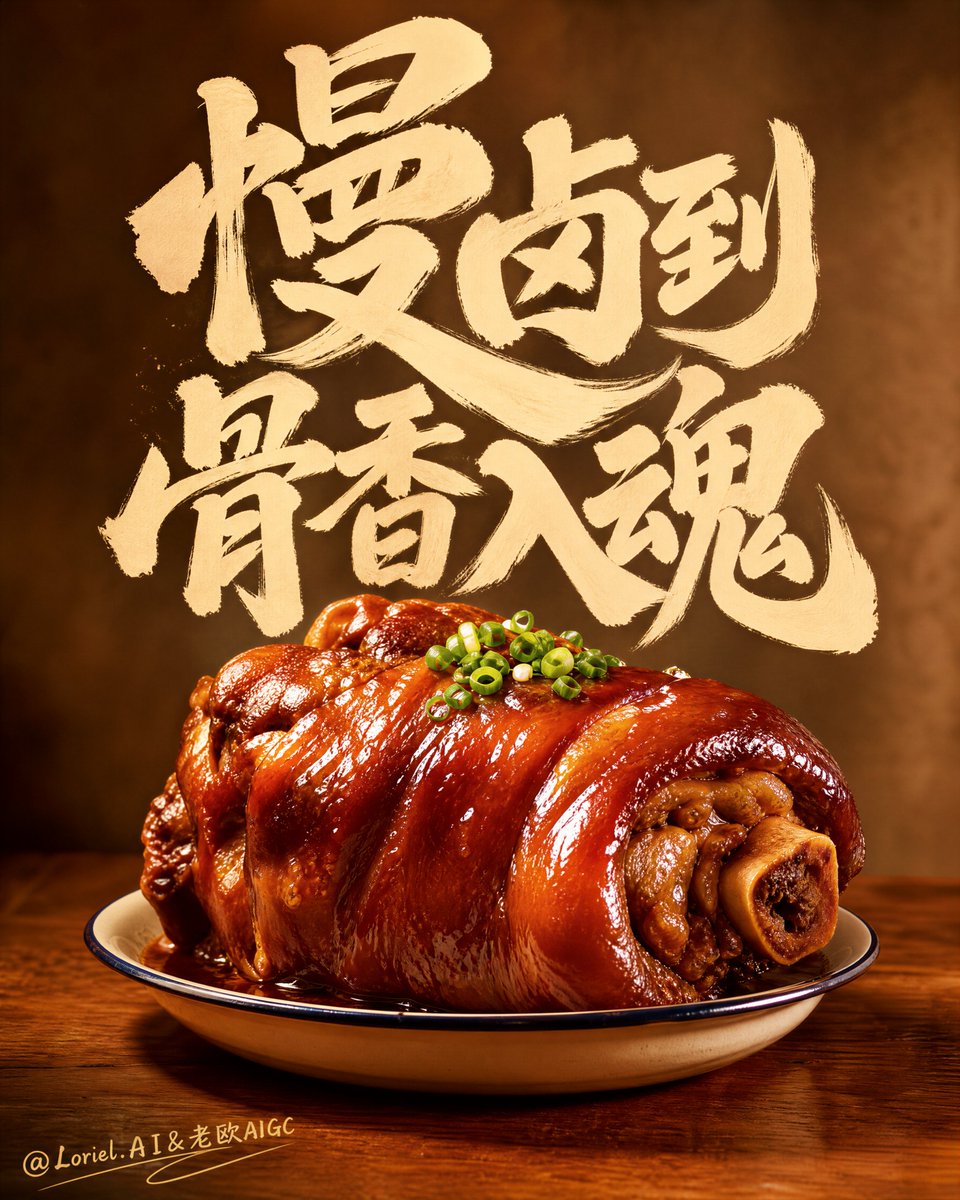
标题不应该位于食物上方。它应该感觉像是从中升起的热气。这是这里的核心控制点:使笔刷字样成为食欲结构的一部分,从而使菜肴和字体成为一个垂直的海报系统。🔥 大型温暖的米白色手绘字样填充上半部分,如同升起的香气。这使文字具有实体感。你会看到粗犷的笔触悬浮在菜肴上方,几乎像蒸汽或手工制作的餐厅招牌,而不是放置在空白处的通用文案。🍖 单个光泽亮丽的红烧蹄髈位于下方中心,点缀着细小的葱绿。这使食物保持聚焦。一个主角菜肴、涂漆般的表皮、温暖的高光,再加上顶部的一点点绿色就足够了;额外的道具会削弱食欲冲击力。创建一个超高级的美食广告海报,融合了 Orbit 风格的视觉冲击力和 Transit 风格的国际化水准,围绕着产品与手绘字体的强力结合。采用高垂直构图,单个红烧蹄髈作为绝对的食物主角位于下方中心的小浅搪瓷盘上,而上半部分则由温暖米白色的大型表现力手绘字样占据,作为主要的构图力量而不是独立的文案。最终图像必须感觉温暖、手工制作、诱人、大胆、高端且具有戛纳级别的精致感。不要复制任何现有的标题、徽标、口号或措辞。核心构图:使用严格的自上而下的层次结构,最大限度地减少干扰。上半部分应由一大块手绘画法文字占据,大胆且富有情感,排列成雕塑般的图形质量。下半部分应包含一个位于温暖木桌上的小搪瓷或陶瓷盘中的单个红烧蹄髈。食物和字体必须感觉像一个完整的海报结构:字样在视觉上向下挤压,而食物通过光泽、香气和温暖向上升腾。Orbit 增强:通过使主要笔刷字样更丰满、更粗大胆且在垂直方向上更占主导地位来增加构图冲击力,仿佛它像手工制作的餐厅招牌一样悬挂在菜肴上方。将蹄髈推得稍微近一点并更居中,使上方文字质量和下方食物质量产生更强的视觉对抗。海报应该从远处看就瞬间引人注目。Transit 增强:将整个图像细化为更具国际旗舰餐饮广告的语言。保持字样温暖但更克制,背景更干净,食物高光更精致高端。使用优雅的色调控制,使图像感觉不那么像随意的本地海报,而更像全球化的高端奢侈食品活动。最小信息原则:将所有边缘信息和辅助元素减少到绝对最小值。没有散乱的边注,没有繁忙的角落文字,没有过多的注释,没有额外的图形杂乱。如果使用细小的手写点缀,请保持极度克制,且仅在食物主角附近以支持食欲和温暖。海报必须依靠主要文字块和单个蹄髈菜肴来发挥其全部叙事力。主角食物造型:展示一个大型红烧蹄髈,具有深红褐色漆皮、丰富的明胶光泽、慢火煨制的褶皱、骨头周围嫩滑的肌肉结构,以及捕捉温暖光线的湿润粘性表面。仅在顶部添加少量细碎的绿葱以形成新鲜感对比。食物必须感觉丰富、芳香、多汁且豪华,绝不能油腻或杂乱。手绘字体:主要字样必须是大胆的、笔触感的、手绘的、厚重的且富有情感表现力的,类似于高端手工制作的餐厅海报书法。它应该感觉人性化、温暖且由食欲驱动,同时仍具有艺术指导感和全球成熟度。字体必须是主要的视觉主体之一,而不不仅仅是辅助文案。光效:使用温暖的电影感餐桌照明,光线从左上方或右上方射入。蹄髈在其光滑的皮肤和圆润的形状上应捕捉到优雅诱人的高光。字体区域应保持柔和明亮且干净。整个图像必须感觉舒适、高端且诱人。材质渲染:渲染具有明胶光泽、焦糖煨制深度、细微皱纹和真实嫩脂肪结构的猪皮。渲染带有细黑边和柔和高光的搪瓷或陶瓷盘。渲染具有温暖纹理和安静触感真实感的木质台面。笔刷字样应感觉像海报表面上真实的油漆墨水或水粉。背景:使用从温暖的焦糖棕色到柔和的烟雾米色工作室餐饮背景,保持干净并在需要时略微模糊。没有额外的菜肴,没有拥挤的餐厅环境,没有无关的道具。框架应感觉受控、亲密且具有海报感。色彩系统:使用克制的高端美食色调,包括红烧红褐色、焦糖棕色、酱油色红棕色、温暖的琥珀木色、奶油白字体和极小的葱绿色点缀。保持整体色彩故事丰富、温暖且具有国际精致感。氛围:温暖、大胆、手工制作、芬芳、舒适、食欲驱动、高端、精致、难忘、产品导向。渲染风格:超高级美食广告,Orbit 风格构图冲击力,Transit 风格国际水准,巨型手绘字体,居中的红烧蹄髈主角,极简注释,温暖的餐桌氛围,电影感食物摄影,世界级商业修图,8k。负面提示词:复制的文字,复制的标题,复制的徽标,边缘杂乱,过多的注释,油腻杂乱,凌乱的桌子,太多的菜肴,通用字体,塑料肉质感,模糊的灯光,黑斑,低分辨率食物细节,混乱的背景。
Original prompt
The headline should not sit above the food. It should feel like heat rising from it. That is the whole control point here: make the brush lettering part of the appetite structure, so the dish and the typography become one vertical poster system. 🔥 large warm off-white hand-brushed lettering filling the upper half like rising aroma This makes the text feel physical. You see the bold strokes hovering over the dish, almost like steam or a handcrafted restaurant sign, instead of generic copy placed in empty space. 🍖 single glossy braised pork knuckle centered low, with tiny scallion-green accents This keeps the food focused. One hero dish, lacquered skin, warm highlights, and just a little green on top is enough; extra props would weaken the appetite hit. Create an ultra-premium gourmet advertising poster that merges Orbit-style visual impact with Transit-style international polish, centered around one powerful union of product and hand-painted typography. Use a tall vertical composition where one single braised pork knuckle sits as the absolute food hero in the lower center on a small shallow enamel dish, while the upper half is dominated by large expressive hand-brushed lettering in warm off-white, integrated as a major compositional force rather than separate copy. The final image must feel warm, handcrafted, appetizing, bold, premium, and Cannes-level refined. Do not copy any existing title, logo, slogan, or wording. Core composition: Use a strict top-to-bottom hierarchy with minimal distractions. The upper half should be occupied by one large block of hand-painted calligraphic text, bold and emotionally charged, arranged as a sculptural graphic mass. The lower half should contain one single braised pork knuckle centered on a small enamel or ceramic dish on a warm wooden table. The food and the typography must feel like one complete poster structure: the lettering presses downward visually, and the food rises upward through gloss, aroma, and warmth. Orbit enhancement: Increase the compositional impact by making the main brush lettering fuller, bolder, and more vertically dominant, as if it is hanging over the dish like a handcrafted restaurant sign. Push the pork knuckle slightly closer and more centered so the upper text mass and lower food mass create a stronger visual confrontation. The poster should feel instantly striking from far away. Transit enhancement: Refine the whole image into a more international flagship dining-advertising language. Keep the typography warm but more restrained, the background cleaner, and the food highlights more polished and premium. Use elegant tonal control so the image feels less like a casual local poster and more like a globally marketable luxury food campaign. Minimal-information rule: Reduce all edge information and auxiliary elements to the absolute minimum. No scattered side notes, no busy corner text, no excessive annotations, no extra graphic clutter. If small handwritten accents are used, keep them extremely restrained and only near the food hero to support appetite and warmth. The poster must rely on the main lettering block and the single pork-knuckle dish for its full storytelling power. Hero food styling: Show one large braised pork knuckle with deep mahogany-brown lacquered skin, rich gelatin gloss, slow-braised folds, tender meat structure around the bone, and a moist sticky surface catching warm light. Add only a few tiny chopped green scallions on top for freshness contrast. The food must feel rich, fragrant, succulent, and luxurious, never greasy or messy. Hand-painted typography: The main lettering must be bold, brushy, hand-painted, thick, and emotionally expressive, like premium handcrafted restaurant poster calligraphy. It should feel human, warm, and appetite-driven, while still being art-directed and globally sophisticated. The typography must be one of the main visual subjects, not just supporting copy. Lighting: Use warm cinematic dining-table lighting with a soft key from upper front-left or upper front-right. The pork knuckle should catch elegant appetizing highlights across its glossy skin and rounded form. The typography area should remain softly luminous and clean. The whole image must feel comforting, premium, and inviting. Material rendering: Render the pork skin with gelatinous gloss, caramelized braise depth, subtle wrinkles, and realistic tender-fat structure. Render the enamel or ceramic dish with a thin dark rim and soft highlights. Render the wooden tabletop with warm grain and quiet tactile realism. The brush lettering should feel like real painted ink or gouache on a premium poster surface. Background: Use a warm caramel-brown to soft smoky beige studio-dining background, kept clean and slightly blurred where needed. No extra dishes, no crowded restaurant setting, no irrelevant props. The frame should feel controlled, intimate, and poster-like. Color system: Use a restrained gourmet palette of braised mahogany, caramel brown, soy-glaze red-brown, warm amber wood, cream-white typography, and tiny scallion-green accents. Keep the overall color story rich, warm, and internationally refined. Mood: warm, bold, handcrafted, fragrant, comforting, appetite-driven, premium, refined, memorable, product-led Rendering style: ultra-premium gourmet advertising, Orbit-style composition impact, Transit-style international polish, giant hand-painted typography, centered braised pork knuckle hero, minimal annotation, warm dining-table atmosphere, cinematic food photography, world-class commercial retouching, 8k Negative prompt: copied text, copied title, copied logo, edge clutter, too many annotations, greasy mess, cluttered table, too many dishes, generic font, plastic meat texture, muddy lighting, black blotches, low-resolution food detail, chaotic background
Use this prompt in the VdoBloom image editor.
Opens the image editor with this prompt — add your own photo to generate.