Hand-Drawn Doodle Grid Poster
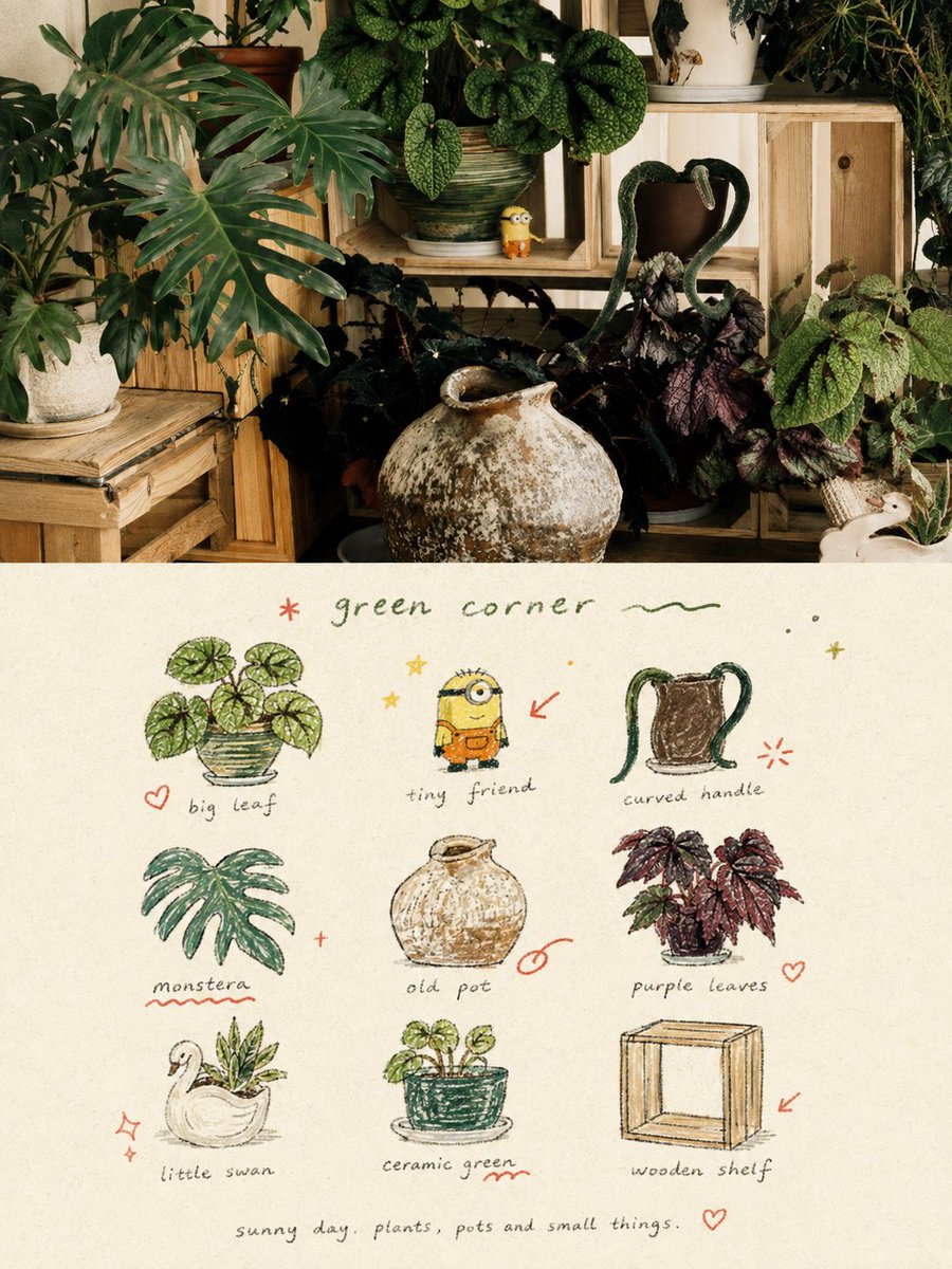
Full prompt
Please transform each photo I upload into an individual high-end design poster, outputting each photo separately without stitching multiple images. The overall composition uses a 3:4 vertical format, with the top and bottom sections strictly 1:1 in height, each occupying 50% of the screen. The upper part retains the original photo, maintaining the subject's identity, structure, posture, realistic texture, natural light and shadow, and original color atmosphere, with only slight professional color grading to give it the texture of an art magazine, independent publication, or exhibition image. The environment background can be naturally extended to fit the frame, but the subject must not be stretched, distorted, or changed. The lower part extracts the most recognizable subjects, local elements, action clues, object details, and narrative relationships from the photo, reconstructing them into a visual system of 3x3 modular icon grid + naive hand-drawn doodle illustrations + crayon/colored pencil grainy texture + handwritten text. Do not trace the original image completely or create realistic illustrations; instead, compress complex information into 9 visual units most worth remembering: these can be the subject itself, local features, personal belongings, plants, food, modes of transport, gestures, emotional symbols, or small memory points in the scene. Each unit should be a semantic extension of the same image above, making people feel at a glance that they belong to the same photo's 'memory checklist'. The composition uses an implicit 3x3 loose grid. The nine-square grid serves only as the underlying order and does not need to be drawn too neatly; the position, size, angle, and placement of each icon can be slightly shifted, creating a sense of loose grid / organic grid that is orderly but not mechanical. A short handwritten title can be added at the top, along with a few relaxed wavy lines, stars, or symbols; a tiny handwritten caption can be added at the bottom, making the whole thing look like a page from a private notebook, visual diary, or collection sheet. White space must be sufficient, and the layout should be relaxed, cute, restrained, and not cluttered. The art style uses Naïve Hand-drawn Doodle Illustration: simple forms, a bit naive, with slightly shaky outlines of uneven thickness that are not completely closed, retaining intentional imperfections. The coloring should not be filled too full, allowing paper texture, white particles, and rough edges to be seen. A mixture of thin black outlines, colored pencil/crayon filling, and small local color blocks can be used, not relying on realistic light and shadow but establishing graphic relationships through flat color / spot color. If grid auxiliary lines appear, they should be extremely faint, like pencil drafts lightly drawn, rather than computer-drawn regular tables. The color scheme uses a low-saturation retro candy palette, with warm off-white coarse-textured paper as the base, keeping colors soft, light, friendly, and high-end. It can refine and translate colors from the original image into comprehensive color relationships like sage green, mint green, pastel blue, cobalt blue, cream yellow, dusty pink, strawberry pink, and coral orange: usually with blue-green as the primary color, yellow-pink for object filling, and orange-red for very little emphasis. The overall control is a large area of off-white background, moderate blue-green primary color, small areas of yellow-pink secondary colors, and minimal orange-red accents, making the picture rich but not messy. Add a layer of minimal hand-drawn red annotation elements, such as circles, arrows, hearts, starbursts, small crosses, wavy lines, or emphasis marks, transforming the work from a regular icon page into a more editorial and personal visual diary. However, these annotations must be few and precise, serving only as a second touch, not overpowering the main subjects. The text content and language are not restricted; a few truly meaningful words should be freely generated based on the photo's theme, mood, location, action, or sense of life. Use a light, loose, handwritten font with slight writing pauses and spacing shifts for titles and descriptive text, making the writing look like casual notes naturally written on paper rather than commercial typography titles. The overall text remains sparse, small, with ample white space, forming a natural text-image mix with icons and annotations. The overall presentation gives a visual temperament of being naive, relaxed, retro, healing, light, friendly, and having a sense of editorial design, like a seriously collected private notebook, happiness list, or life observation page. Avoid clean vector feelings, realistic light and shadow, complex textures, heavy shadows, overly neat UI icon feelings, commercial template feelings, and children's cartoonization.
Original prompt
请将我上传的每一张照片分别制作成一张独立的高级设计海报,不多图拼接,每张照片单独输出。整体采用3:4竖版构图,上下两个区域高度严格1:1,各占画面50%。上半部分保留原始照片,保持主体身份、结构、姿态、真实质感、自然光影和原有色彩氛围,仅进行轻微高级调色,使其具有艺术杂志、独立出版物与展览图像质感。为适配画幅,可自然扩展环境背景,但不得拉伸、扭曲或改变主体。下半部分提取照片中最具识别性的**主体、局部元素、动作线索、物件细节与叙事关系**,重构为一套 **3×3 模块化图标网格 + 手绘稚拙涂鸦插画 + 蜡笔/彩铅颗粒质感 + 手写文字** 的视觉系统。不要完整描摹原图,也不要做写实插画,而是将复杂信息压缩为 9 个最值得被记住的视觉单元:可以是主体本身、局部特征、随身物件、植物、食物、交通方式、姿态、情绪符号或场景中的小记忆点。每个单元都应来自上方同一画面的语义延伸,使人一眼感到它们属于同一张照片的“记忆清单”。构图采用**隐性的 3×3 松散网格**。九宫格只作为底层秩序,不必画得过于工整;每个图标的位置、大小、角度和落点都可轻微偏移,形成既有秩序又不机械的 **loose grid / organic grid** 感。顶部可加入一个简短手写标题,并配少量轻松的小波浪线、星点或符号;底部可加入一句极小的手写 caption,使整体像一页私人手帐、视觉日记或 collection sheet。留白必须充足,版面要松弛、可爱、克制而不凌乱。画风采用**Naïve Hand-drawn Doodle Illustration**:形体简洁、略带稚拙感,轮廓轻微抖动、粗细不均、不完全闭合,保留有意识的不完美。填色不要铺得太满,允许看到纸纹、白色颗粒和边缘毛糙感。可混合黑色细线轮廓、彩铅/蜡笔填色和少量局部色块,不依赖真实光影塑造,而以 flat color / spot color 的方式建立图形关系。网格辅助线若出现,应极淡,像铅笔轻轻打出的底稿,而不是电脑绘制的规则表格。配色采用**低饱和复古糖果色系**,整体以温暖米白粗纹纸为底,色彩保持柔和、轻快、亲切而高级。可从原图中提炼并转译为鼠尾草绿、薄荷绿、蜡笔蓝、钴蓝、奶油黄、灰粉、草莓粉、珊瑚橘红等综合色关系:通常以蓝绿为主色,黄粉作为物体填色,橘红仅用于极少量强调。整体控制为大面积米白背景、适量蓝绿主色、小面积黄粉辅助色与极少量橘红点睛,使画面丰富却不杂乱。加入一层少量**手绘批注式红色注释元素**,如圈圈、箭头、爱心、星芒、小叉号、波浪线或强调记号,使作品从普通图标页转化为更有编辑感和私人感的视觉日记。但这些注释必须少而准,只作为二次点睛,不可喧宾夺主。文字不限制固定内容与语种,应根据照片的主题、情绪、地点、动作或生活感,自由生成少量真正有意义的字词。标题与说明文字使用**轻小、松弛、略带书写停顿与字距漂移的手写字体**,让文字像自然写在纸上的随手记录,而不是商业排版标题。整体文字保持少量、细小、留白充足,与图标和注释形成自然的图文混排关系。整体呈现一种**稚拙、松弛、复古、治愈、轻快、亲切又有编辑设计感**的视觉气质,像一本被认真收藏的私人手帐、幸福清单或生活观察页。避免整洁矢量感、真实光影、复杂纹理、厚重阴影、过度工整的UI图标感、商业模板感和儿童卡通化。
Use this prompt in the VdoBloom image editor.
Opens the image editor with this prompt — add your own photo to generate.