Japanese Chore Quest App Ad
Full prompt
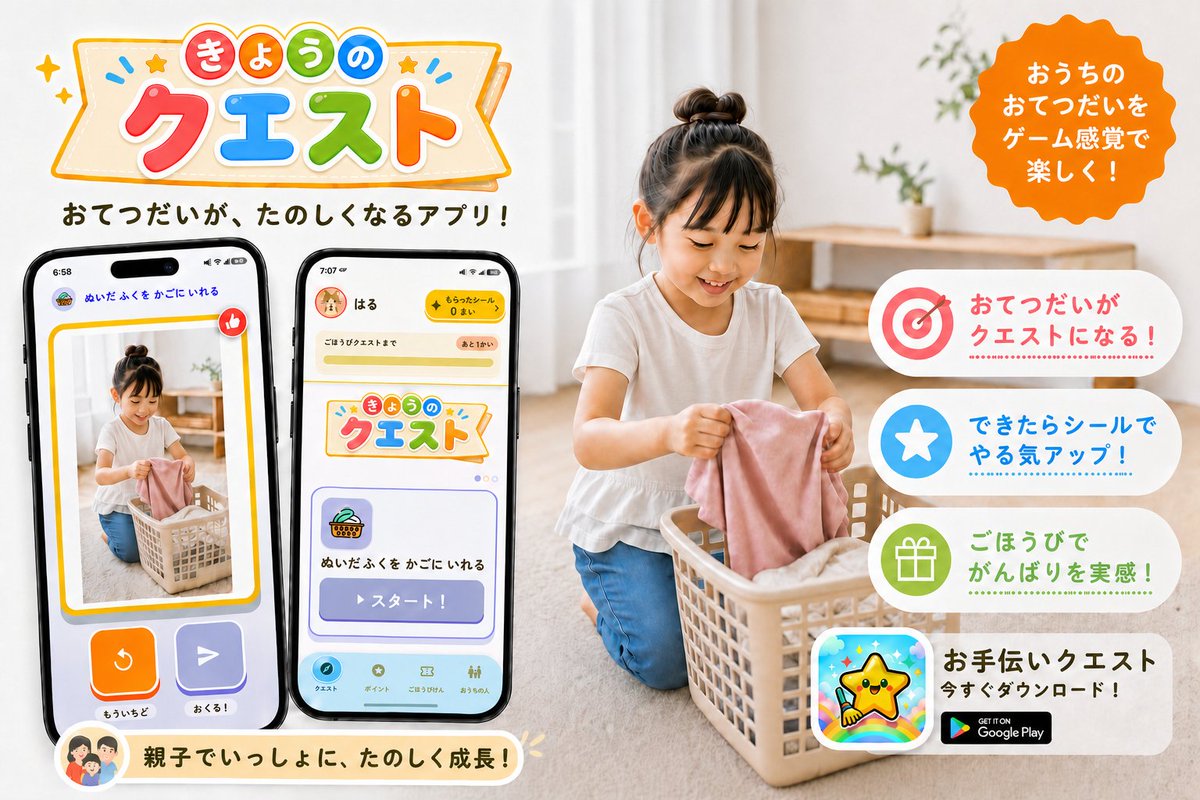
Goal: Create a cheerful Japanese promotional app banner for a family chore-help app called {argument name="app name" default="きょうのクエスト"}, showing household chores turned into fun game-like quests.

Canvas: Horizontal 3:2 social media ad, bright white and warm beige home interior, clean commercial design, high-resolution photorealistic lifestyle photo combined with colorful app UI mockups and playful vector graphics.

Layout: Left half contains the large app logo at the top, a short Japanese tagline below it, and exactly 2 large smartphone mockups angled slightly toward each other. Right half contains a photorealistic child doing laundry in a basket, with a bright orange scalloped speech-badge near the top right and exactly 4 rounded white feature cards stacked vertically along the right side. Bottom left has one cream-colored rounded message ribbon with a small family avatar icon.

Main subject: A young child with a top bun hairstyle, wearing a white short-sleeve shirt and blue pants, kneeling on a light wood floor and putting a pink cloth into a beige laundry basket. The home background is softly blurred, with sheer curtains, natural daylight, a simple wooden shelf, and small green plants. Keep the child face softly obscured or neutral, not the focus.

Logo and headline text: At the top left, create a playful banner logo with colorful rounded Japanese characters. Use a cream ribbon sign with orange outline, tiny stars, sparkles, and blue accent marks. The logo text reads 「きょうの クエスト」, with 「きょうの」 in small colored circles and 「クエスト」 in large red, blue, green, and orange letters. Under the logo, add the tagline 「おてつだいが、たのしくなるアプリ!」 in bold dark brown rounded Japanese type.

Phone mockups: Include exactly 2 black-framed smartphones. Phone 1 on the far left shows a reward/confirmation-style screen with a photo of the child doing laundry inside a yellow border, a red thumbs-up icon, two large bottom buttons in orange and purple, and small Japanese labels including 「ぬいたふくを かごにいれる」, 「もういちど」, and 「おくる!」. Phone 2 to its right shows the app home/quest screen with a yellow top bar, a user name 「はる」, a coin counter, the same app logo card, a quest card with basket icon, and a large purple button labeled 「スタート!」; include a bottom navigation bar with small rounded icons.

Right-side callouts: Add an orange scalloped circular badge at the top right with white Japanese text: 「おうちのおてつだいをゲーム感覚で楽しく!」. Stack exactly 4 rounded feature cards on the right, each with a large icon on the left and Japanese copy on the right: 1) target icon in red/pink with text 「おてつだいがクエストになる!」, 2) white star in blue circle with text 「できたらシールでやる気アップ!」, 3) gift icon in green circle with text 「ごほうびでがんばりを実感!」, 4) app icon showing a smiling yellow star mascot over a rainbow background, with bold text 「お手伝いクエスト」, smaller text 「今すぐダウンロード!」, and a black Google Play badge.

Bottom ribbon: Add one rounded cream ribbon near the bottom left under the phones with a small circular family illustration icon and the Japanese message 「親子でいっしょに、たのしく成長!」.

Visual style: Friendly, family-oriented, colorful, polished Japanese app PR graphic. Use rounded fonts, soft shadows, sticker-like icons, pastel accents, clean spacing, and a warm natural photo background. Make all UI elements crisp and readable, with no extra feature cards, no extra phones, no watermark, and no unrelated English text except the Google Play badge.
Use this prompt in the VdoBloom image editor.
Opens the image editor with this prompt — add your own photo to generate.