Japanese Mystery Game Website Mockup
Full prompt
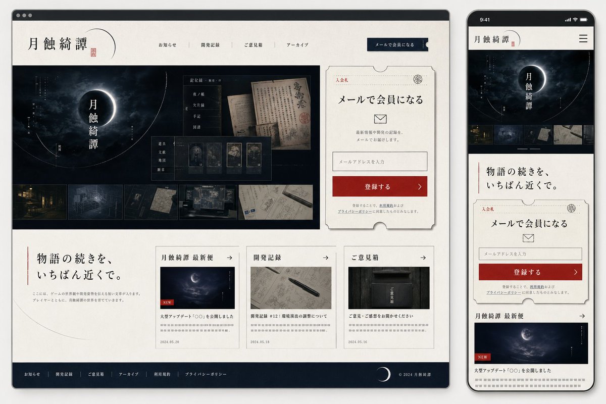
Goal: Create a polished responsive website mockup for a Japanese mystery / horror game community called {argument name="site title" default="月蝕綺譚"}, shown as both a desktop browser window and a smartphone screen side by side.

Canvas: 16:9 presentation image on a light gray background. Place a large desktop browser mockup on the left, occupying about 75% of the width, and a tall smartphone mockup on the right. Use soft shadows, rounded device corners, and realistic UI framing.

Visual style: Elegant Japanese gothic mystery aesthetic, off-white washi-paper texture backgrounds, deep navy-black panels, thin gray borders, muted red accents, refined serif Japanese typography, subtle ink-like lines, crescent moon motifs, archival documents, old maps, dark forest/night imagery, and restrained premium web-design spacing.

Desktop layout: A browser window with a dark top chrome bar and three small circular window buttons. Header contains the site title logo 「月蝕綺譚」 on the left with a thin crescent arc and red seal mark, 4 centered navigation links labeled 「お知らせ」, 「開発記録」, 「ご意見箱」, 「アーカイブ」, and a dark navy call-to-action button on the right labeled 「メールで会員になる」. Below, create a hero section split into a large dark image area on the left and a signup card on the right. The hero image shows a cloudy night sky with a glowing eclipsed crescent moon and vertical title text 「月蝕綺譚」, with fine circular orbit lines and small vertical annotations. Overlay a translucent archive-style panel containing old Japanese documents and 5 small thumbnail cards; along the bottom of the hero image include exactly 5 horizontal thumbnail images: an old building at night, a blueprint-like room drawing, a dark symbolic detail, handwritten documents, and a desk with maps/screens.

Signup card: On the right of the desktop hero, create a cream ticket-shaped card with notched edges, thin border, small red label 「入会札」, headline 「メールで会員になる」, an envelope icon, short explanatory copy, one email input field with placeholder 「メールアドレスを入力」, and a red button labeled 「登録する」 with a right arrow. Add small privacy-policy style text beneath.

Desktop lower content: Under the hero, place a large intro message on the left with a vertical red line and headline {argument name="intro headline" default="物語の続きを、いちばん近くで。"}, plus small gray body copy. To the right, place exactly 3 article cards in a row. Card 1 title section 「月蝕綺譚 最新便」 with a moon image, red NEW tag, headline 「大型アップデート『〇〇』を公開しました」, date 2024.05.20. Card 2 title section 「開発記録」 with a notebook and pen image, headline 「開発記録 #12:環境演出の調整について」, date 2024.05.18. Card 3 title section 「ご意見箱」 with a dark mailbox image, headline 「ご意見・ご感想をお聞かせください」, date 2024.05.16. Each card has a small right arrow in the header and gray teaser lines.

Footer: Dark navy footer spanning the desktop width with exactly 6 links: 「お知らせ」, 「開発記録」, 「ご意見箱」, 「アーカイブ」, 「利用規約」, 「プライバシーポリシー」. Add a crescent moon icon near the right and copyright text 「© 2024 月蝕綺譚」.

Mobile layout: Show a smartphone preview of the same site. Top status bar reads 9:41, followed by a compact header with 「月蝕綺譚」 logo and a hamburger menu icon. The mobile page stacks vertically: hero moon image with title, exactly 5 small thumbnails in a horizontal strip, intro headline 「物語の続きを、いちばん近くで。」, the same ticket-style email signup card, then the first news card 「月蝕綺譚 最新便」 with the moon image and NEW tag. Ensure all elements feel like the mobile-responsive version of the desktop layout.

Constraints: Use only Japanese text where specified, keep typography crisp and legible, avoid extra sections beyond those described, preserve the exact counts of 4 desktop nav links, 5 hero thumbnails, 3 desktop article cards, 6 footer links, and 1 mobile hamburger menu.
Use this prompt in the VdoBloom image editor.
Opens the image editor with this prompt — add your own photo to generate.