Japanese Travel App Poster
Full prompt
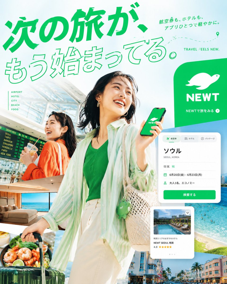
Goal: Create a vibrant Japanese travel-app advertising poster for {argument name="brand name" default="NEWT"}, combining editorial travel photography, clean app UI mockups, and bold Japanese typography to promote the feeling that the next trip is already beginning.

Canvas: Square 1:1 promotional graphic, bright white and mint-green background, high-key summer lighting, energetic composition, polished commercial ad quality.

Layout: A large diagonal Japanese headline dominates the top-left and upper center. The main traveler stands large in the center foreground, smiling and looking up to the right while holding a smartphone showing the green brand screen. A second traveler appears behind her on the left inside an airport scene. Layer multiple travel photo cutouts around the lower half and right side, with floating app interface cards over them. Place a large green rounded brand block on the upper-right.

Text content: Use exactly 5 main text groups: 1) huge headline text {argument name="headline text" default="次の旅が、もう始まってる。"} in vivid green, with the first line filled and the second line outlined; 2) small upper-right Japanese copy {argument name="subheadline text" default="航空券も、ホテルも、アプリひとつで軽やかに。"}; 3) English tagline “TRAVEL FEELS NEW.” near the top-right; 4) left-side vertical category list with exactly 5 items: “AIRPORT”, “HOTEL”, “CITY”, “BEACH”, “FOOD”; 5) brand block text with a white animal-like logo, the word “NEWT”, and the small Japanese call-to-action “NEWTで旅をみる” with a circular arrow icon.

Subject details: Main subject is a cheerful young East Asian woman traveler, mid-20s, short dark bob hair moving naturally, gold hoop earrings, green ribbed top, loose translucent mint-and-white striped overshirt, cream high-waisted pants, woven straw shoulder bag with a small green charm, pulling a dark green rolling suitcase. She holds a phone with a green screen, white brand logo, and “NEWT” text. Secondary subject is a smiling young East Asian woman in an orange cardigan at an airport, holding a drink, with a departures board behind her.

Travel image collage: Include exactly 5 travel photo cutouts: 1) bright airport terminal with departures board behind the secondary woman, 2) luxury hotel room with ocean view, 3) close-up seafood dish with shrimp and greens near the suitcase, 4) turquoise beach and ocean with swimmers on the right, 5) colorful resort city street with palm trees along the bottom-right.

App UI cards: Include exactly 2 floating white app interface cards with rounded corners and soft shadows. Card 1 is a booking search card at mid-right with tabs for flight, hotel, and package; large destination text “ソウル”, small text “SEOUL, KOREA”, rows showing round trip, dates “6月20日(金) - 6月23日(月)”, passengers “大人1名、エコノミー”, and a green button labeled “検索する”. Card 2 is a hotel recommendation card lower-right with a pool thumbnail, small heart icon, hotel name “NEWT SEOUL 明洞”, rating “4.8”, and five yellow stars.

Visual style: Premium Japanese startup travel campaign, fresh mint green brand color, crisp cutout collage, clean sans-serif typography, dynamic diagonal composition, airy negative space, glossy magazine-ad finish, realistic photography mixed with minimal vector UI. Add a dotted flight path with a location pin near the top-right.

Constraints: Use no extra logos or watermarks beyond the specified brand. Keep all Japanese text legible and accurately placed. Maintain the strong green-and-white identity, optimistic summer travel mood, and layered depth.
Use this prompt in the VdoBloom image editor.
Opens the image editor with this prompt — add your own photo to generate.