Minimalist Abstract Geometric Deconstruction Poster
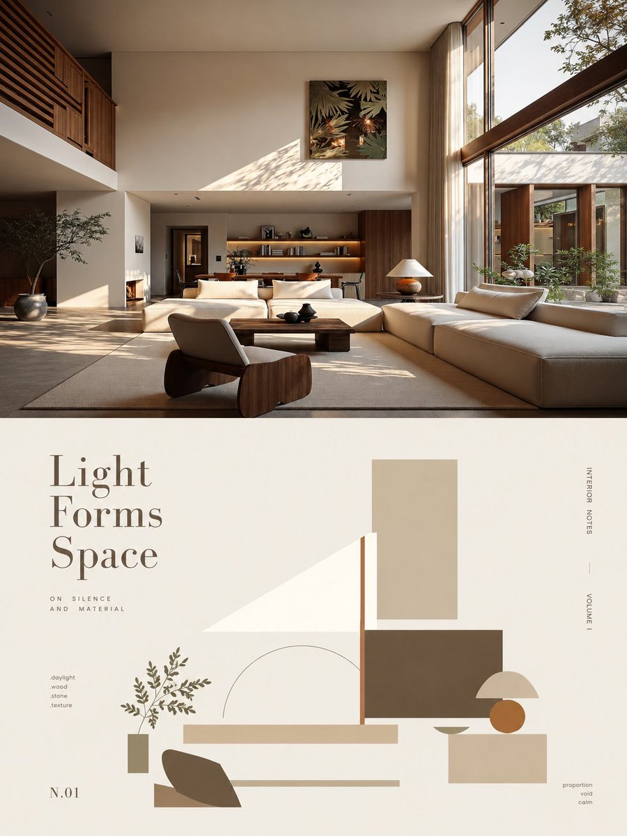
Full prompt
Please transform each photo I upload into an individual high-end design poster, outputting each photo separately without stitching them together. The overall composition uses a 3:4 vertical layout, with two areas of strictly 1:1 height, each occupying 50% of the screen.\n\nThe top half preserves the original photo, maintaining its structural integrity, spatial relationships, realistic materials, natural lighting, and original color atmosphere, with only slight professional color grading to give it the feel of an art magazine, independent publication, or exhibition photography. The environmental background can be naturally extended to fit the frame, but the subject must not be stretched, distorted, or changed.\n\nThe bottom half uses a clean ivory background to extract the most recognizable subject, silhouette, posture, and narrative relationship from the photo, transforming it into minimalist abstract visuals according to the logic of 'deconstruction-screening-refinement-reconstruction.' The focus is on retaining the most unique volume proportions, axes, curves, interspersions, layering, occlusions, negative space, and asymmetrical relationships, reorganized with a few geometric shapes. Details are not fully replicated, but the correspondence to the original image above must be immediately felt. The composition emphasizes visual center of gravity, scale differences, hierarchical layers, positive/negative shapes, and the rhythm of white space, avoiding iconization, even arrangements, or cluttered piles.\n\nAll colors are extracted from the photo above and simplified into one primary color, one dark structural color, and one light/neutral color, with at most a few key accent colors. Priority is given to the most recognizable and spirited colors of the original, establishing layers through area proportions, light/dark relationships, and local contrasts, keeping it clean, restrained, and vibrant, avoiding overall graying or average use of color.\n\nThe text establishes a complete high-end editorial micro-typography system: a poetic 2-5 word English main title is refined from the photo's lighting, space, action, material, or emotion, paired with 2-4 sets of tiny auxiliary text. These can be freely combined from short phrases, status words, location or object info, numbers, chapter marks, serial numbers, scale-style numbers, direction words, material words, archive-style tags, or miniature descriptions, without using years. The main title handles emotion, while small text handles order and detail, making the text look like editorial annotations in an art book, architectural journal, or exhibition catalog rather than common titles.\n\nText must be composed together with abstract shapes, arranged along geometric axes, edges, outlines, or negative spaces, or vertically aligned, rotated, columned, widely spaced, edge-aligned, corner-pressed, crossing color blocks, embedded between shapes, or interspersed and aligned with the subject. One group of text can be tiny while another is slightly larger, establishing a reading path through font size contrast, spacing, direction, and position. A combination of restrained serif and thin editorial fonts is used, letting the abstract shapes handle visual memory while the text handles structure, rhythm, and high-end feel.\n\nThe overall visual temperament presents **Real Photography × Abstract Memory × Editorial Layout**. It is modern, quiet, restrained, exquisite, artistic, and collectible, avoiding complex collages, cheap decorations, commercial template vibes, or meaningless abstraction.
Original prompt
请将我上传的每一张照片分别制作成一张独立的高级设计海报,不多图拼接,每张照片单独输出。整体采用3:4竖版构图,上下两个区域高度严格1:1,各占画面50%。\n\n上半部分保留原始照片,保持主体结构、空间关系、真实材质、自然光影和原有色彩氛围,仅进行轻微高级摄影调色,使其具有艺术杂志、独立出版物与展览摄影质感。为适配画幅,可自然扩展环境背景,但不得拉伸、扭曲或改变主体。\n\n下半部分以干净象牙色背景,提取照片中最具识别性的主体、轮廓、姿态与叙事关系,按照“解构—筛选—提炼—重构”的逻辑转化为极简抽象视觉。重点保留最独特的体量比例、轴线、曲线、穿插、层叠、遮挡、负空间与非对称关系,用少量几何形体重新组织;不完整复刻细节,但必须一眼感受到与上方原图的对应。构图强调视觉重心、尺度差、主次层级、正负形和留白节奏,避免图标化、平均排列和零碎堆积。\n\n配色全部从上方照片中提取并精简为1个主色、1个深色结构色、1个浅/中性色,最多加入少量关键强调色。优先保留原图中最有辨识度、最有精气神的颜色,通过面积比例、深浅关系和局部对比建立层次,保持干净、克制而有生命力,避免整体灰化与平均用色。\n\n文字建立完整的高级编辑式微排版系统:从照片的光影、空间、动作、材质或情绪中提炼一个2–5词的诗意英文主标题,同时搭配2–4组极小辅助文字,可由短句、状态词、地点或对象信息、编号、章节标记、序列号、尺度式数字、方向词、材质词、档案式标签或微型说明自由组合,不使用年份。主标题负责情绪,小字负责秩序与细节,使文字像艺术书、建筑期刊或展览图录中的编辑注释,而不是普通标题。\n\n文字必须与抽象图形共同构图,可沿几何轴线、边缘、轮廓或负空间排列,也可纵排、旋转、分栏、拉开字距、贴边、压角、跨越色块、嵌入形体之间或与主体形成穿插和对齐;允许一组文字极小、一组稍大,通过字号反差、字距、方向和位置建立阅读路径。整体使用克制的衬线字体与细瘦编辑字体组合,让抽象形体负责视觉记忆,文字负责结构、节奏与高级感。\n\n整体呈现真实摄影 × 抽象记忆 × 编辑排版的视觉气质,现代、安静、克制、精致、艺术化且具有收藏感,避免复杂拼贴、廉价装饰、商业模板感和无意义抽象。
Use this prompt in the VdoBloom image editor.
Opens the image editor with this prompt — add your own photo to generate.