Abstract Geometric Humanistic Poster
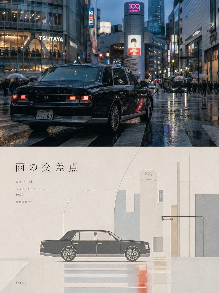
Full prompt
Turn uploaded photos into high-end posters. 3:4 layout, 1:1 split. Top half is original photo with high-end grading. The lower half reconstructs the subject into a {argument name="style" default="minimal abstract geometric expression"} using simple shapes and fine lines. The composition is balanced and humanistic with an embossed quality on paper. Use a soft color palette extracted from the original image using warm, restrained tones like off-white and dusty pink.
Original prompt
Please turn each of my uploaded photos into a separate high-end designed poster. Do not create collages or combine multiple images—each photo should be processed and output individually.

Use an overall 3:4 vertical composition, divided into two equal sections with a strict 1:1 height ratio, each occupying 50% of the canvas.

The upper half should preserve the original photo, maintaining the subject’s structure, realistic texture, natural lighting, and original color atmosphere. Only apply subtle high-end color grading to give it the feel of magazine photography and art exhibition imagery. To fit the format, the sky, ground, or environmental background may be naturally extended, but the subject must not be stretched, distorted, or altered.

The lower half should extract the most recognizable subject, silhouette, posture, and narrative relationship from the photo, and reconstruct them into a minimal abstract geometric visual expression. Use simple geometric shapes, flat color blocks, fine lines, structural lines, and negative space to reinterpret the subject. Do not create realistic illustration or pile up complex details, but the key characteristics must remain clear enough that the original subject is instantly recognizable. Depending on the relationships in the original image, a small number of horizontal lines, contour lines, spatial dividing lines, or abstract environmental elements may be added, so the composition retains a sense of order and breathing space within restraint.

The composition should emphasize balance, rhythm, and humanistic character. The subject in the lower half should be the only visual focal point. The overall layout should remain generally centered, but not rigidly symmetrical. Use controlled proportions, positive and negative space relationships, variation in density, subtle layering shifts, and large areas of blank space to establish a calm, professional layout order. The image should be clean, stable, and restrained, while also carrying a gentle sense of spatial undulation and a slight embossed quality—so that the geometric forms feel as if they are softly pressed into or subtly raised from the paper surface, creating delicate and understated dimensionality rather than obvious 3D effects.

The color palette should be extracted from the upper photo, but not copied mechanically. Instead, it should be transformed into a softer palette with a stronger humanistic temperament. Use low-stimulation, warm, restrained tones such as off-white, warm white, light gray, sand, dusty pink, pale ochre, mist blue, and sage green as the base. Retain the most characteristic main and supporting colors from the original image, and build a harmonious, calm, and visually enduring relationship through a limited palette. The overall color feeling should be gentle, airy, cultured, and lived-in, while avoiding
Use this prompt in the VdoBloom image editor.
Opens the image editor with this prompt — add your own photo to generate.