Modern Heterogeneous Chinese Font Design
Full prompt
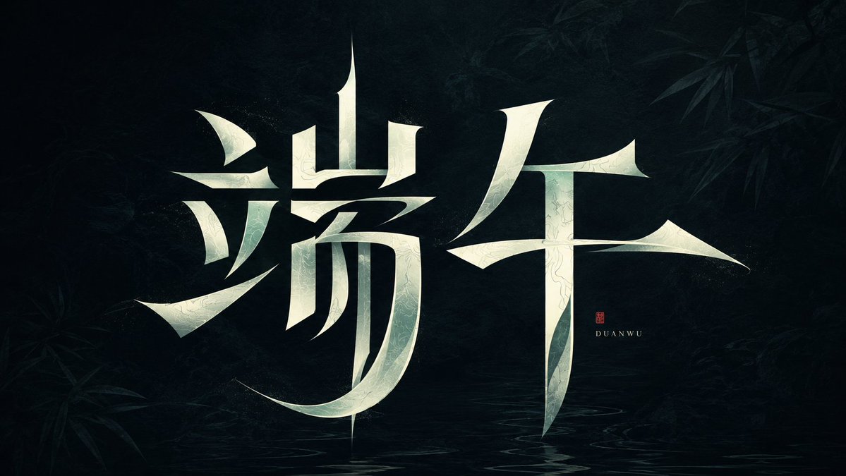
Generate a set of highly original Chinese character font designs around specific theme words, making the glyphs themselves the main visual. Retain the most critical readable skeleton of each character, then deconstruct radicals and strokes into graphic parts with modern calligraphic tension: vertical strokes form stable axes, while horizontal, left-falling, and right-falling strokes transform into sharp wedge-shaped closings, floating short strokes, curved sweeps, and chiseled transitions. Local strokes can be broken, misplaced, compressed, or elongated, but negative space must participate in character formation, keeping the text between clear readability and defamiliarization. The main characters occupy the strongest visual weight, with restrained white space around them; clear density rhythms are formed between crowded and empty areas. Tiny English transliterations or signatures can be added for scale contrast, placed close to but not overshadowing the main character. Colors are extracted from the theme's emotion, material, and cultural temperament, maintaining a relationship between a low-interference background field and a high-brightness main character: the background can be a quiet deep field, a soft light and shadow field, or a low-saturation shadow of the theme's material. The main characters use clean, bright light colors or theme highlights, creating a calm, mysterious, sharp, and memorable high contrast. Edges should be sharp, with thickness variations having design intent, and transitions looking like they are folded, cut, or slightly suspended. The overall presentation is a customized Chinese character logo, experimental but not messy, with an oriental feel derived from structure and brushwork, not relying on traditional calligraphic decorations.

Target text: {argument name="text" default="Dragon Boat Festival"}

Aspect ratio 16:9
Original prompt
围绕具体主题文字生成一组高度原创的汉字字体设计,让字形本身成为主视觉。先保留每个汉字最关键的可读骨架,再把偏旁、横竖撇捺拆解为带有现代书法张力的图形零件:竖画形成稳定轴线,横画与撇捺转化为锋利楔形收口、悬浮短笔、弧形扫笔和被切削过的转折,局部笔画可以断开、错位、压缩或拉长,但必须让负形一起参与造字,使文字处在清晰可读与陌生化之间。主字占据画面最强视觉重量,四周保持克制留白,笔画密集处与空旷处形成明确疏密节奏;可加入极小的英文音译或署名作为尺度对比,位置贴近但不抢主字。色彩从主题自身的情绪、材质和文化气质中提取,保留低干扰背景场与高明度主体字的角色关系:背景可以是安静深场、柔和光影场或主题材质的低饱和暗部,主体字使用干净明亮的浅色或主题高光色,形成冷静、神秘、锋利而有记忆点的高反差。边缘要利落,厚薄变化有设计意图,转折像被折叠、切开或轻微悬浮;整体呈现为一件定制化汉字标识,实验但不潦草,东方感来自结构和笔势,不依赖传统书法装饰。

本次文字:{argument name="文字" default="端午"}

比例16:9
Use this prompt in the VdoBloom image editor.
Opens the image editor with this prompt — add your own photo to generate.