Modern MPLUS Link UI Redesign
Full prompt
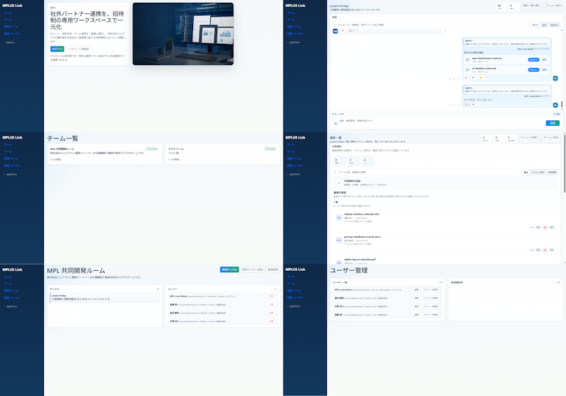
Using REFERENCE_0 as the source UI, redesign the Teams-like internal/external collaboration system into a cleaner, more modern product mockup while preserving the MPLUS Link brand, the dark navy left sidebar navigation, and the overall set of app functions. Create a polished 2-column by 3-row presentation showing exactly 6 redesigned screens: 1) a welcome/login landing screen with a large hero card, Japanese headline {argument name="headline text" default="社外パートナー連携を、招待制の専用ワークスペースで一元化"}, login tabs/buttons, and a realistic desktop-monitor hero image; 2) a project bridge chat screen with right-aligned chat cards, action chips, and a message composer; 3) a team list screen simplified into two clean team cards; 4) a materials/document list screen with upload controls, search/filter area, and file rows; 5) a shared collaboration room screen titled {argument name="room title" default="MPI 共同開発ルーム"} with a project overview card and compact member/status list; 6) a user management screen titled {argument name="admin title" default="ユーザー管理"} with user rows and an empty detail panel. Make the new mockups much more spacious than the reference: fewer table rows, larger margins, softer dividers, pale blue-gray backgrounds, white rounded cards, subtle shadows, and small blue/green accent buttons. Keep the Japanese enterprise SaaS feel and dummy-data nature, but remove the dense micromanaged tables and replace them with simplified, presentable mock UI suitable for a design-improvement comparison. Use brand name {argument name="brand name" default="MPLUS Link"} in the sidebar, keep the sidebar consistent on every screen, and avoid adding unrelated features, watermarks, or decorative clutter.
Use this prompt in the VdoBloom image editor.
Opens the image editor with this prompt — add your own photo to generate.