Skippy Peanut Butter Editorial Grid
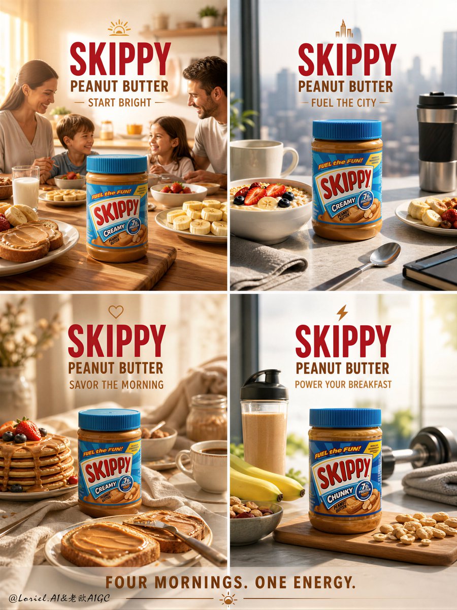
Full prompt
Create an ultra-premium symmetrical 4-panel editorial campaign board for Skippy Peanut Butter, reimagined as a “Breakfast Energy” luxury food campaign with four clearly different breakfast environments. The final result must feel like a world-class commercial brand system: warm, appetizing, polished, and highly strategic, with each panel representing a unique morning setting and lifestyle mood while keeping Skippy Peanut Butter as the hero product in every frame. Overall layout: use a clean symmetrical 2x2 grid with four balanced square panels. Each panel must function as a standalone premium advertisement, yet all four must feel unified as one campaign through consistent branding, lighting quality, typography, and color harmony. The grid must feel elegant, commercially intelligent, and visually satisfying. All Skippy Peanut Butter products must be rendered with absolute realism: authentic Skippy jar proportions, correct lid and label design, legible Skippy branding, realistic jar material behavior, visible creamy or chunky peanut butter texture, premium reflections, and clean product clarity. The jars must feel fresh, premium, appetizing, and instantly recognizable. The key visual concept is four distinct breakfast environments. Each panel must represent a different breakfast-world mood and setting, with no repetition in scene logic. Do not simply recolor the same setup. The four panels should clearly feel like four different mornings, four different tables, and four different breakfast rituals. Panel 1: Bright Family Kitchen Breakfast Create a warm sunlit home-kitchen breakfast setting with soft morning light, toast, sliced banana, milk, and a wholesome family-table atmosphere. The Skippy jar must remain the hero, with supporting elements arranged cleanly and elegantly. The mood should feel welcoming, nourishing, and full of positive morning energy. Panel 2: Urban Fast Morning Breakfast Create a modern city-apartment breakfast scene with a sleek tabletop, oats, yogurt, fruit slices, coffee, and a more efficient stylish on-the-go energy. The Skippy jar must remain central and product-dominant. The mood should feel contemporary, smart, active, and premium. Panel 3: Cozy Weekend Slow Breakfast Create a softer, more indulgent weekend morning environment with pancakes, warm toast, peanut butter spread texture, soft linen, perhaps a pastry detail, and calm golden light. The Skippy jar must remain highly visible. The mood should feel comforting, rich, and luxurious, like a slow breakfast ritual. Panel 4: Fitness Fuel Breakfast Setup Create a protein-forward athletic breakfast scene with bananas, oats, nuts, smoothie or protein pairing cues, and a clean energetic environment suggesting performance nutrition. The Skippy jar must remain the hero, with the scene styled to communicate strength, fuel, and active morning discipline. The mood should feel crisp, energizing, and modern. Each panel must have a different breakfast environment in terms of: table styling, lighting direction, supporting food, surface material, and emotional tone. The four breakfast worlds should read as: family morning, urban modern, cozy indulgent, and fitness-fuel energy. Supporting styling: use elegant breakfast props only where they support the Skippy jar and the breakfast story: toast, bananas, oats, berries, milk, coffee, pancakes, nuts, linen, wood, ceramic bowls, or smoothie glasses. All props must remain secondary to the product. Do not clutter the frame. Do not turn the campaign into a recipe collage. Lighting: use premium studio-commercial lighting with refined warm morning polish across all four panels. Each panel should include: clean highlights on the jar, beautiful peanut-butter sheen, refined texture visibility, controlled reflections, and elegant shadow shaping. The light should feel like elevated breakfast-hour sunlight, different in each panel but still unified across the campaign. All shadows must remain breathable and clean, with no muddy blacks, dirty blotches, or noisy dark contamination. Backgrounds and surfaces: allow each breakfast panel to have distinct styling while remaining in one premium family. Possible material directions: sunlit wood, light stone, soft white kitchen surfaces, neutral linen, ceramic breakfastware, oat-beige tabletops, and warm modern home textures. The full 4-panel layout must feel harmonious and brand-consistent. Color palette: peanut gold, warm beige, creamy ivory, toasted brown, oat beige, banana yellow, soft berry accents, milk white, and subtle Skippy brand blue-red accents from the packaging. The overall campaign should feel warm, fresh, energetic, and commercially elevated. Typography: use refined English branding and promotional copy only. Main recurring text: “SKIPPY” “PEANUT BUTTER” Possible supporting lines by panel: “START BRIGHT” “FUEL THE CITY” “SAVOR THE MORNING” “POWER YOUR BREAKFAST” Or one overall campaign line: “FOUR MORNINGS. ONE ENERGY.” Typography must feel bold, clean, and commercially premium, never loud or cheap. Mood: premium breakfast energy, modern lifestyle warmth, nourishing comfort, morning ritual elegance, appetite appeal, commercial sophistication. Rendering style: hyper-real food photography, luxury 4-panel campaign board, authentic Skippy Peanut Butter product rendering, four distinct breakfast environment scenes, refined commercial typography, 8k, world-class campaign quality. Negative prompt: generic peanut butter ad, fake Skippy label, low-detail jar, repeated breakfast scene, repetitive props, cluttered food styling, weak product hierarchy, cheap supermarket flyer look, muddy shadows, black blotches, noisy lighting, chaotic recipe collage, rough typography
Use this prompt in the VdoBloom image editor.
Opens the image editor with this prompt — add your own photo to generate.