Rebus Style Visual Poetry Poster
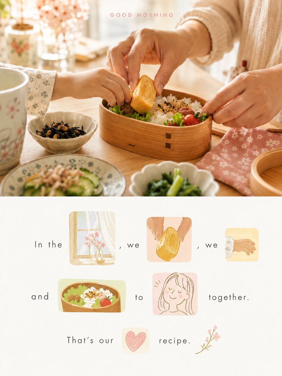
Full prompt
Please turn each photo I upload into an individual high-end design poster, rather than a collage of multiple photos, outputting each photo separately. The overall composition should be a 3:4 vertical layout, with the top and bottom areas strictly maintaining a 1:1 height ratio, each occupying 50% of the frame.

The upper half should retain the original photo, preserving the identity of the subject, structure, posture, authentic texture, natural lighting, and original color atmosphere, with only slight high-end color grading to give it the texture of an art magazine, independent publication, or exhibition image. The background can be naturally extended to fit the aspect ratio, but the subject must not be stretched, distorted, or changed.

The lower half should not be a complete replica of the photo, nor a simple downsized redrawing of it. Instead, it should extract the most memorable subjects, actions, partial outlines, objects, plants, architectural fragments, color relationships, and symbolic details from the original image, re-refining them into several visual elements converted into a unified style. These elements, combined with text, will form a Rebus-style visual sentence. These images are not decorative illustrations; they must truly replace words in the sentence. Once a word is replaced by an image, the word must not be written in text again. The entire sentence must rely on the combination of 'text + images' to be fully understood.

First, generate a short, imaginative, and slightly poetic or editorial sentence based on the photo's mood, action, relationships, location, memory, or metaphor. Then, select several nouns, action words, imagery words, or emotion words from the sentence that are best suited for visualization and replace them directly with corresponding image elements. For example, flowers, windows, birds, trees, cups, the sea, wind, lamps, roads, waiting, passing, returning, and early morning can all be represented by visual elements derived from the original photo. The images must occupy the original position of the words, forming a truly continuous 'text → image-word → text → image-word → text' reading logic, rather than just small drawings decorating a complete sentence.

Each replaced 'visual word' should be placed within an independent, small colored block background, like a small fragment cut from the memory of the original photo. Each block can have different sizes, aspect ratios, and cropping styles—nearly square, horizontal strips, vertical blocks, or small irregular cutouts. The blocks do not need to be uniform in size but must have a clear rhythm and hierarchy. The images within these blocks are not screenshots of the original photo but artistic fragments redrawn in a unified visual language, retaining only the most recognizable outlines, actions, structures, and essence. They can be partially cropped, showing only a portion, or naturally extend beyond the block's edges, making them look more like a meaningful visual word rather than a standard illustration.

These visual elements should overall adopt a unified modern hand-drawn editorial illustration style: reconstructing original elements through simplified outlines, generalized forms, a few flat color blocks, and a slight handmade feel, avoiding excessive realism, complex volumes, photographic textures, and mechanical reproduction. The images should retain the soul and recognizability of the original subject but not strive for complete depiction, feeling more like refined visual memories. The style should be light, clever, design-oriented, and reminiscent of art publications, ensuring all image-words are unified and harmonious.

The color block backgrounds behind each visual word should follow a 'fresh, bright, and eye-pleasing' soft color logic, though each block can have a different color. Colors should be extracted from the brightest, most vibrant, and most vital colors in the upper photo and then retuned, rather than simply taking an average. Increase the overall brightness and color purity to create a softer, lighter, and more approachable color palette, naturally expressing hues like milk blue, lake cyan, mint green, sprout green, cream yellow, peach pink, cherry blossom pink, apricot orange, and lavender purple. There can be slight shifts between blocks, but the overall look must be unified, comfortable, transparent, and clean, conveying a relaxed, pleasant, healing, slightly feminine, and 'Instagram-style' aesthetic. Avoid dirty grays, dark tones, aged effects, heavy Morandi palettes, fluorescent colors, cheap candy-like vibes, and excessive contrast.

The composition should be organized around the 'reading path of the sentence,' making the bottom half look like a page of a visual poem. Text and image-words can be spread across 2–4 lines; absolute alignment is not required, but there must be a clear, elegant, and natural reading rhythm. The size of the image-words should vary according to their semantic importance: some may be the size of a regular word, while others can be slightly larger to act as visual focal points. Use varying heights, density, slight offsets, white space, and baseline rhythm between text, image-words, and color blocks to create an asymmetrical but stable editorial layout. Avoid sticker-wall, card-list, regular grid, or messy collage appearances.

The bottom half should retain a significant amount of white space, allowing the void itself to become an essential part of the breath, rhythm, and sophisticated feel. The background should be near-white, off-white, or an extremely light shade that intelligently coordinates with the overall color temperature of the original photo, remaining clean, quiet, and transparent. All image-words, text, and color blocks should appear suspended within ample white space, making the layout resemble an art magazine, independent publication, visual poem page, or experimental graphic work rather than a commercial poster template.

There is no restriction on the language of the text; you may freely choose Chinese, English, bilingual, or any language that suits the atmosphere of the photo, provided the content is concise, natural, and imaginative. Avoid common commercial headline fonts; instead, use light, fresh, delicate, and thin fonts with a modern editorial feel and a slight humanistic touch. Character spacing should be naturally relaxed with plenty of white space and a restrained yet dynamic layout. Slight offsets, line breaks, and rhythmic changes are allowed so that the text and image-words coexist as equals, jointly forming the image rather than one dominating the other.

The overall visual effect should be: the top half is the realistic image, and the bottom half is a visual sentence composed of 'text + image-words + color blocks.' It should look like an emotional short poem, a memory fragment, or a visual metaphor extracted from the original photo, reorganized into a light, clever, fresh, healing, modern, and design-forward piece of art. The focus is not on describing what is in the photo, but on translating the photo's most moving elements into a graphic language that can be both read and viewed.

Avoid: directly using original photo crops as visual words, treating images merely as decorative illustrations next to text, including images without deleting the corresponding words in the sentence, sticker-wall aesthetics, card-grid layouts, commercial template styles, information-stream layouts, e-commerce vibes, childlike collage feels, messy disorder, muddy colors, cheap candy colors, excessive realism, complex backgrounds, mechanical fonts, and crowded layouts lacking white space.
Original prompt
请将我上传的每一张照片分别制作成一张独立的高级设计海报,不多图拼接,每张照片单独输出。整体采用3:4竖版构图,上下两个区域高度严格1:1,各占画面50%。

上半部分保留原始照片,保持主体身份、结构、姿态、真实质感、自然光影和原有色彩氛围,仅进行轻微高级调色,使其具有艺术杂志、独立出版物与展览图像质感。为适配画幅,可自然扩展环境背景,但不得拉伸、扭曲或改变主体。

下半部分不要完整复刻照片,也不要把照片简单缩小后重新画一遍,而是从原图中提取最有记忆点的主体、动作、局部轮廓、物件、植物、建筑片段、颜色关系与象征性细节,重新提炼为若干经过统一风格转换的视觉元素,并与文字共同组成一段图像替词式视觉句子(Rebus-style visual sentence)。这些图像不是装饰插图,而必须真正替代句子中的单词;一旦某个词被图像替代,文字中不得再次重复写出这个词。整句话必须依靠“文字 + 图像”共同才能被完整读懂。

先根据照片本身的情绪、动作、关系、地点、记忆或隐喻,自由生成一句简短、有想象力、带有轻微诗意或编辑感的句子,再从句子中挑选若干最适合视觉化的名词、动作词、意象词或情绪词,用对应的图像元素直接替换。例如花、窗、鸟、树、杯子、海、风、灯、路、等待、经过、归来、清晨等,都可以由来自原图的视觉元素承担。图像必须占据单词原本的位置,形成真正连续的“文字 → 图像词 → 文字 → 图像词 → 文字”阅读逻辑,而不是完整句子旁边点缀几张小画。

每个被替代的“视觉单词”都放置在一个独立的小型色块背景之中,像从原照片记忆里裁下的一小段画面。每个色块都可以拥有不同的尺寸、长宽比例与裁切方式,可为近方形、横向窄条、竖向长块或小型不规则裁切块;色块之间不需要统一大小,但必须有清晰的节奏和主次变化。色块中的图像不是原照片截图,而是经过统一语言重新绘制后的艺术化片段,只保留最有识别性的轮廓、动作、结构和神韵,允许局部被裁切、只露出一部分,或自然超出色块边缘,使其更像一个具有含义的视觉词,而不是普通小插图。

这些视觉元素整体采用统一的现代手绘编辑插画语言进行转换:以简化轮廓、概括形体、少量平面色块和轻微手工感来重构原图元素,避免过度写实、复杂体积、照片感纹理和机械复制。图像应保留原物的灵魂与识别性,但不追求完整描绘,而是更像被提炼后的视觉记忆。风格可以轻盈、聪明、略带设计感和艺术出版物气质,让所有图像词统一而协调。

每个视觉词背后的色块背景都应来自同一套“小清新、明快、令人眼睛愉快”的柔和配色逻辑,但每个色块颜色可以不同。配色从上方照片中提取最明亮、最鲜活、最有生命力的颜色重新调制,而不是平均取色。整体提高明度与色彩纯净度,形成更柔和、更轻盈、更有亲和力的综合色关系,可自然表现为牛奶蓝、湖水青、薄荷绿、嫩芽绿、奶油黄、蜜桃粉、樱花粉、杏子橙、薰衣草紫等轻快柔和的明亮色相。色块之间可以有轻微跳跃,但整体必须统一、舒适、通透、干净,给人轻松、愉快、治愈、带一点少女感和ins气质的观感。避免灰脏、暗沉、发旧、厚重莫兰迪化、荧光色、廉价糖果感和过强对比。

构图以“句子的阅读路径”为核心进行组织,下半部分整体应像一页可以被阅读的视觉诗。文字与图像词可以分为2–4行自由展开,不要求绝对整齐,但必须具有清晰、优雅而自然的阅读节奏。图像词的大小应根据语义重要程度而变化:有些接近普通单词大小,有些可适度放大成为视觉停顿点。文字、图像词和色块之间要通过高低错落、疏密变化、轻微错位、留白间距和基线节奏形成不对称但稳定的编辑排版关系。不要变成贴纸墙、卡片列表、规则宫格或杂乱拼贴。

下半部分保留大量合理留白,让空白本身成为呼吸、节奏和高级感的重要组成部分。背景使用近白色、米白色或与原图综合色温智能协调的极浅浅色底,整体干净、安静、通透。所有图像词、文字和色块都应悬浮在充足留白之中,使版面像艺术杂志、独立出版物、视觉诗页或实验性图文作品,而不是商业海报模板。

文字不限制语种,可根据原图气质自由选择中文、英文、双语或其他更适合画面语境的语言,但整体应简洁、自然、有想象力。字体不要使用普通商业标题样式,而应采用轻盈、清爽、细致、具有现代编辑感和轻微人文气息的细体文字,字距自然舒展,留白充足,排版克制而灵动。可允许轻微错位、换行和节奏变化,使文字与图像词平等共处,共同组成画面,而不是一方压过另一方。

整体视觉效果应呈现为:上半部分是真实图像,下半部分是一句由“文字 + 图像词 + 彩色色块”共同构成的视觉句子。它应像从原照片中提炼出的情绪短诗、记忆碎片和视觉隐喻,被重新组织成一页轻盈、聪明、清新、治愈、现代、富有设计感的艺术作品。重点不是说明照片里有什么,而是把原照片最动人的内容转译成一种可以被阅读、也可以被观看的图文语言。

避免:直接使用原图裁切作为视觉词、把图像仅仅当作文字旁边的装饰插图、完整句子不删词却再配图、贴纸墙感、卡片宫格感、商业模板感、信息流排版、电商感、儿童拼贴感、杂乱无序、颜色脏灰、廉价糖果色、过度写实、复杂背景、机械字体和无留白的拥挤版面。
Use this prompt in the VdoBloom image editor.
Opens the image editor with this prompt — add your own photo to generate.