Retro More Sense Poster
Full prompt
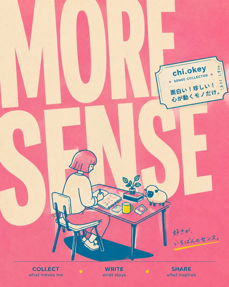
Goal: Create a square retro poster-style social media header/brand visual for a personal creative account themed around collecting everyday senses, writing what resonates, and sharing inspiration.

Canvas: 1:1 square image, warm risograph print texture, slightly faded paper grain, bold graphic composition. Use a coral-pink background with oversized cream typography filling almost the entire image.

Layout: Place enormous condensed block letters reading “MORE” across the top half and “SENSE” across the middle, cropped by the canvas edges so the letters feel poster-sized and architectural. In the lower center, draw a small line-art scene of a person seated at a desk. Add a tilted ticket-shaped label in the upper right. Add a small handwritten Japanese tagline near the lower right. Along the bottom, add a thin horizontal line and exactly 3 navigation words with small yellow dots between them.

Main illustration: A simple teal-blue line drawing with cream fills and coral accents. Show {argument name="character name" default="chi.okey"} as a short-haired person with a bob haircut, seen from behind/side, sitting on a chair at a rectangular desk. The person wears a loose sweater, skirt or shorts, socks, and sneakers, and is writing in an open notebook. On the desk include exactly 5 visible objects: 1 open notebook, 1 small potted plant, 1 yellow mug, 1 smartphone or small card, and 1 small rectangular item. Beside the desk on the right, include exactly 1 fluffy sheep mascot with a cream wool body, dark face, and small legs. Add a dark teal cast shadow under the chair and table.

Ticket label: In the upper right, draw a cream admission-ticket style sticker with teal outline, perforation details, and small decorative marks. Text on the ticket should read “{argument name="account name" default="chi.okey"}” in bold, “SENSE COLLECTOR” below it, and Japanese copy: “面白い!珍しい!心が動くモノだけ。”

Bottom text: Create exactly 3 bottom menu items in blue uppercase with smaller lowercase captions: 1) “COLLECT” with “what moves me”, 2) “WRITE” with “what stays”, 3) “SHARE” with “what inspires”. Put exactly 2 small yellow circular dots between the three items.

Additional text: Near the lower right, add handwritten Japanese text “好きが、いちばんのセンス。” with a short yellow underline stroke.

Visual style: Minimal Japanese zine aesthetic, retro risograph, clean vector linework, teal outlines, cream typography, coral-pink background, yellow accent dots and mug. Slight ink misregistration, subtle paper speckles, playful but calm brand identity.

Constraints: Keep the composition uncluttered, preserve the oversized cropped “MORE SENSE” lettering, include exactly 1 sheep mascot, no photorealism, no extra characters, no watermark.
Use this prompt in the VdoBloom image editor.
Opens the image editor with this prompt — add your own photo to generate.