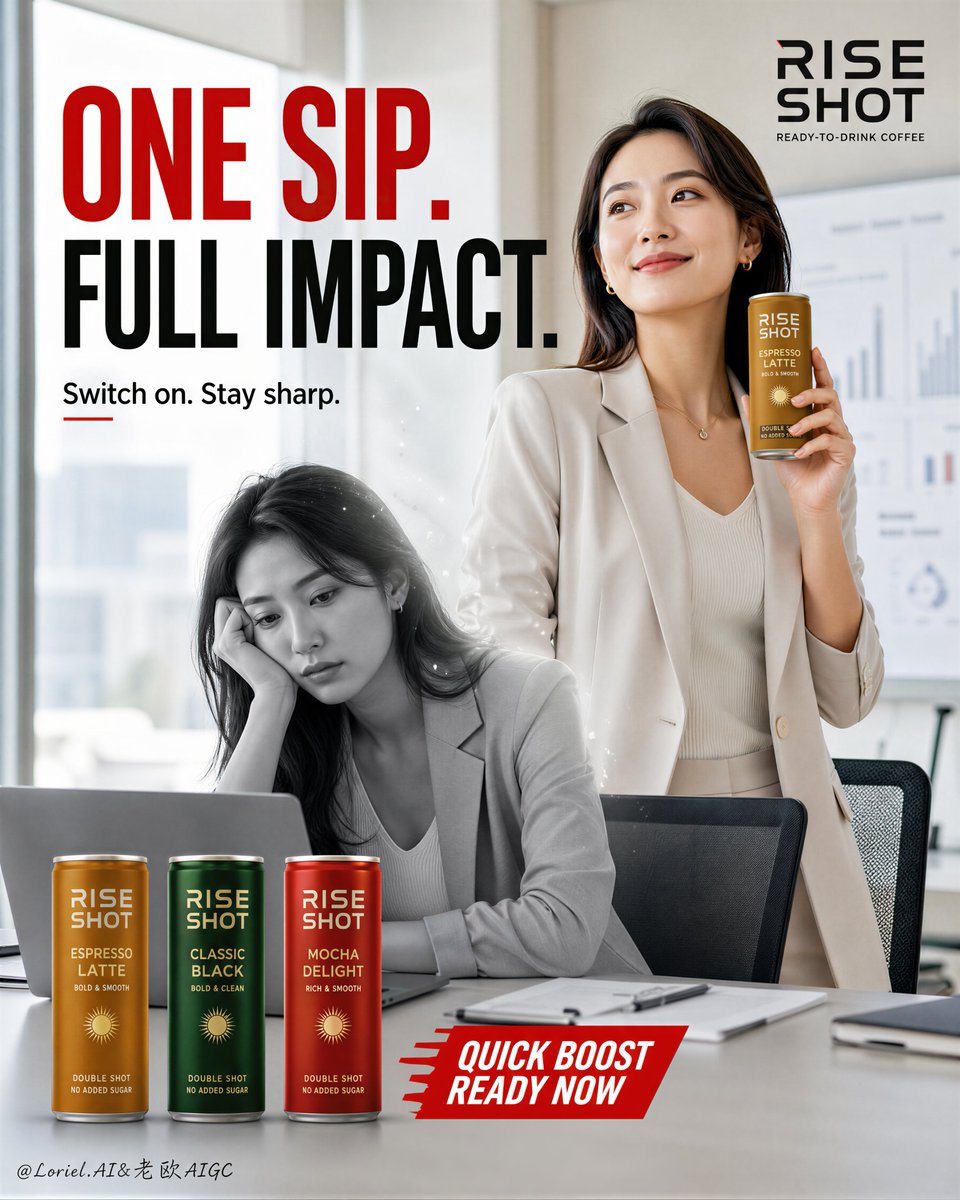
Rise Shot Commercial Coffee Poster
Full prompt
Create a flagship commercial advertising poster for an original ready-to-drink coffee brand named "RISE SHOT". Use ultra-realistic commercial lifestyle photography, not illustration, not 3D render. Merge Transit restraint with Orbit energy while converting all headline and campaign text into English only. Keep the same core structural logic: a bright modern office meeting room with softly blurred charts and presentation boards in the background; one elegant young professional woman standing slightly right of center, smiling with calm confidence while holding a slim coffee can near her face; in front of her, a monochrome grayscale tired office-version figure sits behind an open laptop, representing pre-coffee fatigue; three color-variant coffee cans are aligned in the lower-left foreground; a bold oversized English headline occupies the upper-left to upper-center area; a red angled English campaign tag sits near the lower center. The final image must feel like a Cannes-level FMCG office-energy campaign: witty, aspirational, clean, premium, and product-led. Style lock: ultra-realistic commercial product-and-portrait photography, premium office lifestyle advertising, bright soft daylight interior, clean corporate aesthetic, sharp packaging realism, strong typography hierarchy, contemporary global campaign design. Core composition: vertical poster layout, one standing woman in the mid-right hero zone, one seated grayscale alter-ego figure centered lower-middle behind a laptop, one hero can in the woman’s hand near shoulder height, three SKU cans aligned in the lower-left foreground, large English headline at the top, minimal brand mark in the upper-right, one red callout strip near the lower center. The in-hand coffee can and the bottom SKU lineup must remain the true product heroes, while the woman acts as the aspirational energy bridge. Transit logic: simplify the desk surface, reduce background chart detail, keep the room bright and quiet, shorten all copy, and let the can, the woman, and the before-after contrast carry the campaign. Avoid a cluttered office-ad feeling. Use negative space, clean hierarchy, and disciplined layout to create flagship impact. Orbit logic: build a subtle but clear visual flow from the top headline into the standing woman’s face, then to the can in her hand, down through the grayscale seated figure, and finally into the three cans at bottom left. Add only a very restrained transition effect between the grayscale and color states, such as faint light fragments or minimal tonal drift, to imply motion and transformation without visual noise. Concept logic: show the contrast between "low-energy work mode" and "switched-on performance mode" within one premium frame. The grayscale seated figure feels drained, mentally flat, and stuck at work, while the standing color figure feels refreshed, sharp, productive, and effortlessly confident after coffee. The transition should feel clean, elegant, and believable. Female character: one realistic young adult office woman with natural anatomy, correct shoulders, neck, arms, and hand proportions, natural five fingers, clear finger joints, realistic skin texture, subtle pores, natural lip texture, soft under-eye detail, and believable hair strands. She wears a light tailored blazer over a minimal office top. Expression: relaxed, knowing smile, bright but not exaggerated. Pose: upright, elegant, one arm bent naturally holding the can, body slightly angled, gaze subtly upward-left with confident satisfaction. Alter-ego seated figure: one realistic grayscale office-worn female figure seated behind a laptop at the desk, leaning on one hand with visible fatigue and boredom. Keep her desaturated, softly sculpted, and cleanly integrated into the scene. She should feel like the same person in an earlier drained state, not a separate character. Lighting: soft premium office daylight from upper-left front with gentle ambient fill across the room. The standing woman and coffee can receive the clearest and brightest light. The seated grayscale figure is slightly flatter and dimmer but still readable. Use delicate highlight control on the aluminum cans, hair, blazer folds, laptop edge, and desk surface. No harsh shadows, no muddy haze. Materials and realism: highly realistic slim aluminum coffee cans with commissioned printed labels, subtle metallic reflections, visible rim highlights, and a premium satin finish. Clean matte desk surface with only minimal papers and office items. Soft-focus charts and graphs behind. Clothing shows natural fabric folds and light texture. Skin remains natural, de-AI, and photographic. Color strategy: warm ivory and soft beige office background, cool pale-gray blazer tones, rich can accent colors such as amber gold, forest green, and deep red, plus a strong red campaign tag. The grayscale seated figure provides the main contrast device. Keep the palette disciplined, modern, and premium. Typography and layout: use original English text only, never copy any existing wording. Add a bold top headline such as “ONE SIP. FULL IMPACT.” with a small supporting line like “Switch on. Stay sharp.” Place a red angled tag near the lower center with short copy such as "QUICK BOOST / READY NOW". Add a minimal brand logo in the upper-right. Typography must feel bold, global, and structured, but always secondary to the coffee can and character action. Atmosphere: sharp, witty, modern office confidence, productivity boost, premium convenience coffee, polished workplace aspiration, clean and instantly readable. Quality and physical rules: extremely sharp hero can, readable labels, realistic metallic material, correct hand anatomy, five fingers only, natural face proportions, clean separation between standing figure and grayscale seated figure, believable perspective, no clutter, no cheap flyer feel, no muddy whites, no dead black patches, no distorted laptop, no warped cans, no broken text, no extra limbs. The coffee product must remain visually dominant. Negative prompt: copied brand name, copied slogan, copied packaging text, celebrity face, deformed hands, extra fingers, fused fingers, warped can shape, unreadable label, plastic skin, bad anatomy, messy office, cluttered desk, muddy lighting, low-resolution packaging, cartoon rendering, CGI look, illustration style, chaotic composition, weak product hierarchy, grayscale figure overpowering product, random props, dirty background.
Original prompt
Create a flagship commercial advertising poster for an original ready-to-drink coffee brand named "RISE SHOT". Use ultra-realistic commercial lifestyle photography, not illustration, not 3D render. Merge Transit restraint with Orbit energy while converting all headline and campaign text into English only. Keep the same core structural logic: a bright modern office meeting room with softly blurred charts and presentation boards in the background; one elegant young professional woman standing slightly right of center, smiling with calm confidence while holding a slim coffee can near her face; in front of her, a monochrome grayscale tired office-version figure sits behind an open laptop, representing pre-coffee fatigue; three color-variant coffee cans are aligned in the lower-left foreground; a bold oversized English headline occupies the upper-left to upper-center area; a red angled English campaign tag sits near the lower center. The final image must feel like a Cannes-level FMCG office-energy campaign: witty, aspirational, clean, premium, and product-led. Style lock: ultra-realistic commercial product-and-portrait photography, premium office lifestyle advertising, bright soft daylight interior, clean corporate aesthetic, sharp packaging realism, strong typography hierarchy, contemporary global campaign design. Core composition: vertical poster layout, one standing woman in the mid-right hero zone, one seated grayscale alter-ego figure centered lower-middle behind a laptop, one hero can in the woman’s hand near shoulder height, three SKU cans aligned in the lower-left foreground, large English headline at the top, minimal brand mark in the upper-right, one red callout strip near the lower center. The in-hand coffee can and the bottom SKU lineup must remain the true product heroes, while the woman acts as the aspirational energy bridge. Transit logic: simplify the desk surface, reduce background chart detail, keep the room bright and quiet, shorten all copy, and let the can, the woman, and the before-after contrast carry the campaign. Avoid a cluttered office-ad feeling. Use negative space, clean hierarchy, and disciplined layout to create flagship impact. Orbit logic: build a subtle but clear visual flow from the top headline into the standing woman’s face, then to the can in her hand, down through the grayscale seated figure, and finally into the three cans at bottom left. Add only a very restrained transition effect between the grayscale and color states, such as faint light fragments or minimal tonal drift, to imply motion and transformation without visual noise. Concept logic: show the contrast between "low-energy work mode" and "switched-on performance mode" within one premium frame. The grayscale seated figure feels drained, mentally flat, and stuck at work, while the standing color figure feels refreshed, sharp, productive, and effortlessly confident after coffee. The transition should feel clean, elegant, and believable. Female character: one realistic young adult office woman with natural anatomy, correct shoulders, neck, arms, and hand proportions, natural five fingers, clear finger joints, realistic skin texture, subtle pores, natural lip texture, soft under-eye detail, and believable hair strands. She wears a light tailored blazer over a minimal office top. Expression: relaxed, knowing smile, bright but not exaggerated. Pose: upright, elegant, one arm bent naturally holding the can, body slightly angled, gaze subtly upward-left with confident satisfaction. Alter-ego seated figure: one realistic grayscale office-worn female figure seated behind a laptop at the desk, leaning on one hand with visible fatigue and boredom. Keep her desaturated, softly sculpted, and cleanly integrated into the scene. She should feel like the same person in an earlier drained state, not a separate character. Lighting: soft premium office daylight from upper-left front with gentle ambient fill across the room. The standing woman and coffee can receive the clearest and brightest light. The seated grayscale figure is slightly flatter and dimmer but still readable. Use delicate highlight control on the aluminum cans, hair, blazer folds, laptop edge, and desk surface. No harsh shadows, no muddy haze. Materials and realism: highly realistic slim aluminum coffee cans with crisp printed labels, subtle metallic reflections, visible rim highlights, and a premium satin finish. Clean matte desk surface with only minimal papers and office items. Soft-focus charts and graphs behind. Clothing shows natural fabric folds and light texture. Skin remains natural, de-AI, and photographic. Color strategy: warm ivory and soft beige office background, cool pale-gray blazer tones, rich can accent colors such as amber gold, forest green, and deep red, plus a strong red campaign tag. The grayscale seated figure provides the main contrast device. Keep the palette disciplined, modern, and premium. Typography and layout: use original English text only, never copy any existing wording. Add a bold top headline such as “ONE SIP. FULL IMPACT.” with a small supporting line like “Switch on. Stay sharp.” Place a red angled tag near the lower center with short copy such as "QUICK BOOST / READY NOW". Add a minimal brand logo in the upper-right. Typography must feel bold, global, and structured, but always secondary to the coffee can and character action. Atmosphere: sharp, witty, modern office confidence, productivity boost, premium convenience coffee, polished workplace aspiration, clean and instantly readable. Quality and physical rules: extremely sharp hero can, readable labels, realistic metallic material, correct hand anatomy, five fingers only, natural face proportions, clean separation between standing figure and grayscale seated figure, believable perspective, no clutter, no cheap flyer feel, no muddy whites, no dead black patches, no distorted laptop, no warped cans, no broken text, no extra limbs. The coffee product must remain visually dominant. Negative prompt: copied brand name, copied slogan, copied packaging text, celebrity face, deformed hands, extra fingers, fused fingers, warped can shape, unreadable label, plastic skin, bad anatomy, messy office, cluttered desk, muddy lighting, low-resolution packaging, cartoon rendering, CGI look, illustration style, chaotic composition, weak product hierarchy, grayscale figure overpowering product, random props, dirty background.
Use this prompt in the VdoBloom image editor.
Opens the image editor with this prompt — add your own photo to generate.