Neito Brand Color Exploration Board
Full prompt
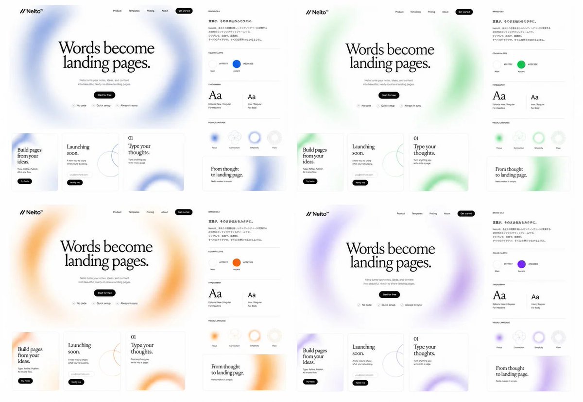
Goal: Create a clean brand exploration board for a fictional SaaS landing-page builder called {argument name="brand name" default="Neito"}, showing the same website and brand identity system repeated in exactly 4 color directions.

Canvas: Wide 16:9 white canvas, arranged as a 2×2 grid of four complete brand/website mockup panels with generous white space. Each panel is nearly identical except for the accent color and soft blurred gradient decorations.

Layout: Each of the 4 panels contains exactly 2 main areas: a large landing-page mockup on the left and a narrow brand-guide column on the right. The four accent themes are: 1 blue, 2 green, 3 orange, 4 purple.

Landing-page mockup details: At the top left place the logo mark as two forward slashes followed by “Neito” with a small star/spark symbol. Across the top navigation place exactly 5 items: Product, Templates, Pricing, About, and a black rounded “Get started” button. Center a large editorial serif headline: “Words become landing pages.” Below it add small gray supporting copy about turning ideas and content into beautiful ready-to-share landing pages, then a black pill button reading “Start for free”. Under the button place exactly 3 small feature chips with icons: “No code”, “Quick setup”, and “Always in sync”. Behind the hero headline use a huge airy blurred circular gradient ring in the panel’s accent color.

Bottom website cards: Under each hero section place exactly 3 rectangular content cards with thin borders and rounded corners. Card 1 reads “Build pages from your ideas.” with a small black pill button “Try Neito”. Card 2 reads “Launching soon.” and includes a small rounded email/input pill plus a black “Notify me” button and a thin abstract circle-line graphic. Card 3 is numbered “01” and reads “Type your thoughts.” with small descriptive text and a large cropped blurred accent-color ring in the lower right.

Brand-guide column: Add a small heading “BRAND IDEA” and a short Japanese-style paragraph block in small black text. Below it create exactly 4 labeled sections separated by thin gray horizontal rules: COLOR PALETTE, TYPOGRAPHY, VISUAL LANGUAGE, and a sample card. In COLOR PALETTE show exactly 2 circular swatches labeled Main and Accent; the Main swatch is near-white and the Accent swatch matches the panel color, with a small hex-code label beside each. In TYPOGRAPHY show exactly 2 type specimens: a large serif “Aa” labeled for headlines and a smaller sans-serif “Aa” labeled for body text. In VISUAL LANGUAGE show exactly 4 circular tokens labeled Flow, Connection, Simplicity, and Flex, with one or more using the accent color as a blurred ring. The final sample card reads “From thought to landing page.” with small subtext and a cropped blurred accent-color ring.

Visual style: Minimal premium web-design presentation, monochrome typography, lots of white space, thin light-gray dividers, subtle shadows, soft frosted gradients, editorial serif headline paired with tiny modern sans-serif UI labels. Keep everything crisp like a Figma brand exploration screenshot. Use {argument name="headline text" default="Words become landing pages."} as the main repeated hero headline, {argument name="accent palette" default="blue, green, orange, purple"} for the four color variants, and {argument name="canvas ratio" default="16:9"}.

Constraints: Show exactly 4 panels, exactly 3 bottom website cards per panel, exactly 2 brand areas per panel, exactly 2 color swatches per brand guide, exactly 2 typography specimens per brand guide, and exactly 4 visual-language tokens per brand guide. Do not add photos, people, device frames, dark backgrounds, or extra panels.
Use this prompt in the VdoBloom image editor.
Opens the image editor with this prompt — add your own photo to generate.