Selective Memory Sticker Poster Design
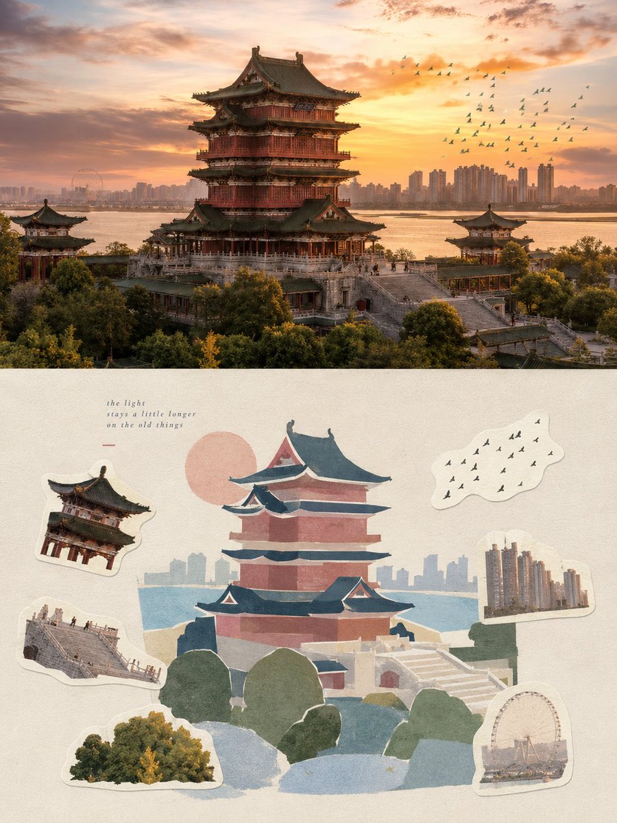
Full prompt
Please transform each photo I upload into a separate, independently designed high-end poster. No multi-image collages; output each photo individually. Use a 3:4 vertical composition with a top-bottom split logic: the upper half is the original photography, and the lower half is a graphic reconstruction based on selective memory, naturally echoing each other.

The upper half preserves the original photo, maintaining the subject's identity, structure, pose, authentic texture, natural lighting, and original color atmosphere, with only subtle high-end photographic color grading for an art magazine or exhibition feel. The background can be naturally extended to fit the aspect ratio, but do not stretch or alter the subject.

The lower half extracts the most recognizable elements and reconstructs them through 'selective memory' rather than descriptive realism. Distill visual cues into 3-6 large geometric blocks, reorganized using matte gouache, paper collage, or Risograph styles for a modern graphic and handcrafted feel.

The lower layout follows a main visual + six memory stickers logic. The main visual serves as the narrative focus, while six local details from the photo (actions, textures, objects, etc.) are distilled into independent stickers. Use thick, light-colored cut edges for stickers, arranged non-uniformly with sufficient white space.

Composition emphasizes visual weight, block proportions, negative space, and rhythm. The main visual should be significantly larger than the stickers. Colors are based on a soft, desaturated high-end palette. Use {argument name="main atmosphere colors" default="pale powder blue, misty blue, sky blue, airy cold blue"} for the primary feel, balanced with {argument name="secondary colors" default="ivory, creamy white, light beige, soft gray-green, neutral architectural tones"}. Allow small amounts of {argument name="accent color" default="dusty rose or muted blush"} for tiny details like flowers or clothing to add layers without losing the airy feel.

Generate minimal meaningful text based on the photo's context, integrated naturally into the white space. The final result should feel like an independent visual travel journal or personal memory album: quiet, modern, and handcrafted.
Original prompt
请将我上传的每一张照片分别制作成一张独立的高级设计海报,不多图拼接,每张照片单独输出。整体采用3:4竖版构图,延续上下双层逻辑:上半部分为真实摄影,下半部分为基于选择性记忆的平面重构,上下自然呼应。

上半部分保留原始照片,保持主体身份、结构、姿态、真实质感、自然光影和原有色彩氛围,仅进行轻微高级摄影调色,使其具有艺术杂志、独立出版物与展览摄影质感。为适配画幅,可自然扩展环境背景,但不得拉伸、扭曲或改变主体。

下半部分提取照片中最具识别性的主体、轮廓、姿态与叙事关系,以“选择性记忆”而非描述性写实的方式重构。不要完整描摹照片,只保留最值得记住的视觉线索,将复杂场景压缩成3–6个大的形体块面,以哑光水粉、剪纸拼贴、Risograph与丝网印刷式平涂重新组织,使主体仍能一眼识别,同时具有鲜明的现代平面构成与手工质感。

下半部分采用主视觉 + 六枚记忆贴纸的构图逻辑。主视觉承担主要叙事与视觉重心;另外从原照片中挑选六个具有记忆价值的局部——可以是主体特征、动作、局部结构、植物、器物、交通方式、食物、纹样、材质、光影或某个偶然细节——分别提炼为六枚独立 sticker。贴纸使用厚实的浅色切边,以不同尺度自然平铺、错落分布,可形成松散的两排、边缘聚集或围绕主视觉的非对称关系,保持足够留白,不做整齐商品目录式排列。六枚贴纸之间应有明显主次与大小变化,像从同一段记忆中剪下来的碎片,而不是六个同等重要的图标。

构图重视视觉重心、块面比例、尺度反差、正负形、前后遮挡与留白节奏。主视觉应明显大于贴纸碎片,贴纸可局部越界、轻微旋转、相互错开或与主体形成呼应,但不能抢夺主焦点。复杂环境主动删减,让大面积安静底色成为呼吸场,使整体既有平面秩序,又带轻松自然的收藏册感。

材质使用不透明水粉、剪纸、Risograph或丝网印刷式色块,保留轻微粉质边缘、纸张颗粒、手工切边与套印偏差。贴纸与主视觉使用同一种材质语言,避免水彩晕染、复杂笔触、密集线稿、写实纹理、光滑矢量和3D塑料质感。

配色以柔和、通透、略微去饱和的高级色系为基础,可从原图中提炼综合色温进行调整,但整体保持轻盈统一。以{argument name="主氛围颜色" default="浅粉蓝、雾蓝、天空蓝、空气感冷调蓝"}营造主氛围,再以{argument name="辅助色" default="象牙白、奶油白、浅米色、柔和灰绿、建筑中性色"}保持平衡;仅允许少量 {argument name="点缀色" default="dusty rose 或 muted blush"} 作为微小点缀,用于花、服饰、小标识、遮阳篷或局部装饰,使画面既有呼吸感又不失精致层次。

文字不预设固定标题、编号、地点或语种。根据照片的主体、动作、环境、情绪、声音、记忆或文化语境,自由生成极少量真正有意义的文字,并让其自然进入留白、贴纸间隙或主视觉边缘,与图形形成编辑排版关系。文字应小、轻、克制,不做菜单式信息栏,也不把每枚贴纸逐一标注。

整体像一本独立出版的视觉旅行手册、私人记忆册与高级贴纸艺术页:安静、现代、敏锐、松弛,既有专业平面秩序,又保留剪贴、收藏 and 手工材料的温度。避免贴纸商品目录感、六宫格、等尺寸排列、完整写实风景、密集细节、商业明信片模板、卡通、动漫和电商素材感。
Use this prompt in the VdoBloom image editor.
Opens the image editor with this prompt — add your own photo to generate.