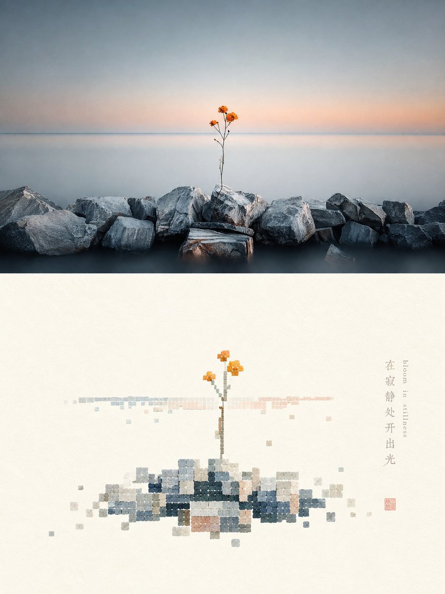
Shell-textured pixel art design poster
Full prompt
Please turn each photo I upload into an independent high-end design poster, not a multi-image collage, with each photo output separately. The overall composition is a 3:4 vertical layout, with the upper and lower regions strictly 1:1 in height, each occupying 50% of the frame.

The upper part retains the original photo, maintaining the subject's identity, structure, posture, real texture, natural light and shadow, and original color atmosphere, with only slight high-end color grading to give it the texture of an art magazine, independent publication, or exhibition image. To adapt to the frame, the environmental background can be naturally extended, but the subject must not be stretched, distorted, or changed.

The lower part first understands the most memorable **subject, basic composition, perspective relationship, structural trend, visual memory points, and overall atmosphere** of the original photo, and then reconstructs it into a minimalist pixel landscape with a sense of material collage. Instead of completely copying the photo, delete irrelevant details and only keep the structures, trends, and visual memory points that best represent the original, summarizing them through the order of regular blocks and the texture of natural materials, so that people can instantly recognize its correspondence with the photo above.

Pixel modules are not standard digital color blocks, but like **small square and near-square fragments cut from rough shells, shell flakes, or natural mineral shell layers**. Maintain a clear geometric grid order, but the edges can be slightly chipped or not perfectly regular, with surfaces featuring natural bedding, powdery particles, slight bumps, wear, and uneven colors, mainly with a matte, natural, and gentle material feel. The core area of the subject is formed by relatively dense modules, with edges gradually decreasing, missing, breaking, and floating, allowing the form to naturally dissipate from clarity into white space. Strictly control the total number of modules to no more than 200, with individual module sizes being uniform or close to uniform, avoiding fine noise, standard mosaics, and a game pixel feel.

The composition maintains a relationship between **small-scale stamps and large areas of white space**, freely arranging positions based on the subject's own direction, proportion, and visual center, which can be off-center, edge-aligned, suspended, or partially cropped. The subject occupies about 30%–45% of the lower part, with the remaining space intentionally left blank. White space is not just a blank background, but a constituent element as important as the subject, module density, and disappearing boundaries, establishing a sense of breath, space, and pause through positive and negative forms, density, gathering and scattering, and asymmetric balance. It is better to delete information than to fill the screen, making the subject like a material stamp carefully placed on a large sheet of paper.

The color scheme extracts **the brightest, most vivid, and most vital colors from the upper photo and retunes them**, instead of taking average colors or faithfully copying original color values. Moderately increase brightness, purity, and transparency, naturally deriving clear sky blue, lake cyan, tender green, warm yellow, coral orange, peach pink, and other bright comprehensive colors from the original image, forming a warm and healing color rhythm through refreshing cold and warm relationships. Use a large amount of pure warm white or very light near-white coordinated with the original image's composite color temperature as a breathing space. The main colors are bright and energetic but not glaring, with local warm orange, golden yellow, coral red, or soft pink serving as sun-like highlight colors. Retain the slight natural color difference and bedding of the shell material itself, but avoid turning gray, old, or dirty. Avoid gray and dirty, old, low-saturation Morandi-style, dark brown filters, gloomy earth tones, fluorescent colors, and a cheap candy feel.

Text only makes minimal editorial intervention, with no language restrictions and no preset fixed titles or numbers. A small amount of words or short phrases can be freely extracted from the photo's subject, location, action, emotion, or metaphor, placed quietly in the white space or at the edge of the subject, forming a refined graphic relationship with the material modules without overwhelming the main subject.

The overall presentation is a high-end visual effect composed of **natural material collage, shell-textured pixels, regular geometric order, progressive fading, small-scale stamps, large-area artistic white space, and modern editorial layout**, more like a reconstructed poster from a contemporary material art and design studio rather than a common digital pixel painting. Avoid full duplication of photos, complex backgrounds, real details, standard solid color blocks, smooth vectors, plastic mosaics, strong pearlescence, game UI feel, filled screens, excessive text, and templated effects.
Original prompt
请将我上传的每一张照片分别制作成一张独立的高级设计海报,不多图拼接,每张照片单独输出。整体采用3:4竖版构图,上下两个区域高度严格1:1,各占画面50%。

上半部分保留原始照片,保持主体身份、结构、姿态、真实质感、自然光影和原有色彩氛围,仅进行轻微高级调色,使其具有艺术杂志、独立出版物与展览图像质感。为适配画幅,可自然扩展环境背景,但不得拉伸、扭曲或改变主体。

下半部分先理解原照片最值得被记住的**主体、基本构图、透视关系、结构走势、视觉记忆点与整体气氛**,再重构为具有材料拼贴感的极简像素景观。不要完整复制照片,而是删去无关细节,只保留最能代表原物的结构、走势和视觉记忆点,通过规则方块的秩序与天然材料质感重新概括,使人能够一眼识别它与上方照片之间的对应关系。

像素模块不是标准数字色块,而像由**粗粝贝壳、贝壳薄片或天然矿物壳层切割而成的小型方形与近方形碎片**。保持明确的几何网格秩序,但边缘可略有崩缺、不完全规整,表面带天然层理、粉质颗粒、轻微凹凸、磨损与不均匀色泽,以哑光、自然、温和的材料感为主。主体核心区域由相对密集的模块聚合成形,边缘逐步减少、缺失、断开和漂浮,让形态从清晰向留白中自然逸散。严格控制模块总量,整体不超过200块,单个模块大小统一或接近统一,避免细碎噪点、标准马赛克和游戏像素感。

构图保持**小尺度章印与大面积留白**的关系,根据主体自身的方向、比例和视觉重心自由安排位置,可偏心、贴边、悬置或局部裁切。主体约占下半部分30%–45%,其余空间主动留空。留白不是空背景,而是与主体、模块密度和消隐边界同等重要的构成元素,通过正负形、疏密、聚散和不对称平衡建立呼吸感、空间感与停顿感。宁可删减信息,也不要填满画面,让主体像一枚被精心安放在大片纸面上的材料章印。

配色从上方照片中提取**最明亮、最鲜活、最有生命力的颜色重新调制**,而不是平均取色或忠实复制原始色值。整体适度提高明度、纯净度与通透感,根据原图自然推导出清澈天空蓝、湖水青、嫩绿、暖黄、珊瑚橙、桃粉等明快综合色,通过清爽冷暖关系形成温暖而治愈的色彩节奏。以大量纯净暖白或与原图综合色温协调的极浅近白色作为呼吸空间,主色明亮、有精神但不刺眼,局部暖橙、金黄、珊瑚红或柔粉可作为阳光般的点睛色。保留贝壳材料自身轻微天然色差与层理,但避免因此变灰、变旧或变脏。避免灰脏、发旧、低沉莫兰迪化、暗褐滤镜、阴郁大地色、荧光色和廉价糖果感。

文字只作极少量编辑性介入,不限制语种,也不预设固定标题或编号。可从照片的主体、地点、动作、情绪或隐喻中自由提炼少量字词或短句,安静地置于留白或主体边缘,与材料模块形成精致的图文关系,不喧宾夺主。

整体呈现**天然材料拼贴、贝壳质感像素、规则几何秩序、渐进消隐、小尺度章印、大面积艺术留白与现代编辑排版**共同构成的高级视觉效果,更像当代材料艺术与设计工作室的重构海报,而不是普通数字像素画。避免完整复制照片、复杂背景、真实细节、标准纯色色块、光滑矢量、塑料马赛克、强珠光、游戏UI感、画面填满、过多文字和模板化效果。
Use this prompt in the VdoBloom image editor.
Opens the image editor with this prompt — add your own photo to generate.