Teacher Appreciation Mid-Autumn Poster
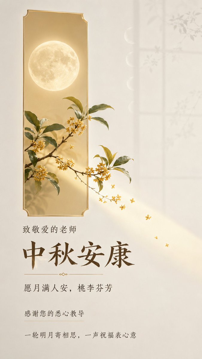
Full prompt
Design a vertical Mid-Autumn Festival greeting poster for teachers, intended for WeChat chat windows and mobile forwarding. It targets respected teachers, designed for short viewing time but requiring full legibility, with information density between text-light and standard. The core visual language is 'Real Objects Crossing Geometric Emotional Windows': featuring a realistic full moon, osmanthus branches, and a few osmanthus flowers as the subject, depicting a single visual event where 'moonlight and blessings pass through the window to reach the teacher.' The scene features a narrow, low-saturation light champagne gold geometric block acting as a visual anchor and spatial container. The block resembles a quiet emotional window illuminated by moonlight, maintaining clear controlled boundaries and slight translucency. The full moon is inside the window, with osmanthus branches naturally emerging from one end, with leaves, flowers, and a small patch of moonlight crossing the boundary and extending into a large area of whitespace, creating a real sense of spatial penetration; the subject must not be completely trapped by the color block nor turn into a decorative icon. The background is a 'Moonlit Classroom Air Field' related to the theme: warm ivory white to very light fog gray whitespace, like air illuminated by moonlight by a classroom window at night. In the distance, only very faint, almost transparent window frame outlines and soothing lunar arcs are kept, allowing the subject to emerge from a quiet distance and preserving a truly clean breathing zone for the text. Add only a few thin-line lunar phases and osmanthus branch shadows related to the Mid-Autumn and teacher-student emotions; the surface should be complete, clean, and matte, with only subtle controlled brightness changes. Avoid irrelevant scenery, crowded decorations, or dramatic dark scenes. The text must accurately present the following Chinese, with no pseudo-text, garbled characters, extra English, or unauthorized content, maintaining natural and clear Simplified Chinese fonts: 1. '中秋安康' (Mid-Autumn Well-being) — Main title, first reading entry, gentle and solemn high-recognition title lock. 2. '致敬爱的老师' (To My Dear Teacher) — Addressee, short kicker, establishing a cordial identity confirmation with the main title. 3. '愿月满人安,桃李芬芳' (May the moon be full and people be safe, may your students flourish) — Festival wish, authored expression, as an emotional promise following the main title. 4. '感谢您的悉心教导' (Thank you for your careful teaching) — Teacher-student emotional explanation, authored expression, appearing as a short sentence or lightweight callout, performing the gratitude function. 5. '一轮明月寄相思,一声祝福表心意' (A bright moon sends yearning, a blessing expresses my heart) — Closing copy, authored expression, as a quiet bottom/edge instruction line, completing the reading loop from festival to teacher's grace. Reading order: Addressee → Main title → Festival wish → Gratitude explanation → Closing copy. Text forms 4 readable blocks: kicker and main title are adjacent but clearly layered; the wish stands independently as a soft short sentence; gratitude and closing copy form a lightweight coda. Most whitespace remains text-free to allow the moonlit window and crossing subject sufficient space. No dates, schools, names, institutions, contact info, locations, or signatures, as these weren't provided and shouldn't be fabricated. The composition uses a complete editorial-style greeting poster layout: the geometric window and realistic moon-osmanthus subject form the sole visual focus, with text naturally organized along the relationship of moonlight spilling from the window, creating a soothing reading path from the top address to the title near the subject and then to the bottom wish coda; text is not floating on irrelevant images but echoes the window edges, moonlight, and whitespace. Preserve Oriental whitespace, modern order, natural vitality, light luxury quality, and restrained editorial temperament, avoiding template-like stacking. The color scheme uses low-saturation warm moonlight: ivory white and very light fog gray for large areas, light champagne gold windows and soft moonlight for festival warmth, the moon surface is natural warm white, osmanthus and branches use realistic but restrained pale gold, olive green, and a small amount of deep gray-brown as visual anchors, and text uses soft deep gray-brown rather than pure black. Maintain high brightness, low to medium-low saturation, and soft contrast, making viewers feel peaceful, cordial, respected, and gently remembered; the subject and whitespace are clearly separated, but the overall effect is not heavy, noisy, or using high-saturation festive red and gold. The typography adopts a modern humanistic editorial temperament suitable for Chinese mobile reading: the main title is a clear, slightly scholarly, steady Chinese display font, strokes have a warm hand-written feel but edges are precise and complete; auxiliary text uses lightweight, regular, and stretched Chinese arrangement to form rhythm, distinguishing address, wish, gratitude, and closure through font weight, density, whitespace, and line length, without stacking all text in the same size centered. Text enters the scene like moonlight, emphasized near the window edges and appropriately retreating in the whitespace; keep Simplified Chinese naturally legible with all characters complete and clear. The subject uses fine realistic photographic texture: the moon surface has restrained real circular shading and soft halo, the slender branches of osmanthus, clusters of small flowers, and leaves have identifiable natural forms and delicate layers; completed with soft diffuse moonlight, clean matte surfaces, precisely controlled edges and natural spatial depth. No heavy shadows, no cartoonization, no 3D icons, no watermarks, no UI elements, no pseudo-text, no causeless symbols, no cheap template feel. THEORY_LOGIC = SET[Whitespace Composition::Visual Metaphor::Editorial Hierarchy] || SYNTHESIS[Using the window as a relational boundary, allowing the moon and osmanthus to cross the boundary into quiet whitespace; using the main title, wishes, gratitude, and closure to form a progressive rhythm from recognition to emotional resonance, keeping the teacher-gratitude theme clear, gentle, and respectful in fast mobile reading] METAPHOR_LOGIC = Moonlight passes through the emotional window, bringing Mid-Autumn reunion and osmanthus fragrance across the boundary to the teacher, with whitespace becoming a quiet space for gratitude to be heard.
Original prompt
设计一张用于微信聊天窗口与手机转发的中秋节教师祝福竖版海报,面向被尊敬的老师,观看时间短但需要完整读懂,信息密度 text-light 到 standard 之间。核心视觉语言是“真实物象穿越几何情绪窗口”:以真实写实的满月、桂花枝与少量桂花为主体,表现“月光与祝福穿过窗口,来到老师身边”的单一视觉事件。 画面中设置一个窄长、低饱和的浅香槟金几何色块,作为视觉锚点和空间容器,色块像一扇被月光照亮的安静情绪窗口,保持清晰受控的边界与轻微半透明感。满月位于窗口内部,桂花枝从窗口的一端自然穿出,枝叶、花朵与一小片月光越界并延伸到外部大片留白,形成真实的空间穿透感;主体不能被色块完全困住,也不能变成装饰图标。 背景是与主题相关的“月光教室空气场”:温暖的象牙白到极浅雾灰留白,像夜晚教室窗边被月光照亮的空气,远处只保留极淡、几乎透明的窗棂轮廓与舒缓的月相弧线,让主体从安静的距离中显现,并为文字保留真正干净的呼吸区。只加入少量与中秋和师生情感有因果关系的细线月相和桂花枝影,表面完整、清洁、哑光,只有细微受控的明度变化,不要无关风景、拥挤装饰或戏剧化暗场。 文字必须准确呈现以下中文,不要出现伪文字、乱码、额外英文或未批准内容,保持自然清晰的简体中文字形: 1. “中秋安康”——主标题,第一阅读入口,温柔而庄重的高识别度标题锁定。 2. “致敬爱的老师”——对象称谓,短 kicker,与主标题形成亲切的身份确认。 3. “愿月满人安,桃李芬芳”——节日祝愿, authored expression,作为主标题后的情绪承诺。 4. “感谢您的悉心教导”——师生情感说明, authored expression,以短句或轻量 callout 方式出现,承担感谢功能。 5. “一轮明月寄相思,一声祝福表心意”——收束文案, authored expression,作为安静的底部/边缘说明行,完成从节日到师恩的阅读回环。 阅读顺序为:对象称谓 → 主标题 → 节日祝愿 → 感谢说明 → 收束文案。文字形成 4 个可读块:kicker 与主标题相邻但层级分明;祝愿独立成柔和短句;感谢说明与收束文案形成轻量的尾声。大部分留白保持无文字,让月光窗口与越界主体有充分空间。没有日期、学校、姓名、机构、联系方式、活动地点或署名,因为用户未提供且不应虚构。 构图采用一张完整的编辑式祝福海报构图:几何窗口与写实月桂主体形成唯一视觉焦点,文字沿着窗口外溢的月光关系自然组织,形成从上方称谓到主体附近标题、再到下方祝福尾声的舒缓阅读路径;文字不是漂浮在无关图片上,而是与窗口边缘、月光和留白发生呼应。保留东方留白、现代秩序、自然生命力、轻奢品质感与克制编辑气质,避免模板化堆叠。 色彩采用低饱和的温暖月光方案:象牙白与极浅雾灰作为大面积空间,浅香槟金窗口与柔和月光负责节日温度,月面为自然的暖白,桂花与枝叶使用真实但克制的淡金、橄榄绿和少量深灰褐作为视觉锚点,文字使用柔和深灰褐而非纯黑。保持高明度、低至中低饱和与柔和对比,让观者感到安宁、亲切、受尊重和被温柔惦念;主体与留白有清楚分离,但整体不浓重、不喧闹、不使用高饱和节庆红金。 排版采用适合中文手机阅读的现代人文编辑气质:主标题为清晰、略带书卷感的稳健中文展示字形,笔画有温润的手工书写气息但边缘精确完整;辅助文字以轻量、规整、舒展的中文排布形成节奏,通过字重、密度、留白和行长区分称谓、祝愿、感谢与收束,不将所有文字做成同字号的居中堆叠。文字像月光一样进入画面,在窗口边缘附近获得强调,在留白中适度退后;保持简体中文自然识读,所有字形完整清楚。 主体采用精细写实摄影质感:月面有克制的真实环形明暗与柔和光晕,桂花枝的纤细枝条、成簇小花和叶片具有可辨识的自然形态与细腻层次;以柔和漫射月光、干净哑光表面、精确受控的边缘和自然空间深度完成,不要厚重阴影、不要卡通化、不要3D图标、不要水印、不要界面元素、不要伪文字、不要无因果符号、不要廉价模板感。 THEORY_LOGIC = SET[留白构成::视觉隐喻::编辑层级] || SYNTHESIS[以窗口作为关系边界,让月与桂花跨过边界进入安静留白;用主标题、祝愿、感谢和收束形成由识别到情感回响的渐进节奏,使师恩主题在手机快速阅读中保持清楚、温柔与尊重] METAPHOR_LOGIC = 月光穿过情绪窗口,把中秋的团圆与桂花的芬芳越界送到老师身边,留白成为感谢被听见的安静空间。
Use this prompt in the VdoBloom image editor.
Opens the image editor with this prompt — add your own photo to generate.