Watercolor Postcard Ticket Style Poster
Full prompt
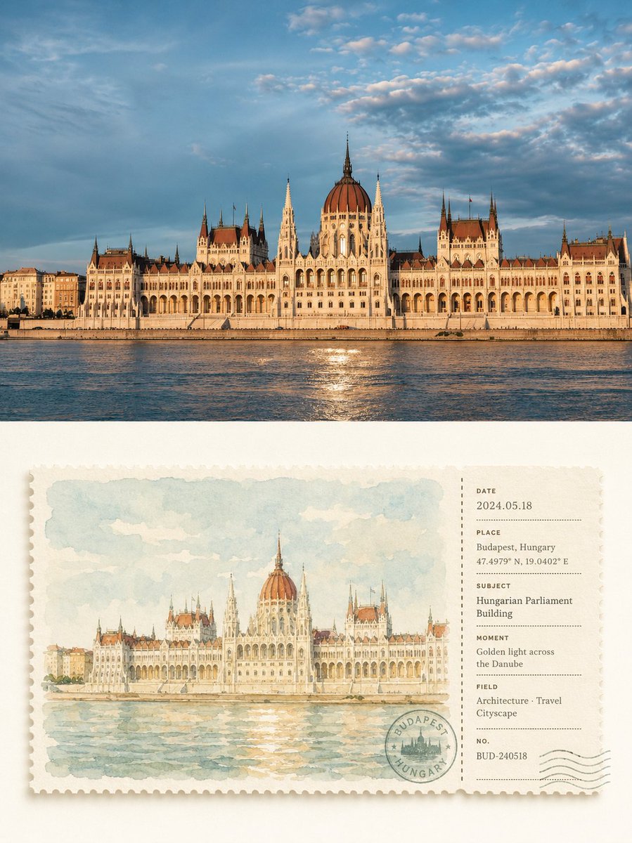
Please transform each photo I upload into an individual high-end design poster, outputting each photo separately without stitching them together. The overall composition uses a 3:4 vertical layout, with two areas of strictly 1:1 height, each occupying 50% of the screen.\n\nThe top half preserves the original photo, maintaining its structural integrity, realistic texture, natural lighting, and original color atmosphere, with only slight professional color grading to give it the feel of an art magazine, travel publication, or exhibition photography. To fit the aspect ratio, sky, ground, or environmental backgrounds can be naturally extended, but the subject must not be stretched, distorted, or changed.\n\nThe bottom half extracts the most recognizable **subject, silhouette, posture, and narrative relationship** from the photo, re-summarizing the original scene into a horizontal watercolor ticket stub that merges postcard and receipt forms. Instead of drawing an isolated object, it preserves the most memorable relationship between the subject and the necessary environment, reorganized with simple watercolor strokes so the image clearly corresponds to the photo above while looking like a carefully collected travel sketch ticket.\n\nThe ticket body is suspended in the center of a large area of ivory-white negative space, using a strict **large-left, small-right geometric partition**: about 74% on the left is the watercolor image, and about 26% on the right is the information stub, precisely separated by a vertical dashed line, perforations, or a tear line. Margins are uniform, and images, text, postmarks, and numbers all follow the same implicit grid and alignment lines, creating a neat, quiet, and professional editorial order. The paper is thick matte watercolor paper with fine serrated edges and very subtle natural shadows.\n\nThe watercolor on the left uses a **high-brightness, low-to-medium saturation healing color palette** to re-harmonize the original colors, avoiding direct copying of dirty gray values. Priority is given to the freshest and most vibrant colors from the original, translated into a soft natural color system such as sage green, mist blue, light cyan-gray, cream yellow, warm sand, and light terracotta. Use 2–4 similar colors to build a sense of airiness, with only minimal warm contrast colors to highlight the subject. The overall feel is bright, clean, transparent, and soft, avoiding gray, yellowish, heavy brown, gaudy contrasting colors, or cheap vintage filters.\n\nWatercolor strokes are clear and light, preserving the paper's transparency, soft blending, wet-and-dry variations, and a small amount of grain. The subject is slightly clearer, while the background and secondary environment are naturally softened without realistic lighting or complex details, giving the image a quiet, relaxed, and gentle feel of a picture book or travel journal.\n\nThe right-hand stub uses a restrained **geometric information layout system**, flexibly generating a few fields like DATE, PLACE, SUBJECT, MOMENT, FIELD, NO. based on the photo content, paired with dates, numbers, dashes, dot lists, coordinate-style numbers, and a circular seal. All text is strictly aligned along a uniform left margin, baseline, and spacing, with clear hierarchical font sizes and ample white space. Postmarks can slightly overlap with the dividing line or bottom grid, creating a clever relationship between information elements and the ticket structure rather than being randomly scattered. If the theme is not urban or travel, the location field can naturally transform into an object name, state, project, chapter, season, or emotional record.\n\nThe overall design refers to **high-end travel postcards, vintage receipts, artist journals, watercolor publications, and modern editorial design**, emphasizing healing colors, geometric order, paper texture, and a sense of collectability. It presents a visual temperament that is fresh, gentle, quiet, neat, and exquisite without being over-designed. Avoid dirty old tones, loose layouts, floating information, complex decorations, realistic illustrations, e-commerce template vibes, or cheap vintage effects.
Original prompt
请将我上传的每一张照片分别制作成一张独立的高级设计海报,不多图拼接,每张照片单独输出。整体采用3:4竖版构图,上下两个区域高度严格1:1,各占画面50%。\n\n上半部分保留原始照片,保持主体结构、真实质感、自然光影和原有色彩氛围,仅进行轻微高级摄影调色,使其具有艺术杂志、旅行出版物与展览摄影质感。为适配画幅,可自然扩展天空、地面或环境背景,但不得拉伸、扭曲或改变主体。\n\n下半部分提取照片中最具识别性的**主体、轮廓、姿态与叙事关系**,将原场景重新概括为一张融合明信片与票据形式的横向水彩票根。不是孤立画一个物体,而是保留主体与必要环境之间最有记忆点的关系,以简洁水彩笔触重新组织,让画面既能一眼对应上方照片,又像一张被精心收藏的旅行速写票据。\n\n票体居中悬置于大面积象牙白留白中,采用严格的**左大右小几何分区**:左侧约74%为水彩画面,右侧约26%为信息票根,中间以竖向虚线、齿孔或撕票线精准分隔;上下边距统一,图像、文字、邮戳、编号均服从同一隐性网格与对齐线,形成规整、安静、专业的编辑秩序。卡纸为厚实哑光水彩纸,边缘细密锯齿,带极轻微自然投影。\n\n左侧水彩以**高明度、低至中等饱和度的治愈系色盘**重新调和原图颜色,不直接复制脏灰色值。优先保留原图中最清新、最有生命力的色彩,再统一转译为柔和的鼠尾草绿、雾蓝、浅青灰、奶油黄、暖沙色、淡陶土色等自然综合色系;以2–4个相近色建立空气感,仅用极少量温暖对比色点亮主体。整体明亮、干净、通透、柔和,避免灰蒙、发黄、重褐、浓艳撞色和廉价复古滤镜。\n\n水彩笔触清晰而轻薄,保留纸张透白、柔和晕染、干湿变化与少量颗粒,主体稍清晰,远景与次要环境自然减弱,不做写实光影和复杂细节,使画面具有安静、松弛、温柔的绘本与旅行手账感。\n\n右侧票根采用克制的**几何信息排版系统**,根据照片内容灵活生成 DATE、PLACE、SUBJECT、MOMENT、FIELD、NO. 等少量字段,并搭配日期、编号、短线、点列、坐标式数字和一枚圆形印章。所有文字严格沿统一左边线、基线和间距排列,字号层级清晰,留白充足;邮戳可与分割线或底部网格轻微交叠,让信息元素与票体结构形成巧妙关系,而不是随意散落。若不是城市或旅行题材,地点字段可自然转化为对象名、状态、项目、章节、季节或情绪记录。\n\n整体参考**高级旅行明信片、复古票据、艺术家手账、水彩出版物与现代编辑设计**,强调治愈色彩、几何秩序、纸张质感和收藏感,呈现清新、温柔、安静、规整、精致而不过度设计的视觉气质。避免脏旧色调、松散排版、信息漂浮、复杂装饰、写实插画、电商模板感和廉价复古效果。
Use this prompt in the VdoBloom image editor.
Opens the image editor with this prompt — add your own photo to generate.