Woodcut Print Graphic Design Poster
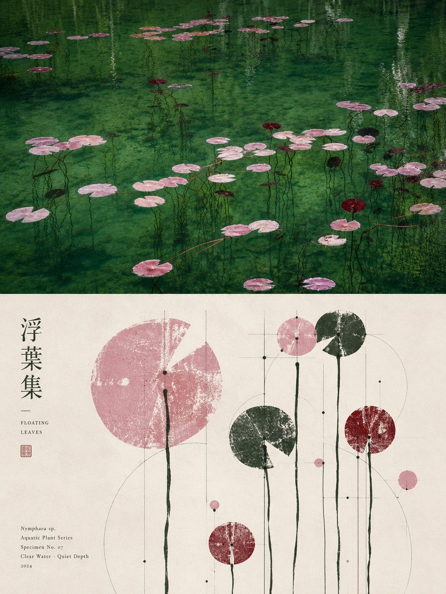
Full prompt
Please turn each photo I upload into a separate high-end design poster, avoiding multi-photo stitching, and output each photo individually. Use a 3:4 vertical composition overall, where the top and bottom sections are strictly 1:1 in height, each occupying 50% of the frame. The upper part retains the original photo, preserving its main structure, realistic texture, natural light/shadow, and original color atmosphere, with only slight high-end photographic color grading for an art publication and exhibition quality. To fit the frame, the sky, ground, or environment may be naturally extended, but the subject must not be stretched, distorted, or altered. The lower part extracts the most recognizable **subject, silhouette, posture, and narrative relationship** from the photo. First, interpret its core meaning, cultural attributes, or emotional connection, then reconstruct it into a graphic image with the aesthetic of folk catalogs, ancient artifact rubbings, and modern graphic design. Do not translate photo elements literally, and avoid generic traditional patterns; retain only **one core visual motif and a few truly narrative auxiliary forms**. Through silhouettes, negative shapes, local zooming, merging of forms, and symbolic translation, ensure the graphics both reflect the original object and convey its underlying meaning. The composition is built on a rigorous **geometric skeleton and proportion system**. Based on the subject's structure, extract circles, squares, triangles, curves, axes, or repeating proportions as the 'geometric matrix.' All subjects, auxiliary graphics, text, and negative space should then interact with this matrix through alignment, tangency, co-axiality, nesting, mirroring, proportional progression, or boundary cropping. The layout can be free-form, off-center, boundary-crossing, or asymmetric, but it must share the same structural logic, creating a clear visual focus, hierarchy, rhythm, and negative space. The order should be clear from a distance, while traditional imprints and detailed variations are visible up close, avoiding random scattering and decorative clutter. The color scheme extracts the most recognizable and vital colors from the photo, summarizing them into a clean and restrained print color palette. Use a bright, light paper base to create 'breathing room,' a dark color for the visual skeleton, and 1–2 theme colors from the original image for the subject and minor accents. Establish layers through area ratios, overprinting, and value relationships; colors should be clean and spirited, avoiding muddy aging, fixed folk palettes, and cluttered multi-colors. The texture uses a mix of **woodcut rubbing, dry-brush screen printing, and old-style catalog printing**. Ink gaps, scratches, and uneven ink distribution should primarily occur within the graphics, while geometric boundaries, key outlines, and the overall layout remain sharp and precise, creating a contrast of 'raw materiality × rigorous geometric order.' Text serves only as auxiliary information. Extract minimal titles and micro-annotations based on the photo's theme, meaning, or cultural attributes. These can be arranged along geometric axes, negative shapes, or graphic boundaries, aligning with or nesting within the subject without competing for the visual center. The overall presentation is **meaning-led, graphically restrained, geometrically rigorous, with raw rubbings, clear white space, and a coexistence of traditional culture and modern design order**. Every graphic element must have a source, a meaning, and a structural purpose. Remove decorative elements that do not enhance thematic understanding, avoiding material collages, random traditional symbols, uniform layouts, realistic illustrations, and a templated look.
Original prompt
请将我上传的每一张照片分别制作成一张独立的高级设计海报,不多图拼接,每张照片单独输出。整体采用3:4竖版构图,上下两个区域高度严格1:1,各占画面50%。 上半部分保留原始照片,保持主体结构、真实质感、自然光影和原有色彩氛围,仅进行轻微高级摄影调色,使其具有艺术出版物与展览摄影质感。为适配画幅,可自然扩展天空、地面或环境背景,但不得拉伸、扭曲或改变主体。 下半部分提取照片中最具识别性的**主体、轮廓、姿态与叙事关系**,先理解其核心寓意、文化属性或情绪关系,再重构为具有民俗图录、古物拓片与现代平面设计气质的图形画面。不要把照片中的元素逐一翻译,也不要添加泛泛的传统纹样;只保留**一个核心视觉母题与极少量真正有叙事意义的辅助形态**,通过剪影、负形、局部放大、形态合并与符号化转译,使图形既能对应原物,又能表达其背后的意义。 构图建立在严谨的**几何骨架与比例系统**之上,根据主体自身的结构提炼圆、方、三角、弧线、轴线或重复比例作为“几何母体”,再让所有主体、辅助图形、文字和留白与其发生对齐、切线、共轴、嵌套、镜像、比例递进或边界裁切关系。版面可以自由分布、偏心、越界或不对称,但必须共享同一套结构逻辑,形成清晰的视觉重心、层级、节奏与负空间;远看秩序明确,近看才发现传统印痕与细节变化,避免随机散点 and 装饰性堆砌。 配色从上方照片中提取最具辨识度、生命力与精神气质的颜色,重新归纳为清爽克制的纸面印刷色组。以明亮浅色纸底形成呼吸感,用一个深色建立视觉骨架,再以1–2个源自原图的主题色组织主体和少量强调,通过面积比例、叠印与明度关系建立层次,颜色应干净、有精神,避免灰脏做旧、固定民俗配色和杂乱多色。 材质采用**木刻拓印、干刷丝网印与旧式图录印刷**的混合质感,断墨、擦痕、露底和不均匀墨量主要存在于图形内部,几何边界、重要轮廓和整体版式仍保持清晰准确,形成“粗粝物质感 × 严谨几何秩序”的对比。 文字仅作为构图中的辅助信息,从照片的主题、寓意或文化属性中提炼少量标题与微型注释,可顺应几何轴线、负形或图形边界自由排布,与主体形成对齐、嵌套或穿插关系,但不抢夺视觉中心。 整体呈现**寓意先行、图形克制、几何严谨、拓印粗粝、留白清晰、传统文化感与现代设计秩序并存**的视觉气质。每一个出现的图形都必须有来源、有寓意、有结构作用;删除不能增强主题理解的装饰元素,避免素材拼贴、传统符号乱入、平均排版、写实插画和模板感
Use this prompt in the VdoBloom image editor.
Opens the image editor with this prompt — add your own photo to generate.